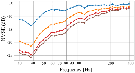
## Chart: NMSE vs. Frequency
### Overview
The image is a line chart showing the relationship between NMSE (Normalized Mean Squared Error) in dB and Frequency in Hz. There are four distinct data series represented by different colored lines: blue, orange, red, and brown. The chart illustrates how NMSE changes with frequency for each series.
### Components/Axes
* **X-axis:** Frequency [Hz]. The scale ranges from approximately 30 Hz to 300 Hz. Major tick marks are present at 30, 40, 50, 60, 70, 80, 90, 100, 200, and 300 Hz.
* **Y-axis:** NMSE (dB). The scale ranges from -25 dB to -5 dB. Major tick marks are present at -25, -20, -15, -10, and -5 dB.
* **Data Series:** Four data series are plotted on the chart, each represented by a different color: blue, orange, red, and brown. There is no explicit legend, so the series are identified by color.
### Detailed Analysis
* **Blue Line:** This line generally slopes upward, indicating that NMSE increases with frequency.
* At 30 Hz, the NMSE is approximately -11.5 dB.
* It dips to around -13 dB at 40 Hz.
* It then rises sharply to approximately -7 dB at 100 Hz.
* The line plateaus around -6 dB between 200 Hz and 300 Hz.
* **Orange Line:** This line also slopes upward, showing an increase in NMSE with frequency.
* At 30 Hz, the NMSE is approximately -20 dB.
* It rises to approximately -11 dB at 100 Hz.
* The line plateaus around -8 dB between 200 Hz and 300 Hz.
* **Red Line:** This line shows a similar upward trend, with NMSE increasing with frequency.
* At 30 Hz, the NMSE is approximately -23.5 dB.
* It rises to approximately -14 dB at 100 Hz.
* The line plateaus around -9 dB between 200 Hz and 300 Hz.
* **Brown Line:** This line also slopes upward, indicating that NMSE increases with frequency.
* At 30 Hz, the NMSE is approximately -25 dB.
* It rises to approximately -15 dB at 100 Hz.
* The line plateaus around -10 dB between 200 Hz and 300 Hz.
### Key Observations
* All four data series show a general trend of increasing NMSE with increasing frequency.
* The blue line consistently exhibits the highest NMSE values across the frequency range.
* The brown line consistently exhibits the lowest NMSE values across the frequency range.
* The NMSE values for all series tend to converge as the frequency increases beyond 200 Hz.
### Interpretation
The chart suggests that, across the four data series, higher frequencies generally result in lower error (higher NMSE values, since the values are negative dB). The blue series performs the best (lowest error), while the brown series performs the worst (highest error). The convergence of the lines at higher frequencies indicates that the performance difference between the series diminishes as frequency increases. The initial dip in the blue line around 40 Hz is an anomaly that might warrant further investigation. The data demonstrates a clear relationship between frequency and NMSE, with performance generally improving at higher frequencies.