## Digital Route Display: Transit Information Sign
### Overview
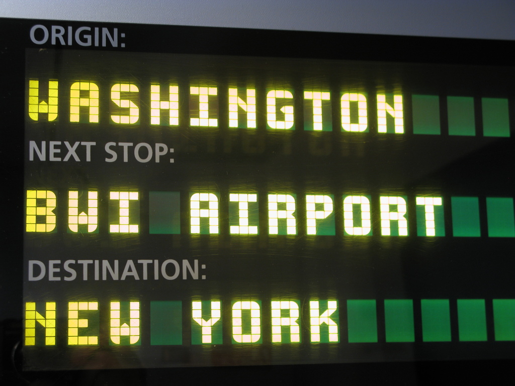
The image shows a close-up photograph of an electronic dot-matrix display board, likely installed inside a public transit vehicle (such as a train or bus). The display provides real-time route information using illuminated text against a dark background. The information is presented in three distinct, vertically stacked lines.
### Components/Axes
The display is structured into three labeled rows. Each row consists of a static label in a grey, sans-serif font followed by a dynamic value displayed in a bright yellow, segmented LED/dot-matrix font. To the right of each dynamic value, there is a series of solid green rectangular blocks.
**Spatial Layout (Top to Bottom):**
1. **Top Row:**
* **Label (Left):** `ORIGIN:`
* **Value (Center-Left):** `WASHINGTON`
* **Green Blocks (Right):** Three consecutive green blocks.
2. **Middle Row:**
* **Label (Left):** `NEXT STOP:`
* **Value (Center-Left):** `BWI AIRPORT`
* **Green Blocks (Right):** Two consecutive green blocks.
3. **Bottom Row:**
* **Label (Left):** `DESTINATION:`
* **Value (Center-Left):** `NEW YORK`
* **Green Blocks (Right):** Five consecutive green blocks.
### Detailed Analysis
* **Text Transcription:**
* Line 1: `ORIGIN: WASHINGTON`
* Line 2: `NEXT STOP: BWI AIRPORT`
* Line 3: `DESTINATION: NEW YORK`
* **Visual Characteristics:**
* **Font:** The dynamic values (`WASHINGTON`, `BWI AIRPORT`, `NEW YORK`) use a classic dot-matrix or segmented LED font style, where each character is formed by a grid of illuminated yellow squares/pixels.
* **Color Scheme:** The primary palette is high-contrast for readability: bright yellow text on a black/dark grey background. The static labels are a muted grey. The green blocks provide a secondary accent color.
* **Green Blocks:** The number of green blocks varies per row (3, 2, and 5 respectively). Their purpose is not explicitly labeled. They may represent a progress bar, a visual separator, or a placeholder for additional information not currently displayed.
### Key Observations
1. **Information Hierarchy:** The display clearly communicates a three-stage journey: starting point, immediate next stop, and final terminus.
2. **Geographic Context:** The locations indicate a transit route in the Northeastern United States. "BWI" is a common airport code for Baltimore/Washington International Thurgood Marshall Airport.
3. **Design for Readability:** The use of all-caps, a simple dot-matrix font, and high-contrast colors is optimized for quick reading in a moving vehicle, potentially from a distance or at an angle.
4. **Variable Data Fields:** Only the location names are displayed in the dynamic, illuminated font, suggesting these are the elements that change based on the vehicle's position in its route. The labels (`ORIGIN:`, etc.) are fixed.
### Interpretation
This image captures a standard real-time passenger information system. Its primary function is to reduce passenger anxiety and improve wayfinding by clearly stating the vehicle's current context within its route.
* **Journey Narrative:** The data tells a simple story: The trip began in Washington, the immediate next destination is BWI Airport, and the final endpoint is New York. This suggests a long-distance intercity route, possibly an Amtrak train or a dedicated airport connector service.
* **Ambiguity of Green Blocks:** The green blocks are the only element without an explicit label. Their varying count (3, 2, 5) does not correlate obviously with the length of the location names or any other visible data. They might be a legacy design element, a generic "fill" graphic, or part of a system where they could be filled/unfilled to indicate progress (though all are solidly lit here). Their exact function cannot be determined from this single image alone.
* **User Experience:** The display is effective in its simplicity. It answers the three most critical questions for a passenger: "Where did we start?", "Where are we going next?", and "Where does this trip end?" without any extraneous information.