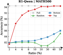
## Chart: Accuracy vs Ratio
### Overview
The image is a line chart comparing the accuracy (%) of different models (Full, Random, Bottom, Top) against the ratio (%) on the R1-Qwen | MATH500 dataset. The x-axis represents the ratio (%), and the y-axis represents the accuracy (%).
### Components/Axes
* **Title:** R1-Qwen | MATH500
* **X-axis:** Ratio (%) with markers at 2, 4, 6, 8, 10, 20, 30, 40, 50
* **Y-axis:** Accuracy (%) with markers at 82, 84, 86, 88, 90, 92, 94
* **Legend:** Located in the top-right corner.
* Full (Gray dashed line with 'x' markers)
* Random (Green line with triangle markers)
* Bottom (Blue line with square markers)
* Top (Red line with circle markers)
### Detailed Analysis
* **Full (Gray dashed line with 'x' markers):** The accuracy remains almost constant at approximately 94.5% across all ratios.
* Ratio 2%: ~94.5%
* Ratio 50%: ~94.5%
* **Random (Green line with triangle markers):** The accuracy initially increases slightly, then decreases and plateaus.
* Ratio 2%: ~82%
* Ratio 6%: ~82%
* Ratio 10%: ~82%
* Ratio 20%: ~81%
* Ratio 30%: ~81%
* Ratio 50%: ~85%
* **Bottom (Blue line with square markers):** The accuracy increases steadily with the ratio.
* Ratio 2%: ~81.5%
* Ratio 6%: ~82.5%
* Ratio 10%: ~82.5%
* Ratio 20%: ~83%
* Ratio 30%: ~84%
* Ratio 50%: ~86%
* **Top (Red line with circle markers):** The accuracy increases rapidly initially, then plateaus at higher ratios.
* Ratio 2%: ~81.5%
* Ratio 4%: ~88.5%
* Ratio 6%: ~91.5%
* Ratio 8%: ~92.5%
* Ratio 10%: ~93%
* Ratio 20%: ~94%
* Ratio 30%: ~94.5%
* Ratio 50%: ~94.5%
### Key Observations
* The "Full" model consistently achieves the highest accuracy, remaining almost constant across all ratios.
* The "Top" model shows a significant initial increase in accuracy, eventually reaching a similar level to the "Full" model.
* The "Bottom" model's accuracy increases steadily but remains lower than the "Full" and "Top" models.
* The "Random" model performs the worst, with its accuracy fluctuating and remaining the lowest among all models.
### Interpretation
The chart compares the performance of different models based on accuracy versus ratio. The "Full" model serves as a benchmark, demonstrating the highest achievable accuracy. The "Top" model quickly approaches this benchmark, suggesting it is an efficient strategy. The "Bottom" model shows a gradual improvement, indicating it benefits from higher ratios but is less effective overall. The "Random" model's poor performance suggests that random selection is not a viable strategy for this task. The data suggests that focusing on the "Top" elements is a more effective approach than random selection or focusing on the "Bottom" elements.