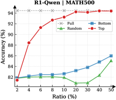
## Line Chart: R1-Qwen | MATH500
### Overview
This is a line chart comparing the performance (accuracy) of four different data selection strategies ("Full", "Bottom", "Random", "Top") on the MATH500 benchmark as the ratio of training data used increases. The chart demonstrates how accuracy changes with the percentage of data utilized.
### Components/Axes
* **Title:** "R1-Qwen | MATH500" (Top center)
* **Y-Axis:** Label is "Accuracy (%)". Scale runs from 80 to 94 in increments of 2.
* **X-Axis:** Label is "Ratio (%)". The scale is non-linear, with marked points at 2, 4, 6, 8, 10, 20, 30, 40, and 50.
* **Legend:** Located in the top-right corner of the chart area. It defines four data series:
* **Full:** Gray dashed line with 'x' markers.
* **Bottom:** Blue solid line with square markers.
* **Random:** Green solid line with triangle markers.
* **Top:** Red solid line with circle markers.
### Detailed Analysis
**Data Series and Trends:**
1. **Full (Gray, 'x' markers):**
* **Trend:** Perfectly horizontal line, indicating constant performance.
* **Data Points:** Accuracy is consistently at **94%** for all data ratios from 2% to 50%.
2. **Top (Red, circle markers):**
* **Trend:** Strong, consistent upward slope. Shows the most significant improvement as more data is added.
* **Data Points (Approximate):**
* Ratio 2%: ~82%
* Ratio 4%: ~88%
* Ratio 6%: ~90%
* Ratio 8%: ~92%
* Ratio 10%: ~93%
* Ratio 20%: ~93.5%
* Ratio 30%: ~94%
* Ratio 40%: ~94%
* Ratio 50%: ~94%
3. **Bottom (Blue, square markers):**
* **Trend:** Gradual, steady upward slope. Performance improves slowly with more data.
* **Data Points (Approximate):**
* Ratio 2%: ~82%
* Ratio 4%: ~82.2%
* Ratio 6%: ~82.5%
* Ratio 8%: ~82.5%
* Ratio 10%: ~82.5%
* Ratio 20%: ~83%
* Ratio 30%: ~84%
* Ratio 40%: ~85%
* Ratio 50%: ~86%
4. **Random (Green, triangle markers):**
* **Trend:** Fluctuating, with a slight overall upward trend. It dips in the middle range before recovering.
* **Data Points (Approximate):**
* Ratio 2%: ~82%
* Ratio 4%: ~82%
* Ratio 6%: ~82%
* Ratio 8%: ~82%
* Ratio 10%: ~82%
* Ratio 20%: ~81%
* Ratio 30%: ~81%
* Ratio 40%: ~83%
* Ratio 50%: ~85%
### Key Observations
* The **"Full"** model sets the performance ceiling at 94% accuracy.
* The **"Top"** selection strategy rapidly approaches the "Full" model's performance, matching it by the 30% data ratio mark.
* The **"Bottom"** and **"Random"** strategies perform significantly worse than "Top" at all data ratios. "Random" performs worse than "Bottom" for most of the middle range (10%-30%).
* All strategies start at approximately the same accuracy (~82%) when using only 2% of the data.
* There is a notable performance dip for the **"Random"** strategy between 10% and 30% data ratio.
### Interpretation
This chart illustrates the principle of data quality over quantity for this specific task (MATH500 with R1-Qwen). The "Top" strategy, which presumably selects the highest-quality or most relevant data samples, achieves near-maximum performance using only 30% of the available data. This suggests that a significant portion of the training data may be redundant or less informative for improving accuracy on this benchmark.
The poor performance of the "Bottom" (likely lowest-quality data) and "Random" strategies confirms that indiscriminate data addition is inefficient. The dip in the "Random" curve could indicate that adding certain mid-quality data points introduces noise that temporarily hinders model performance before the benefit of increased data volume takes over at higher ratios.
The key takeaway is that intelligent data curation ("Top" selection) is a highly effective method for achieving optimal model performance with reduced computational cost, as it avoids processing the full dataset.