## Line Chart: Information Gain and R² Value vs. Training Steps
### Overview
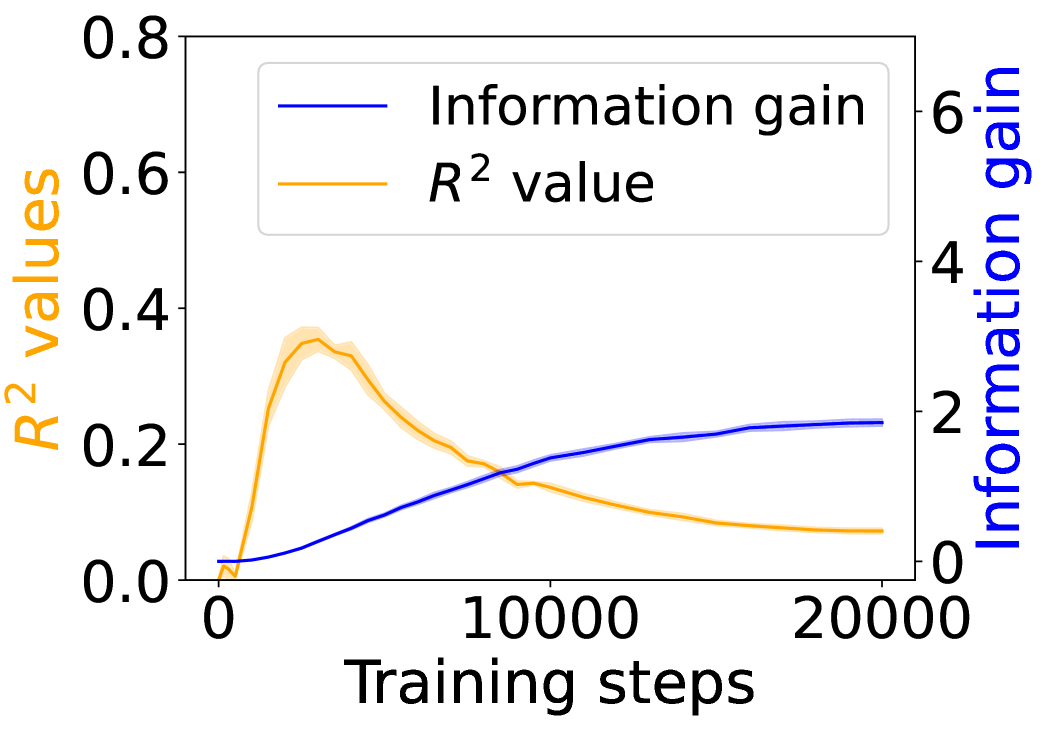
The image is a line chart showing the relationship between training steps and two metrics: Information gain and R² value. The x-axis represents training steps, while the left y-axis represents R² values and the right y-axis represents Information gain. The chart displays how these metrics change over the course of training.
### Components/Axes
* **X-axis:** Training steps, ranging from 0 to 20000.
* **Left Y-axis:** R² values, ranging from 0.0 to 0.8. The axis label is "R² values" in orange.
* **Right Y-axis:** Information gain, ranging from 0 to 6. The axis label is "Information gain" in blue.
* **Legend:** Located at the top of the chart.
* Blue line: Information gain
* Orange line: R² value
### Detailed Analysis
* **Information gain (Blue line):** The information gain starts at approximately 0 at 0 training steps. It increases steadily to approximately 1.5 at 10000 training steps, and continues to increase at a slower rate, reaching approximately 2.2 at 20000 training steps.
* **R² value (Orange line):** The R² value starts at approximately 0 at 0 training steps. It increases rapidly to a peak of approximately 0.35 around 2500 training steps. After the peak, it decreases steadily, reaching approximately 0.1 at 20000 training steps. The R² value line has a shaded region around it, indicating uncertainty or variance.
### Key Observations
* The information gain increases with training steps, while the R² value initially increases but then decreases as training progresses.
* The R² value peaks early in the training process and then declines, suggesting that the model may initially fit the data well but then starts to overfit or lose its predictive power as training continues.
* The information gain continues to increase, indicating that the model is still learning or extracting relevant information from the data even as the R² value declines.
### Interpretation
The chart suggests that the model's performance, as measured by R², initially improves with training but then degrades, possibly due to overfitting. However, the increasing information gain indicates that the model continues to learn relevant features even as its overall fit to the data declines. This could mean that the model is becoming more specialized or is capturing more complex relationships in the data that are not reflected in the R² value. The shaded region around the R² value line suggests that the model's performance is not consistent and may vary depending on the specific data used for evaluation. Further investigation is needed to determine the optimal stopping point for training and to understand the specific features that the model is learning.