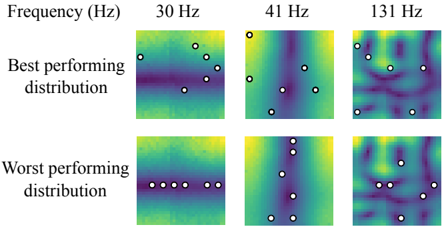
## Heatmap: Best and Worst Performing Distributions at Different Frequencies
### Overview
The image presents a series of heatmaps visualizing "best performing" and "worst performing" distributions at three different frequencies: 30 Hz, 41 Hz, and 131 Hz. Each heatmap is overlaid with white circles, indicating specific data points or locations of interest. The heatmaps use a color gradient, likely representing a performance metric, with darker colors potentially indicating lower values and lighter colors indicating higher values.
### Components/Axes
* **Title:** Frequency (Hz)
* **Frequencies:** 30 Hz, 41 Hz, 131 Hz (arranged horizontally)
* **Distribution Types:**
* Best performing distribution (top row)
* Worst performing distribution (bottom row)
* **Heatmap Color Gradient:** The heatmaps use a color gradient that transitions from dark purple/blue to yellow/green. It is assumed that the color represents a performance metric, but the exact scale is not provided.
* **Data Points:** White circles are overlaid on each heatmap, marking specific locations.
### Detailed Analysis
**30 Hz**
* **Best performing distribution:** The heatmap shows a horizontal band of darker color (lower values) in the middle, with lighter colors (higher values) above and below. The white circles are scattered above this darker band.
* **Worst performing distribution:** The heatmap shows a more uniform color distribution, with a slight gradient from top to bottom. The white circles are arranged in a horizontal line in the middle.
**41 Hz**
* **Best performing distribution:** The heatmap shows a more complex pattern with vertical undulations. The white circles are scattered across the heatmap.
* **Worst performing distribution:** The heatmap shows a similar undulating pattern to the "best performing" distribution, but with slightly different color intensities. The white circles are scattered, mostly in the lower half.
**131 Hz**
* **Best performing distribution:** The heatmap shows a complex, mottled pattern with no clear dominant direction. The white circles are scattered across the heatmap.
* **Worst performing distribution:** The heatmap shows a similar complex, mottled pattern to the "best performing" distribution. The white circles are scattered across the heatmap.
### Key Observations
* The "best performing" and "worst performing" distributions appear to differ more significantly at lower frequencies (30 Hz and 41 Hz) than at the higher frequency (131 Hz).
* At 30 Hz, the "best performing" distribution has a distinct horizontal band of lower values, while the "worst performing" distribution is more uniform.
* The white circles appear to be positioned at locations of interest within each heatmap, potentially indicating local maxima or minima.
* As frequency increases, the patterns in the heatmaps become more complex and less structured.
### Interpretation
The heatmaps likely represent the spatial distribution of some performance metric under different conditions (frequencies and distribution types). The "best performing" and "worst performing" labels suggest that the metric is related to the effectiveness or efficiency of a system.
The data suggests that the frequency of operation has a significant impact on the performance distribution. At lower frequencies, there are more distinct differences between the "best" and "worst" distributions, implying that the system is more sensitive to the distribution at these frequencies. As the frequency increases, the distributions become more similar, suggesting that the system's performance becomes less dependent on the specific distribution.
The white circles highlight specific locations within each distribution that are of particular interest. These locations could represent areas of high or low performance, or points where the distribution is particularly sensitive to changes in frequency. Without more context, it's difficult to determine the exact meaning of these points.