\n
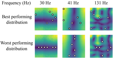
## Heatmap: Frequency Response Distributions
### Overview
The image presents a 2x3 grid of heatmaps, visualizing the distribution of some metric (likely signal strength or activation) at different frequencies (30 Hz, 41 Hz, and 131 Hz) for two different performance levels: "Best performing distribution" and "Worst performing distribution". Each heatmap is overlaid with a series of circular markers, presumably indicating specific data points or locations of interest.
### Components/Axes
* **Title:** "Frequency (Hz)" positioned at the top-left corner.
* **Rows:** Two rows labeled "Best performing distribution" (top row) and "Worst performing distribution" (bottom row).
* **Columns:** Three columns labeled with frequencies: "30 Hz", "41 Hz", and "131 Hz".
* **Heatmap Color Scale:** The heatmaps use a color gradient, ranging from dark purple (low values) to yellow (high values), with intermediate shades of blue and green.
* **Markers:** Each heatmap contains approximately 9-10 circular markers with a black outline and a white fill.
### Detailed Analysis or Content Details
The heatmaps show spatial distributions of values, represented by color. The markers are overlaid on these distributions.
**30 Hz:**
* **Best Performing:** The heatmap shows a predominantly green and blue distribution with some yellow areas. Markers are scattered across the heatmap, with a concentration in the upper-left and lower-right quadrants. The values at the marker locations appear to be moderate to high, based on the color.
* **Worst Performing:** The heatmap is predominantly blue and green, with less yellow than the "Best Performing" distribution. Markers are more evenly distributed, and the values at the marker locations appear generally lower than in the "Best Performing" distribution.
**41 Hz:**
* **Best Performing:** The heatmap shows a strong vertical gradient, with yellow bands running vertically. Markers are aligned with these yellow bands, suggesting a strong response at those locations.
* **Worst Performing:** The heatmap shows a more diffuse distribution, with less pronounced vertical banding. Markers are scattered, and the values at the marker locations appear lower than in the "Best Performing" distribution.
**131 Hz:**
* **Best Performing:** The heatmap shows a complex pattern with multiple areas of high and low intensity. Markers are scattered across the heatmap, with some concentration in the upper-left quadrant.
* **Worst Performing:** The heatmap shows a more uniform distribution, with less contrast than the "Best Performing" distribution. Markers are scattered, and the values at the marker locations appear generally lower.
It is difficult to provide precise numerical values without a color scale legend. However, we can qualitatively assess the relative values based on the color gradient.
### Key Observations
* The "Best Performing" distributions generally exhibit higher intensity (yellow) and more localized peaks compared to the "Worst Performing" distributions.
* At 41 Hz, the "Best Performing" distribution shows a clear vertical banding pattern, which is absent in the "Worst Performing" distribution.
* The marker locations appear to be correlated with areas of high intensity in the "Best Performing" distributions, suggesting that these locations are more responsive at those frequencies.
* The distributions change significantly with frequency, indicating that the system's response is frequency-dependent.
### Interpretation
The data suggests that the system's performance is highly dependent on both frequency and the spatial distribution of the input signal. The "Best Performing" distributions indicate that certain frequencies and spatial patterns elicit a stronger response than others. The vertical banding observed at 41 Hz in the "Best Performing" distribution may represent a resonant frequency or a preferred mode of operation. The "Worst Performing" distributions suggest that the system is less sensitive to certain frequencies or spatial patterns.
The markers likely represent locations where a specific measurement is taken, and their placement on the heatmaps indicates the corresponding value at that location. The difference in marker values between the "Best Performing" and "Worst Performing" distributions highlights the importance of optimizing the input signal to maximize performance.
The image provides a qualitative comparison of different frequency response distributions, but a quantitative analysis would require a color scale legend and the actual numerical values at the marker locations.