\n
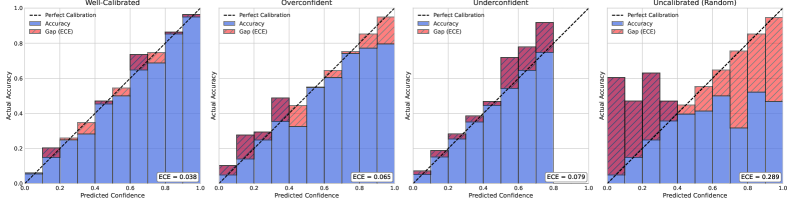
## Calibration Plots: Model Confidence vs. Accuracy
### Overview
The image presents four calibration plots, each representing a different calibration state of a model: Well-Calibrated, Overconfident, Underconfident, and Uncalibrated (Random). Each plot visualizes the relationship between predicted confidence and actual accuracy. The plots use histograms to show the distribution of predictions and overlay lines to represent perfect calibration. The area between the accuracy histogram and the perfect calibration line is shaded to represent the Expected Calibration Error (ECE).
### Components/Axes
Each plot shares the following components:
* **X-axis:** "Predicted Confidence" ranging from 0.0 to 1.0.
* **Y-axis:** "Actual Accuracy" ranging from 0.0 to 1.0.
* **Blue Histogram:** Represents the "Accuracy" – the frequency of correct predictions for each confidence bin.
* **Red Shaded Area:** Represents the "Gap (ECE)" – the difference between the actual accuracy and the perfect calibration line.
* **Black Dashed Line:** Represents "Perfect Calibration" – a diagonal line where predicted confidence equals actual accuracy.
* **Title:** Indicates the calibration state of the model (Well-Calibrated, Overconfident, Underconfident, Uncalibrated (Random)).
* **ECE Value:** Displayed at the bottom-right of each plot, representing the Expected Calibration Error.
### Detailed Analysis or Content Details
**1. Well-Calibrated Plot:**
* The blue "Accuracy" histogram closely follows the black "Perfect Calibration" line.
* The red "Gap (ECE)" is minimal.
* ECE = 0.038.
* The histogram peaks around a predicted confidence of 0.8 and an actual accuracy of 0.8.
**2. Overconfident Plot:**
* The blue "Accuracy" histogram is consistently *below* the black "Perfect Calibration" line.
* The red "Gap (ECE)" is present, but relatively small.
* ECE = 0.065.
* The histogram peaks around a predicted confidence of 0.7 and an actual accuracy of 0.5.
**3. Underconfident Plot:**
* The blue "Accuracy" histogram is consistently *above* the black "Perfect Calibration" line.
* The red "Gap (ECE)" is more pronounced than in the Overconfident plot.
* ECE = 0.079.
* The histogram peaks around a predicted confidence of 0.3 and an actual accuracy of 0.7.
**4. Uncalibrated (Random) Plot:**
* The blue "Accuracy" histogram is highly erratic and deviates significantly from the black "Perfect Calibration" line.
* The red "Gap (ECE)" is the largest among all plots.
* ECE = 0.280.
* The histogram shows a relatively flat distribution across the predicted confidence range, indicating random predictions.
### Key Observations
* The ECE values directly correlate with the degree of calibration. Lower ECE indicates better calibration.
* The Well-Calibrated plot demonstrates the ideal scenario where predicted confidence aligns with actual accuracy.
* The Overconfident plot shows that the model tends to overestimate its confidence.
* The Underconfident plot shows that the model tends to underestimate its confidence.
* The Uncalibrated (Random) plot represents a poorly performing model with no meaningful relationship between predicted confidence and actual accuracy.
### Interpretation
These calibration plots illustrate the importance of model calibration in machine learning. A well-calibrated model provides not only accurate predictions but also reliable confidence scores. This is crucial for decision-making, especially in high-stakes applications where understanding the uncertainty of a prediction is as important as the prediction itself.
The plots demonstrate that a model can achieve high accuracy but still be poorly calibrated (e.g., Overconfident or Underconfident). This suggests that accuracy alone is not a sufficient metric for evaluating a model's performance. The ECE provides a quantitative measure of calibration error, allowing for a more comprehensive assessment of model quality.
The Uncalibrated (Random) plot highlights the scenario where the model's predictions are essentially random, indicating a complete lack of learning or a severe issue with the model's training process. The large ECE value confirms this poor performance.
The plots are a visual representation of the relationship between predicted probabilities and observed frequencies, a core concept in evaluating probabilistic models. They provide a clear and intuitive way to assess whether a model's confidence scores are trustworthy.