## Line Chart: Model Performance Comparison on Pass@k Metric
### Overview
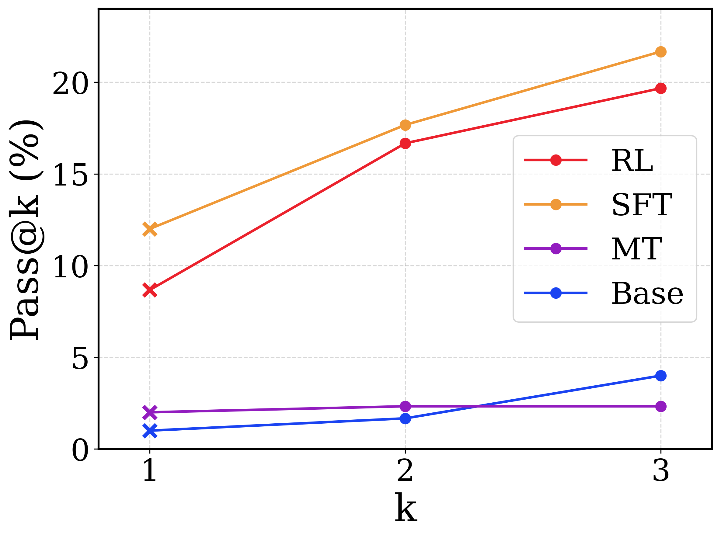
This image is a line chart comparing the performance of four different computational models or methods (labeled RL, SFT, MT, and Base) across three discrete evaluation points. The performance is measured by a metric called "Pass@k (%)". The chart demonstrates that two methods (SFT and RL) significantly outperform the other two (MT and Base) and show a much stronger positive scaling as the value of 'k' increases.
**Language Declaration:** The text in this image is entirely in English.
### Components/Axes
**Spatial Grounding & Layout:**
* **Y-axis (Left):** Labeled vertically as **"Pass@k (%)"**. The scale ranges from 0 to at least 20. Major tick marks and corresponding horizontal dashed gridlines are present at **0, 5, 10, 15, and 20**.
* **X-axis (Bottom):** Labeled horizontally as **"k"**. It features three discrete, evenly spaced markers labeled **1, 2, and 3**. Vertical dashed gridlines align with these three markers.
* **Legend (Center-Right):** Positioned inside the chart area, bounded by a rounded rectangular box. It maps line colors and marker styles to specific categories.
* Red line with a circle marker: **RL**
* Orange line with a circle marker: **SFT**
* Purple line with a circle marker: **MT**
* Blue line with a circle marker: **Base**
* **Visual Anomaly (Markers):** While the legend shows circle markers ('o') for all series, the actual data points plotted at **k=1** use cross markers ('x'). The data points at **k=2** and **k=3** use circle markers ('o').
### Detailed Analysis
Below is the trend verification and data extraction for each series. Values are approximate (denoted by ~) based on visual interpolation between the gridlines.
**1. SFT (Orange Line)**
* **Trend:** The line slopes upward significantly from k=1 to k=2, and continues a steady upward slope from k=2 to k=3. It remains the highest-performing series across all values of k.
* **Data Points:**
* k=1 (cross marker): ~12.0%
* k=2 (circle marker): ~17.8%
* k=3 (circle marker): ~21.5% (Extrapolated above the 20% gridline)
**2. RL (Red Line)**
* **Trend:** The line slopes upward steeply from k=1 to k=2, and continues sloping upward from k=2 to k=3. It closely tracks below the SFT line.
* **Data Points:**
* k=1 (cross marker): ~8.8%
* k=2 (circle marker): ~16.8%
* k=3 (circle marker): ~19.8%
**3. Base (Blue Line)**
* **Trend:** The line slopes upward very slightly from k=1 to k=2, then the upward slope increases moderately from k=2 to k=3. It starts as the lowest value but crosses the MT line between k=2 and k=3.
* **Data Points:**
* k=1 (cross marker): ~1.0%
* k=2 (circle marker): ~1.8%
* k=3 (circle marker): ~4.0%
**4. MT (Purple Line)**
* **Trend:** The line is nearly flat. It shows a microscopic upward slope from k=1 to k=2, and is completely horizontal from k=2 to k=3.
* **Data Points:**
* k=1 (cross marker): ~2.0%
* k=2 (circle marker): ~2.3%
* k=3 (circle marker): ~2.3%
#### Reconstructed Data Table
| k | Base (Blue) | MT (Purple) | RL (Red) | SFT (Orange) |
|---|---|---|---|---|
| **1** | ~1.0% | ~2.0% | ~8.8% | ~12.0% |
| **2** | ~1.8% | ~2.3% | ~16.8% | ~17.8% |
| **3** | ~4.0% | ~2.3% | ~19.8% | ~21.5% |
### Key Observations
* **Bifurcation of Performance:** There is a massive performance gap between the top tier (SFT, RL) and the bottom tier (MT, Base). At k=3, the lowest top-tier model (RL) is nearly 5 times better than the highest bottom-tier model (Base).
* **The Crossover:** The Base model (blue) starts lower than the MT model (purple) at k=1 and k=2, but due to MT's stagnation, Base overtakes MT at k=3.
* **Stagnation of MT:** The MT model is the only series that does not benefit from an increase in 'k' from 2 to 3, showing a completely flat trajectory.
* **Marker Distinction:** The deliberate use of 'x' markers at k=1 versus 'o' markers at k>1 suggests a methodological difference in how the metric is calculated or generated at the first step compared to subsequent steps.
### Interpretation
In the context of machine learning and generative AI, "Pass@k" is a standard metric used to evaluate code generation or problem-solving models. It measures the probability that at least one out of 'k' generated samples passes the unit tests or criteria.
* **Model Efficacy:** The data clearly demonstrates that Supervised Fine-Tuning (SFT) and Reinforcement Learning (RL) are vastly superior training methodologies for this specific task compared to the Base model or the MT (likely Multi-Task) model.
* **Diversity of Generation (Reading between the lines):** The Pass@k metric inherently rewards models that can generate a *diverse* set of plausible answers. Because SFT and RL scale up steeply as 'k' increases, it indicates these models are generating diverse, high-quality candidates; if the first guess (k=1) is wrong, the second or third guess is highly likely to be correct.
* **The MT Anomaly:** The flatlining of the MT model between k=2 and k=3 suggests a "mode collapse" or lack of diversity. Even when allowed to make 3 guesses (k=3), it does not find any new correct answers that it hadn't already found in its first 2 guesses.
* **The Marker Shift:** The shift from 'x' to 'o' markers likely denotes a shift from greedy decoding (k=1, where the model outputs its single highest-confidence answer) to temperature sampling (k>1, where the model introduces randomness to generate multiple different answers).