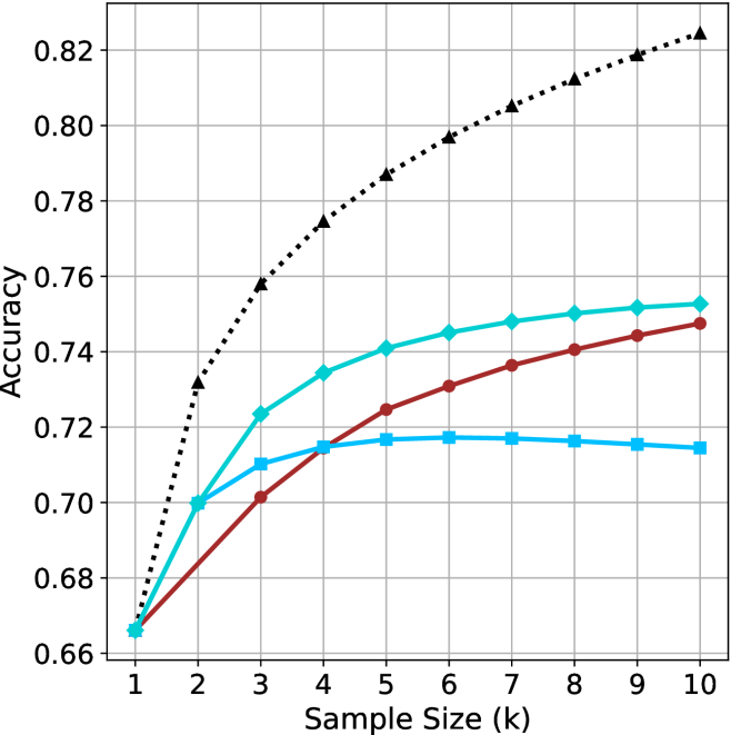
## Line Chart: Accuracy vs. Sample Size
### Overview
The image is a line chart showing the relationship between "Accuracy" (y-axis) and "Sample Size (k)" (x-axis) for three different data series. The x-axis ranges from 1 to 10, and the y-axis ranges from 0.66 to 0.82. There are three distinct lines, each representing a different data series, distinguished by color and marker style.
### Components/Axes
* **X-axis:** "Sample Size (k)" with values ranging from 1 to 10 in integer increments.
* **Y-axis:** "Accuracy" with values ranging from 0.66 to 0.82 in increments of 0.02.
* **Data Series:** Three data series are plotted:
* A black dotted line with triangle markers.
* A cyan solid line with diamond markers.
* A brown solid line with circle markers.
* A blue solid line with square markers.
### Detailed Analysis
**1. Black Dotted Line (Triangle Markers):**
* Trend: This line shows a steep upward trend initially, then gradually plateaus.
* Data Points:
* (1, 0.67) +/- 0.005
* (2, 0.73) +/- 0.005
* (3, 0.77) +/- 0.005
* (4, 0.79) +/- 0.005
* (5, 0.80) +/- 0.005
* (6, 0.81) +/- 0.005
* (7, 0.815) +/- 0.005
* (8, 0.82) +/- 0.005
* (9, 0.82) +/- 0.005
* (10, 0.825) +/- 0.005
**2. Cyan Solid Line (Diamond Markers):**
* Trend: This line shows an upward trend, but less steep than the black dotted line, and also plateaus.
* Data Points:
* (1, 0.67) +/- 0.005
* (2, 0.70) +/- 0.005
* (3, 0.725) +/- 0.005
* (4, 0.74) +/- 0.005
* (5, 0.74) +/- 0.005
* (6, 0.745) +/- 0.005
* (7, 0.745) +/- 0.005
* (8, 0.75) +/- 0.005
* (9, 0.75) +/- 0.005
* (10, 0.755) +/- 0.005
**3. Brown Solid Line (Circle Markers):**
* Trend: This line shows a gradual upward trend, plateauing towards the end.
* Data Points:
* (1, 0.67) +/- 0.005
* (2, 0.69) +/- 0.005
* (3, 0.705) +/- 0.005
* (4, 0.72) +/- 0.005
* (5, 0.73) +/- 0.005
* (6, 0.735) +/- 0.005
* (7, 0.74) +/- 0.005
* (8, 0.745) +/- 0.005
* (9, 0.745) +/- 0.005
* (10, 0.75) +/- 0.005
**4. Blue Solid Line (Square Markers):**
* Trend: This line shows an upward trend, then decreases slightly.
* Data Points:
* (1, 0.67) +/- 0.005
* (2, 0.70) +/- 0.005
* (3, 0.71) +/- 0.005
* (4, 0.715) +/- 0.005
* (5, 0.715) +/- 0.005
* (6, 0.715) +/- 0.005
* (7, 0.715) +/- 0.005
* (8, 0.715) +/- 0.005
* (9, 0.715) +/- 0.005
* (10, 0.71) +/- 0.005
### Key Observations
* All lines start at approximately the same accuracy value (around 0.67) when the sample size is 1.
* The black dotted line (triangle markers) consistently achieves the highest accuracy for any given sample size greater than 1.
* The blue solid line (square markers) plateaus and even decreases slightly after a sample size of 4.
* The cyan solid line (diamond markers) and brown solid line (circle markers) show similar trends, with the cyan line consistently having a slightly higher accuracy.
### Interpretation
The chart illustrates how accuracy changes with increasing sample size for four different methods or models. The black dotted line (triangle markers) represents the most effective method, as it achieves the highest accuracy and plateaus at a high value. The blue solid line (square markers) is the least effective, as its accuracy plateaus and even decreases slightly, indicating that increasing the sample size beyond a certain point does not improve its performance. The cyan and brown lines show intermediate performance. The data suggests that the choice of method or model significantly impacts the accuracy achieved, and that increasing the sample size has diminishing returns for all methods, eventually leading to a plateau in accuracy.