## Line Chart: Accuracy vs. Sample Size (k)
### Overview
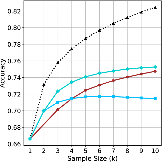
This image is a line chart illustrating the relationship between "Sample Size (k)" and "Accuracy" for four distinct data series. The chart uses a grid background to facilitate reading values. There is no legend provided in the image to identify what each specific line represents (e.g., different models or algorithms), so they are identified by their color and marker shape.
### Components/Axes
* **X-Axis:** Labeled "Sample Size (k)". The scale is linear, ranging from 1 to 10 in integer increments.
* **Y-Axis:** Labeled "Accuracy". The scale ranges from 0.66 to 0.82, with grid lines at intervals of 0.02.
* **Data Series (4 total):**
1. **Black Dotted Line:** Marked with triangles.
2. **Cyan Solid Line:** Marked with diamonds.
3. **Dark Red Solid Line:** Marked with circles.
4. **Medium Blue Solid Line:** Marked with squares.
### Detailed Analysis
All four data series originate from a single point at **x=1**, with an accuracy of approximately **0.665**.
#### Trend Verification
* **Black Dotted Line (Triangles):** Shows a steep, monotonic upward trend throughout the entire range (x=1 to x=10). It is the highest-performing series.
* **Cyan Solid Line (Diamonds):** Shows a strong upward trend, particularly between x=1 and x=3, followed by a steady, slower increase through x=10.
* **Dark Red Solid Line (Circles):** Shows a steady, consistent upward trend throughout the range. It starts as the lowest performer but overtakes the Medium Blue line at x=4.
* **Medium Blue Solid Line (Squares):** Shows an initial increase from x=1 to x=3, a slower increase to x=5, and then plateaus/slightly declines from x=5 to x=10.
#### Data Point Approximations
| Sample Size (k) | Black (Dotted/Tri) | Cyan (Solid/Dia) | Dark Red (Solid/Circ) | Med Blue (Solid/Sq) |
| :--- | :--- | :--- | :--- | :--- |
| **1** | ~0.665 | ~0.665 | ~0.665 | ~0.665 |
| **2** | ~0.730 | ~0.700 | ~0.680 | ~0.700 |
| **3** | ~0.758 | ~0.723 | ~0.702 | ~0.710 |
| **4** | ~0.775 | ~0.735 | ~0.715 | ~0.715 |
| **5** | ~0.787 | ~0.741 | ~0.725 | ~0.717 |
| **6** | ~0.797 | ~0.745 | ~0.731 | ~0.717 |
| **7** | ~0.805 | ~0.748 | ~0.737 | ~0.717 |
| **8** | ~0.813 | ~0.750 | ~0.741 | ~0.716 |
| **9** | ~0.819 | ~0.752 | ~0.744 | ~0.715 |
| **10** | ~0.825 | ~0.753 | ~0.748 | ~0.715 |
### Key Observations
* **Performance Hierarchy:** At x=10, the performance order from highest to lowest is: Black Dotted > Cyan Solid > Dark Red Solid > Medium Blue Solid.
* **Saturation Point:** The Medium Blue (square) line is the only series that exhibits clear signs of saturation or overfitting, as its accuracy stops improving after x=5.
* **Divergence:** The gap between the top performer (Black Dotted) and the others widens significantly as the sample size increases, suggesting the Black Dotted model benefits most from additional data.
### Interpretation
This chart likely represents a comparison of machine learning model performance as a function of training data size.
* **The Black Dotted model** demonstrates superior scalability; it continues to learn effectively as more data is provided, showing no signs of plateauing within the observed range.
* **The Medium Blue model** appears to have a lower capacity or is prone to overfitting; it reaches its maximum utility at a sample size of 5, after which adding more data provides no benefit (or slightly degrades performance).
* **The Cyan and Dark Red models** represent intermediate performance. They continue to improve with more data, but at a diminishing rate compared to the Black Dotted model.
The data suggests that if the goal is to maximize accuracy, the Black Dotted model is the optimal choice, provided the computational cost of the larger sample size is justified.