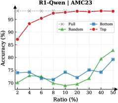
## Line Chart: R1-Qwen1 / AMC23 Accuracy vs. Ratio
### Overview
This is a line chart comparing the performance (accuracy) of four different data selection or sampling strategies ("Full", "Random", "Bottom", "Top") for a model or system identified as "R1-Qwen1" on a task or dataset labeled "AMC23". The chart plots accuracy as a percentage against a variable called "Ratio", also expressed as a percentage.
### Components/Axes
* **Chart Title:** "R1-Qwen1 / AMC23" (centered at the top).
* **Y-Axis:**
* **Label:** "Accuracy (%)" (vertical text on the left).
* **Scale:** Linear scale from 70 to 100.
* **Major Ticks:** 70, 75, 80, 85, 90, 95, 100.
* **X-Axis:**
* **Label:** "Ratio (%)" (horizontal text at the bottom).
* **Scale:** Appears to be a logarithmic or non-linear scale, with values: 2, 4, 6, 8, 10, 20, 30, 40, 50.
* **Legend:** Located in the top-right quadrant of the chart area.
* **"Full":** Gray line with 'x' markers.
* **"Random":** Green line with upward-pointing triangle markers.
* **"Bottom":** Blue line with square markers.
* **"Top":** Red line with circle markers.
### Detailed Analysis
**Data Series Trends & Approximate Values:**
1. **"Full" (Gray, 'x' markers):**
* **Trend:** A perfectly horizontal line at the top of the chart.
* **Data Points:** Constant at 100% accuracy for all Ratio values (2% to 50%). This likely represents a baseline or upper-bound performance using the full dataset.
2. **"Top" (Red, circle markers):**
* **Trend:** A steeply rising curve that plateaus near the top. It is the highest-performing strategy for all ratios greater than 2%.
* **Data Points (Approximate):**
* Ratio 2%: ~87%
* Ratio 4%: ~93%
* Ratio 6%: ~95%
* Ratio 8%: ~96%
* Ratio 10%: ~97%
* Ratio 20%: ~98%
* Ratio 30%: ~98.5%
* Ratio 40%: ~99%
* Ratio 50%: ~99.5%
3. **"Bottom" (Blue, square markers):**
* **Trend:** A fluctuating line with no strong upward or downward trend, generally staying in the 70-80% range. It is often the lowest or second-lowest performing strategy.
* **Data Points (Approximate):**
* Ratio 2%: ~74%
* Ratio 4%: ~75%
* Ratio 6%: ~72%
* Ratio 8%: ~71%
* Ratio 10%: ~73%
* Ratio 20%: ~70%
* Ratio 30%: ~76%
* Ratio 40%: ~74%
* Ratio 50%: ~79%
4. **"Random" (Green, triangle markers):**
* **Trend:** Starts low, dips slightly, then shows a clear upward trend after the 20% ratio point, surpassing the "Bottom" strategy at higher ratios.
* **Data Points (Approximate):**
* Ratio 2%: ~70%
* Ratio 4%: ~71%
* Ratio 6%: ~72%
* Ratio 8%: ~70%
* Ratio 10%: ~69%
* Ratio 20%: ~68%
* Ratio 30%: ~72%
* Ratio 40%: ~78%
* Ratio 50%: ~83%
### Key Observations
* **Performance Hierarchy:** The "Top" strategy significantly outperforms both "Random" and "Bottom" selection across all measured ratios. The "Full" dataset yields perfect accuracy.
* **Critical Threshold:** The "Random" strategy shows a notable performance inflection point around a 20% ratio, after which its accuracy improves substantially.
* **Stability vs. Growth:** The "Bottom" strategy's performance is relatively unstable and does not show consistent improvement with increased ratio. In contrast, "Top" shows rapid initial gains that diminish as it approaches the 100% ceiling.
* **Low-Ratio Performance:** At the smallest ratio (2%), the gap between "Top" (~87%) and the other non-full strategies (~70-74%) is already very large.
### Interpretation
This chart demonstrates the effectiveness of a **data selection strategy** for the R1-Qwen1 model on the AMC23 task. The "Top" label likely refers to selecting samples based on some quality or relevance metric (e.g., highest confidence scores, most informative examples). The results suggest that:
1. **Quality over Quantity:** Using a small subset (e.g., 10%) of the highest-quality data ("Top") achieves near-perfect performance, vastly outperforming using a larger amount of random or low-quality data.
2. **Inefficiency of Low-Quality Data:** The "Bottom" strategy, presumably using the lowest-quality samples, yields poor and inconsistent results, indicating that adding such data does not help and may even harm model performance.
3. **Random Sampling Baseline:** The "Random" strategy serves as a baseline. Its eventual improvement suggests that with enough random data (approaching 50% of the dataset), the model can begin to learn effectively, but it is far less data-efficient than targeted selection.
4. **Implication for Resource Allocation:** The data strongly supports investing resources in identifying and curating high-quality training data ("Top") rather than simply amassing large volumes of unfiltered data. The perfect score of "Full" indicates the task is solvable with the complete dataset, but the "Top" curve shows it can be solved almost as well with a fraction of it.
**In summary, the chart is a compelling argument for intelligent data curation in machine learning, showing that strategic selection of a small amount of high-value data is superior to using larger amounts of random or low-value data.**