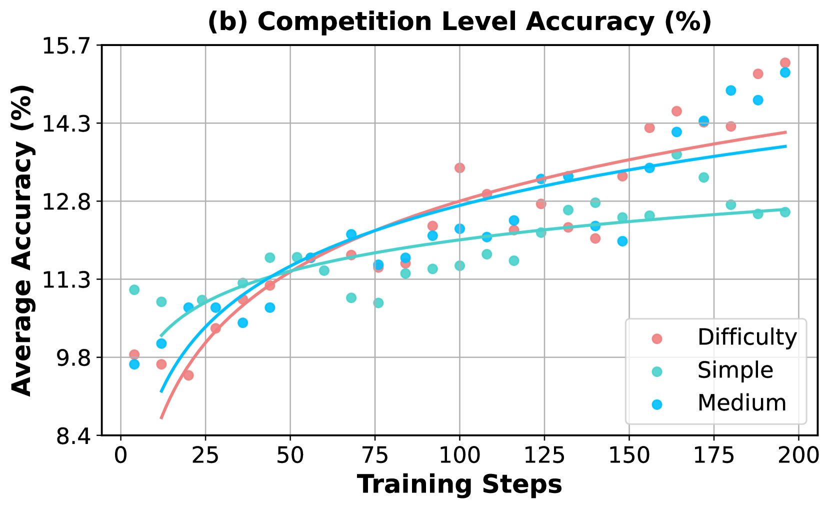
## Chart: Competition Level Accuracy
### Overview
The image presents a line chart illustrating the relationship between Training Steps and Average Accuracy (%) for different competition difficulty levels. Three difficulty levels – Difficulty, Simple, and Medium – are represented by different colored data points and trend lines. The chart aims to demonstrate how accuracy changes with increasing training steps for each difficulty level.
### Components/Axes
* **Title:** (b) Competition Level Accuracy (%) - positioned at the top-center of the chart.
* **X-axis:** Training Steps - ranging from 0 to 200, with tick marks at intervals of 25.
* **Y-axis:** Average Accuracy (%) - ranging from 8.4 to 15.7, with tick marks at intervals of 0.4.
* **Legend:** Located in the bottom-right corner of the chart.
* Difficulty (represented by red circles)
* Simple (represented by green circles)
* Medium (represented by blue circles)
* **Gridlines:** Horizontal and vertical gridlines are present to aid in reading values.
### Detailed Analysis
The chart displays three lines representing the trend of accuracy for each difficulty level.
* **Difficulty (Red):** The red line shows an upward trend, starting at approximately 9.1% accuracy at 0 training steps and reaching approximately 14.7% accuracy at 200 training steps. The line exhibits a steeper slope in the initial stages (0-100 training steps) and then plateaus.
* (0, 9.1)
* (25, 9.8)
* (50, 10.8)
* (75, 11.8)
* (100, 12.5)
* (125, 13.2)
* (150, 13.8)
* (175, 14.4)
* (200, 14.7)
* **Simple (Green):** The green line also shows an upward trend, but it is less pronounced than the red line. It starts at approximately 9.7% accuracy at 0 training steps and reaches approximately 12.7% accuracy at 200 training steps. The slope is relatively consistent throughout the range.
* (0, 9.7)
* (25, 10.4)
* (50, 11.1)
* (75, 11.6)
* (100, 12.0)
* (125, 12.3)
* (150, 12.5)
* (175, 12.6)
* (200, 12.7)
* **Medium (Blue):** The blue line exhibits a similar upward trend to the green line, starting at approximately 10.2% accuracy at 0 training steps and reaching approximately 13.5% accuracy at 200 training steps. The slope is also relatively consistent.
* (0, 10.2)
* (25, 10.9)
* (50, 11.7)
* (75, 12.3)
* (100, 12.8)
* (125, 13.1)
* (150, 13.3)
* (175, 13.4)
* (200, 13.5)
### Key Observations
* The "Difficulty" level consistently demonstrates the highest accuracy across all training steps.
* The "Simple" and "Medium" levels show similar accuracy trends, with "Medium" generally performing slightly better.
* All three difficulty levels exhibit diminishing returns in accuracy as training steps increase, suggesting a point of saturation.
* The data points are scattered around the trend lines, indicating some variability in accuracy for each difficulty level at each training step.
### Interpretation
The chart suggests that increasing training steps generally improves accuracy for all competition difficulty levels. However, the "Difficulty" level benefits the most from additional training, achieving significantly higher accuracy compared to "Simple" and "Medium" levels. This implies that more complex tasks require more training to reach optimal performance. The diminishing returns observed at higher training steps suggest that there is a limit to the improvement achievable through further training. The spread of data points around the trend lines indicates that individual performance may vary, even within the same difficulty level. This could be due to factors such as individual learning rates or variations in the training data. The chart provides valuable insights into the relationship between training effort and performance in different competition settings, highlighting the importance of tailoring training strategies to the specific difficulty level.