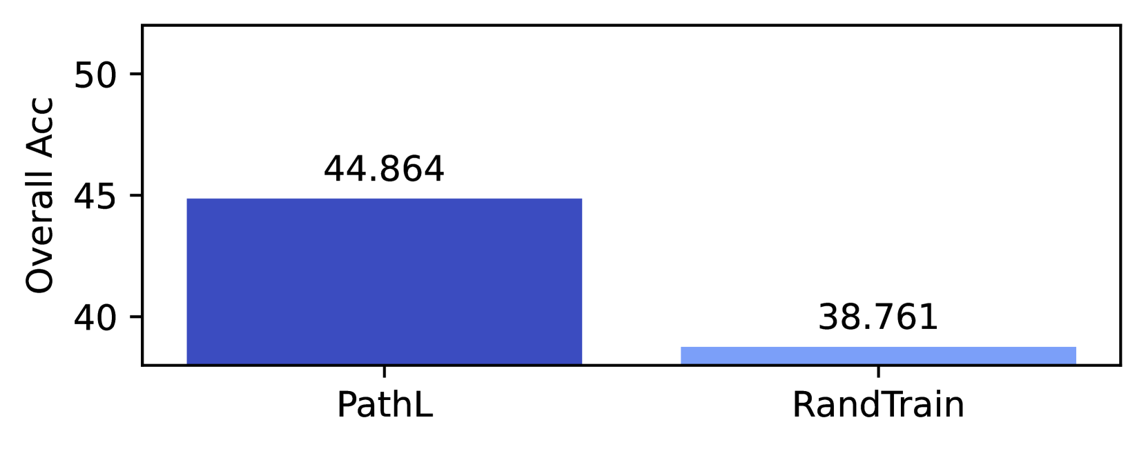
## Bar Chart: Overall Accuracy Comparison
### Overview
The image displays a simple vertical bar chart comparing the "Overall Acc" (Overall Accuracy) of two distinct methods or models, labeled "PathL" and "RandTrain." The chart is presented on a white background with a black border. There is no main title for the chart.
### Components/Axes
* **Y-Axis (Vertical):**
* **Label:** "Overall Acc"
* **Scale:** Linear scale ranging from 40 to 50.
* **Tick Marks:** Major ticks are present at 40, 45, and 50.
* **X-Axis (Horizontal):**
* **Categories:** Two categorical bars are present.
* **Labels:** The left bar is labeled "PathL." The right bar is labeled "RandTrain."
* **Data Series & Legend:**
* There is no explicit legend. The two data series are distinguished solely by their x-axis labels and bar color.
* **Bar 1 (PathL):** A solid, dark blue bar.
* **Bar 2 (RandTrain):** A solid, light blue bar.
* **Data Labels:** Numerical values are displayed directly above each bar.
### Detailed Analysis
* **PathL Bar:**
* **Position:** Left side of the chart.
* **Color:** Dark blue.
* **Height:** The bar extends from the baseline (below 40) to a point just below the 45 tick mark on the y-axis.
* **Value:** The data label above the bar reads **44.864**.
* **RandTrain Bar:**
* **Position:** Right side of the chart.
* **Color:** Light blue.
* **Height:** The bar is significantly shorter, extending from the baseline to a point just below the 40 tick mark.
* **Value:** The data label above the bar reads **38.761**.
### Key Observations
1. **Significant Performance Gap:** There is a clear and substantial difference in Overall Accuracy between the two methods. PathL outperforms RandTrain by a margin of approximately 6.103 percentage points (44.864 - 38.761).
2. **Visual Confirmation:** The trend is visually unambiguous. The dark blue bar (PathL) is markedly taller than the light blue bar (RandTrain), corroborating the numerical values.
3. **Scale Context:** The y-axis is truncated, starting at 40 instead of 0. This visual choice emphasizes the difference between the two values but does not alter the factual data presented.
### Interpretation
The chart presents a direct, quantitative comparison between two approaches, "PathL" and "RandTrain," on a metric called "Overall Acc." The data strongly suggests that the PathL method achieves a meaningfully higher level of overall accuracy than the RandTrain method in the evaluated context.
The absence of a chart title, units for "Acc" (though likely percentage), or any description of the experimental setup limits a full interpretation. However, the core message is clear: PathL is the superior performer according to this specific metric. The use of distinct colors (dark vs. light blue) effectively separates the two categories for quick visual comparison. The presentation is minimalist, focusing solely on the final accuracy values without showing variance, error bars, or other statistical context.