## Line Chart with Scatter Points: Training Batch Accuracy (%)
### Overview
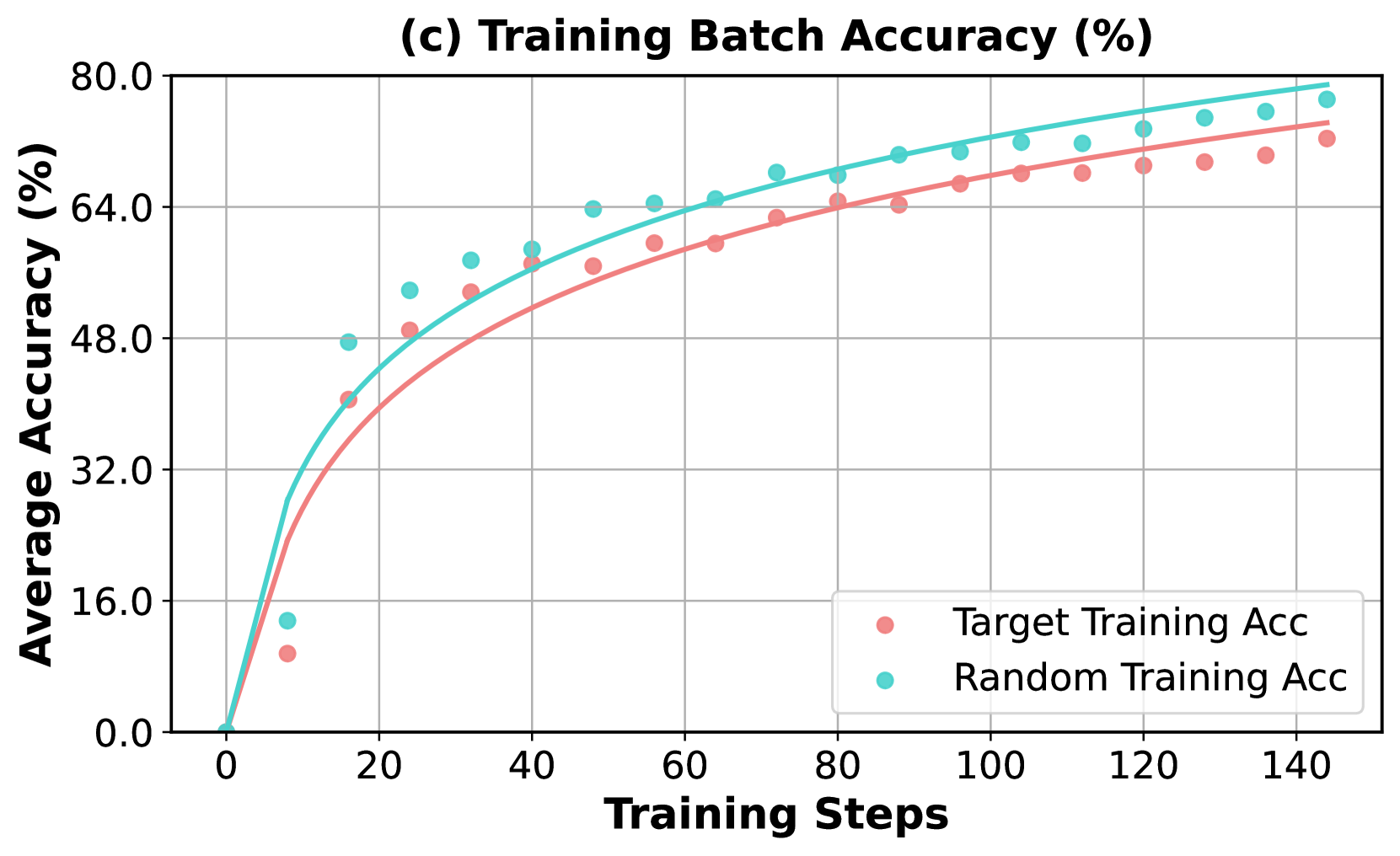
The image is a line chart with overlaid scatter points, titled "(c) Training Batch Accuracy (%)". It plots the average accuracy (in percentage) of two different training methods against the number of training steps. The chart demonstrates a learning curve where accuracy increases rapidly at first and then gradually plateaus for both methods.
### Components/Axes
* **Chart Title:** "(c) Training Batch Accuracy (%)" (centered at the top).
* **Y-Axis:** Labeled "Average Accuracy (%)". The scale runs from 0.0 to 80.0, with major tick marks and grid lines at intervals of 16.0 (0.0, 16.0, 32.0, 48.0, 64.0, 80.0).
* **X-Axis:** Labeled "Training Steps". The scale runs from 0 to 140, with major tick marks and grid lines at intervals of 20 (0, 20, 40, 60, 80, 100, 120, 140).
* **Legend:** Located in the bottom-right quadrant of the chart area. It contains two entries:
* A pink circle symbol labeled "Target Training Acc".
* A cyan circle symbol labeled "Random Training Acc".
* **Data Series:**
1. **Target Training Acc:** Represented by pink circular scatter points and a solid pink trend line.
2. **Random Training Acc:** Represented by cyan circular scatter points and a solid cyan trend line.
### Detailed Analysis
**Trend Verification:**
* **Target Training Acc (Pink):** The line and points show a steep, logarithmic-like increase from near 0% at step 0, crossing 32% before step 20, and continuing to rise at a decreasing rate. The trend is consistently upward, approaching approximately 72% by step 140.
* **Random Training Acc (Cyan):** This series follows a very similar logarithmic growth pattern but is consistently positioned above the Target series. It also starts near 0%, rises steeply, and approaches a higher final value of approximately 78% by step 140.
**Data Point Extraction (Approximate Values):**
The following table lists approximate accuracy values for key training steps, derived from visual inspection of the scatter points against the grid.
| Training Steps | Target Training Acc (Pink) | Random Training Acc (Cyan) |
| :--- | :--- | :--- |
| 0 | ~0% | ~0% |
| 10 | ~10% | ~14% |
| 20 | ~40% | ~48% |
| 40 | ~56% | ~60% |
| 60 | ~60% | ~65% |
| 80 | ~64% | ~68% |
| 100 | ~67% | ~71% |
| 120 | ~69% | ~74% |
| 140 | ~72% | ~78% |
**Spatial Grounding & Cross-Reference:**
The legend is positioned in the bottom-right, clearly associating the pink color/symbol with "Target Training Acc" and the cyan color/symbol with "Random Training Acc". This mapping is consistently applied across all data points and trend lines throughout the chart. The cyan points and line are visually above their pink counterparts at every corresponding training step after the initial point.
### Key Observations
1. **Consistent Performance Gap:** The "Random Training Acc" method achieves a higher average accuracy than the "Target Training Acc" method at every measured step after the start. The gap appears to widen slightly as training progresses.
2. **Similar Learning Dynamics:** Both methods exhibit nearly identical learning curve shapes (rapid initial improvement followed by diminishing returns), suggesting they are learning from the data in a fundamentally similar way, albeit with different efficiencies.
3. **Potential Outlier:** At approximately step 10, the cyan ("Random") data point appears slightly lower relative to its trend line compared to other points, though it is still above the pink ("Target") point at the same step.
4. **High Final Accuracy:** Both methods reach high accuracy levels (>70%) within 140 training steps, indicating effective learning for the given task.
### Interpretation
This chart compares the training efficiency of two different approaches, likely in a machine learning context. The "Random Training Acc" method demonstrates superior performance, achieving higher accuracy faster and maintaining that lead throughout the training process shown.
The data suggests that the strategy or initialization used in the "Random" method is more effective for this specific task than the "Target" method. The fact that both curves follow the same logarithmic trajectory indicates that the underlying learning process (e.g., gradient descent optimization) is similar, but the "Random" method starts from a more advantageous point or follows a more efficient path in the loss landscape.
The narrowing but persistent gap implies that while both models are learning the task, the "Random" model consistently finds better solutions at each stage of training. This could have implications for training time, resource allocation, and final model performance. The chart provides strong visual evidence to favor the "Random Training" approach for this particular application.