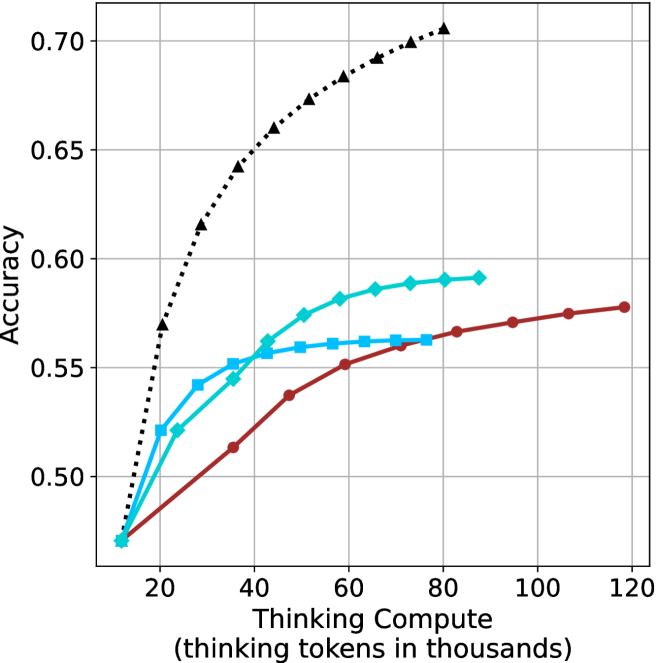
## Line Chart: Accuracy vs. Thinking Compute
### Overview
The image is a line chart comparing the accuracy of different models as a function of "Thinking Compute," measured in thousands of tokens. There are three distinct data series represented by different colored lines with different markers. The chart shows how accuracy increases with more computational resources.
### Components/Axes
* **X-axis:** "Thinking Compute (thinking tokens in thousands)". The scale ranges from approximately 10 to 120, with gridlines at intervals of 20.
* **Y-axis:** "Accuracy". The scale ranges from 0.50 to 0.70, with gridlines at intervals of 0.05.
* **Data Series:**
* Black dotted line with triangle markers.
* Teal line with diamond markers.
* Brown line with circle markers.
* Light Blue line with square markers.
### Detailed Analysis
* **Black dotted line with triangle markers:** This line shows the highest accuracy overall. It increases rapidly from approximately 0.47 at 15k tokens to approximately 0.68 at 60k tokens, and then continues to increase, reaching approximately 0.70 at 70k tokens.
* **Teal line with diamond markers:** This line starts at approximately 0.47 at 15k tokens, increases to approximately 0.56 at 40k tokens, and plateaus around 0.59 between 60k and 80k tokens.
* **Brown line with circle markers:** This line starts at approximately 0.47 at 15k tokens, increases more gradually than the other lines, reaching approximately 0.55 at 60k tokens, and continues to increase to approximately 0.58 at 120k tokens.
* **Light Blue line with square markers:** This line starts at approximately 0.47 at 15k tokens, increases to approximately 0.56 at 60k tokens, and plateaus around 0.56 between 60k and 80k tokens.
### Key Observations
* The black dotted line (with triangle markers) demonstrates the most significant improvement in accuracy with increasing "Thinking Compute."
* The teal line (with diamond markers) and light blue line (with square markers) show similar performance, with accuracy plateauing after a certain point.
* The brown line (with circle markers) shows the slowest but most consistent increase in accuracy across the entire range of "Thinking Compute."
### Interpretation
The chart suggests that increasing "Thinking Compute" generally improves the accuracy of the models. However, the extent of improvement varies depending on the model (represented by the different lines). The black dotted line represents a model that benefits the most from increased compute, while the teal and light blue lines represent models that reach a point of diminishing returns. The brown line represents a model that benefits steadily from increased compute, even at higher levels. The data indicates that the choice of model architecture significantly impacts how effectively computational resources are utilized to improve accuracy.