## Line Chart: Accuracy vs. Thinking Compute
### Overview
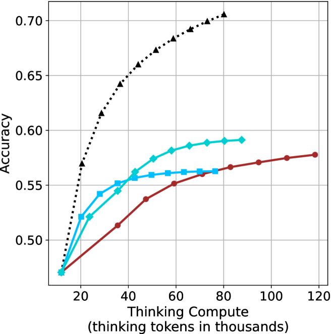
This image is a line chart illustrating the relationship between "Thinking Compute" (measured in thousands of thinking tokens) and model "Accuracy." It compares four distinct data series, each representing a different model or configuration, to demonstrate how increasing computational resources during the "thinking" phase impacts performance.
### Components/Axes
* **Y-Axis:** Labeled "Accuracy." The scale ranges from 0.50 to 0.70, with major grid lines at 0.05 intervals.
* **X-Axis:** Labeled "Thinking Compute (thinking tokens in thousands)." The scale ranges from 20 to 120, with major grid lines at 20-unit intervals.
* **Data Series (Legend-less):** The chart lacks an explicit legend box. The series are identified by their unique line styles and marker shapes:
1. **Black Dotted Line:** Marked with triangles.
2. **Cyan Solid Line:** Marked with diamonds.
3. **Cyan Solid Line:** Marked with squares.
4. **Dark Red Solid Line:** Marked with circles.
### Detailed Analysis
All four data series originate from a common starting point at approximately **(12k, 0.47)**.
**1. Black Dotted Line (Triangles)**
* **Trend:** This series exhibits the steepest upward slope, indicating the highest efficiency in gaining accuracy per unit of compute. It does not show signs of plateauing within the visible range.
* **Data Points (Approximate):**
* 20k: ~0.57
* 30k: ~0.615
* 40k: ~0.64
* 50k: ~0.66
* 60k: ~0.675
* 70k: ~0.69
* 80k: ~0.705
**2. Cyan Solid Line (Diamonds)**
* **Trend:** Shows a moderate upward slope that begins to taper off (diminishing returns) after 60k tokens.
* **Data Points (Approximate):**
* 20k: ~0.52
* 30k: ~0.525
* 40k: ~0.545
* 50k: ~0.575
* 60k: ~0.582
* 70k: ~0.588
* 80k: ~0.592
**3. Cyan Solid Line (Squares)**
* **Trend:** Shows a moderate upward slope initially, but hits a distinct plateau around 50k–60k tokens, after which accuracy gains are negligible.
* **Data Points (Approximate):**
* 20k: ~0.52
* 30k: ~0.542
* 40k: ~0.552
* 50k: ~0.558
* 60k: ~0.561
* 70k: ~0.562
* 80k: ~0.563
**4. Dark Red Solid Line (Circles)**
* **Trend:** This series has the shallowest slope initially but maintains a consistent, linear upward trajectory throughout the entire range (up to 120k tokens), unlike the other series which plateau.
* **Data Points (Approximate):**
* 20k: ~0.48
* 40k: ~0.515
* 60k: ~0.55
* 80k: ~0.565
* 100k: ~0.575
* 120k: ~0.58
### Key Observations
* **Common Origin:** All models start at the same baseline accuracy (~0.47) at the lowest compute level (~12k tokens).
* **Performance Ceiling:** The two cyan-colored series (diamonds and squares) exhibit clear diminishing returns, plateauing well before the 100k token mark.
* **Efficiency vs. Scalability:** The black dotted model is the most efficient (highest accuracy for the least compute). However, the dark red model is the most "scalable" in terms of compute, as it is the only line that continues to rise steadily without flattening out by the 120k mark.
### Interpretation
This chart is a visualization of **inference-time scaling laws** for Large Language Models (LLMs). It demonstrates the trade-off between "thinking compute" (the number of tokens generated during a reasoning process) and the final accuracy of the output.
* **The "Black Dotted" model** represents a highly optimized or superior architecture, achieving significantly higher accuracy with less compute than the others.
* **The "Cyan" models** represent architectures that reach a point of saturation quickly; adding more thinking tokens beyond 60k provides almost no benefit, suggesting these models have a "reasoning limit."
* **The "Dark Red" model** suggests a different architectural approach—perhaps a larger model or one with a different training objective—that does not provide high immediate gains but continues to improve as more compute is allocated. This implies that for complex tasks requiring deep reasoning, this model might eventually surpass the cyan models if given enough compute, though it remains inferior to the black dotted model.