\n
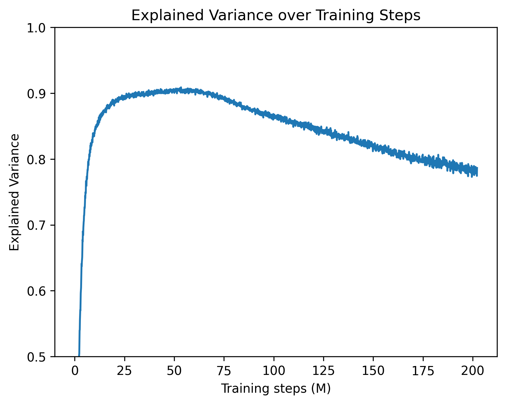
## Line Chart: Explained Variance over Training Steps
### Overview
The image presents a line chart illustrating the relationship between training steps (in millions) and explained variance. The chart shows how the proportion of variance explained by a model changes as it undergoes training.
### Components/Axes
* **Title:** "Explained Variance over Training Steps" - positioned at the top-center of the chart.
* **X-axis:** "Training steps (M)" - ranging from approximately 0 to 200, with tick marks at intervals of 25.
* **Y-axis:** "Explained Variance" - ranging from 0.5 to 1.0, with tick marks at intervals of 0.1.
* **Data Series:** A single blue line representing the explained variance.
### Detailed Analysis
The blue line begins at approximately 0.52 at a training step of 0. It then exhibits a steep upward trend, rapidly increasing to around 0.92 by approximately 25 training steps. From 25 to 100 training steps, the line fluctuates around 0.92, showing a relatively stable explained variance. After 100 training steps, the line begins a gradual downward trend, decreasing to approximately 0.79 by 200 training steps.
Here's a breakdown of approximate data points:
* (0, 0.52)
* (25, 0.92)
* (50, 0.91)
* (75, 0.89)
* (100, 0.87)
* (125, 0.84)
* (150, 0.82)
* (175, 0.80)
* (200, 0.79)
### Key Observations
* **Rapid Initial Increase:** The explained variance increases dramatically during the first 25 million training steps.
* **Plateau:** There's a period of relative stability in explained variance between 25 and 100 million training steps.
* **Gradual Decline:** After 100 million training steps, the explained variance begins to decrease, suggesting potential overfitting or diminishing returns from further training.
* **No Legend:** There is no legend, but the single line is clearly associated with the "Explained Variance" metric.
### Interpretation
The chart suggests that the model learns quickly initially, capturing a significant portion of the variance in the data with relatively few training steps. However, beyond a certain point (around 100 million steps), continued training leads to a decrease in explained variance. This could indicate that the model is starting to overfit the training data, meaning it's learning the noise in the data rather than the underlying patterns.
The initial rapid increase is expected in many machine learning scenarios, as the model quickly identifies the most important features and relationships. The subsequent plateau suggests that the model has reached a point where it's effectively capturing the major sources of variance. The decline after 100 million steps is a critical observation, signaling the need to potentially stop training or employ regularization techniques to prevent overfitting.
The chart provides valuable insight into the training process and can inform decisions about when to stop training, adjust hyperparameters, or explore different model architectures.