\n
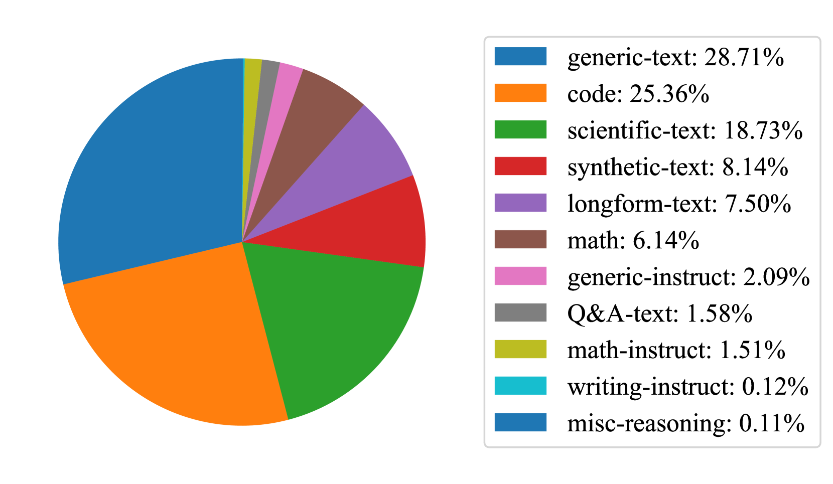
## Pie Chart: Distribution of Text Categories
### Overview
The image displays a pie chart illustrating the percentage distribution of various text categories, likely representing the composition of a dataset or corpus. The chart is accompanied by a legend on the right side that lists each category with its corresponding color and precise percentage value.
### Components/Axes
* **Chart Type:** Pie Chart
* **Legend Position:** Located to the right of the pie chart, enclosed in a light grey bordered box.
* **Legend Content:** The legend contains 11 entries, each with a colored square swatch, a category name, and a percentage value. The categories are listed in descending order of their percentage share.
### Detailed Analysis
The pie chart is divided into 11 segments, each corresponding to a category in the legend. The segments are ordered clockwise from the top, starting with the largest.
**Legend Data (in order as listed):**
1. **generic-text:** 28.71% (Color: Blue)
2. **code:** 25.36% (Color: Orange)
3. **scientific-text:** 18.73% (Color: Green)
4. **synthetic-text:** 8.14% (Color: Red)
5. **longform-text:** 7.50% (Color: Purple)
6. **math:** 6.14% (Color: Brown)
7. **generic-instruct:** 2.09% (Color: Pink)
8. **Q&A-text:** 1.58% (Color: Grey)
9. **math-instruct:** 1.51% (Color: Yellow-Green)
10. **writing-instruct:** 0.12% (Color: Cyan)
11. **misc-reasoning:** 0.11% (Color: Dark Blue)
**Visual Segment Verification (Clockwise from top):**
* The largest segment is **Blue (generic-text, 28.71%)**, occupying the top-left quadrant.
* The next largest is **Orange (code, 25.36%)**, adjacent to the blue segment.
* The third-largest is **Green (scientific-text, 18.73%)**, following the orange.
* The remaining segments decrease in size: **Red (synthetic-text)**, **Purple (longform-text)**, **Brown (math)**, **Pink (generic-instruct)**, **Grey (Q&A-text)**, **Yellow-Green (math-instruct)**.
* The two smallest segments, **Cyan (writing-instruct)** and **Dark Blue (misc-reasoning)**, are very thin slivers at the top of the chart, adjacent to the initial blue segment.
### Key Observations
1. **Dominant Categories:** The top three categories—generic-text, code, and scientific-text—collectively account for **72.8%** of the total, indicating a strong concentration.
2. **Long Tail Distribution:** There is a significant drop-off after the top three. The next five categories (synthetic-text through Q&A-text) range from 8.14% down to 1.58%.
3. **Minimal Representation:** The final three categories (math-instruct, writing-instruct, misc-reasoning) are marginal, each representing less than 2% of the total, with the last two being near-negligible at ~0.1%.
4. **Category Types:** The categories can be broadly grouped:
* **General Text:** generic-text, longform-text.
* **Technical/Specialized:** code, scientific-text, math.
* **Instruction-Based:** generic-instruct, math-instruct, writing-instruct.
* **Other:** synthetic-text, Q&A-text, misc-reasoning.
### Interpretation
This chart likely represents the composition of a training dataset for a language model or a similar text-based AI system. The data suggests a primary focus on **general language understanding (generic-text)** and **technical proficiency (code, scientific-text)**, which form the core of the dataset. The presence of instruction-based categories (instruct) indicates a component designed for tuning the model to follow directions. The very small percentages for specialized instruction types (writing-instruct, math-instruct) and miscellaneous reasoning suggest these are either niche areas or are subsumed within larger categories. The distribution follows a classic "long tail" pattern, where a few categories dominate, and many others have minimal representation. This could imply a design choice to prioritize broad competency in common text types and programming over highly specialized or rarefied tasks.