## Line Charts: Dual-Panel Time Series Analysis
### Overview
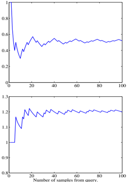
The image displays two vertically stacked line charts sharing a common x-axis. Both charts plot a single blue data series against the same independent variable. The charts appear to show the behavior of two different metrics or variables as a function of the number of samples processed from a query. No chart title, y-axis labels, or legend are present in the image.
### Components/Axes
* **X-Axis (Common to both charts):**
* **Label:** "Number of samples from query"
* **Scale:** Linear, ranging from 0 to 100.
* **Major Tick Marks:** At intervals of 20 (0, 20, 40, 60, 80, 100).
* **Top Chart Y-Axis:**
* **Label:** *Not present.*
* **Scale:** Linear, ranging from 0 to 1.
* **Major Tick Marks:** At intervals of 0.2 (0, 0.2, 0.4, 0.6, 0.8, 1.0).
* **Bottom Chart Y-Axis:**
* **Label:** *Not present.*
* **Scale:** Linear, ranging from 0.8 to 1.3.
* **Major Tick Marks:** At intervals of 0.1 (0.8, 0.9, 1.0, 1.1, 1.2, 1.3).
* **Data Series:** A single blue line in each chart. No legend is provided to identify the specific metric each line represents.
### Detailed Analysis
#### Top Chart
* **Trend Verification:** The line exhibits a sharp initial decline followed by damped oscillations that converge toward a stable value.
* **Data Point Extraction (Approximate):**
* At x ≈ 0, y ≈ 1.0 (starting point).
* At x ≈ 5, y drops sharply to a local minimum of ≈ 0.35.
* The line then rises to a local peak of ≈ 0.6 at x ≈ 20.
* Subsequent oscillations have decreasing amplitude. The line appears to stabilize around y ≈ 0.5 for x > 60.
* Final value at x = 100 is approximately 0.5.
#### Bottom Chart
* **Trend Verification:** The line shows a sharp initial increase followed by smaller fluctuations, converging toward a stable value higher than its starting point.
* **Data Point Extraction (Approximate):**
* At x ≈ 0, y = 1.0 (starting point).
* At x ≈ 5, y spikes to a local maximum of ≈ 1.2.
* It then dips to a local minimum of ≈ 1.1 at x ≈ 10.
* The line rises again, fluctuating between approximately 1.15 and 1.25 for the remainder of the series.
* It appears to stabilize around y ≈ 1.2 for x > 40.
* Final value at x = 100 is approximately 1.2.
### Key Observations
1. **Inverse Initial Behavior:** The two metrics react oppositely to the initial increase in samples. The top metric plummets while the bottom metric surges.
2. **Convergence:** Both series show a pattern of initial volatility followed by stabilization as the number of samples increases (x > 40-60).
3. **Different Scales:** The metrics operate on different numerical scales. The top chart's value is contained within [0,1], while the bottom chart's value stabilizes above its starting point of 1.0.
4. **Missing Context:** The lack of y-axis labels and a chart title makes it impossible to determine the units or the specific phenomena being measured (e.g., accuracy, error rate, confidence score, loss).
### Interpretation
The data suggests a system or process that undergoes a significant adjustment phase with a small number of samples before reaching a steady state. The inverse relationship in the initial phase is notable; it could indicate a trade-off between two competing objectives (e.g., precision vs. recall, speed vs. accuracy) that the system balances as it gathers more information.
The convergence of both lines implies that increasing the "Number of samples from query" beyond approximately 60 yields diminishing returns in terms of changing the measured metrics. The system appears to have learned or adapted sufficiently by that point.
**Without y-axis labels, the practical significance is ambiguous.** For example:
* If the top chart represents an error rate, the system improves (error decreases) and stabilizes at a moderate level (~0.5).
* If the top chart represents a similarity score, the system's confidence in its initial match decreases and stabilizes at a moderate similarity.
* The bottom chart, stabilizing at ~1.2, could represent a normalized performance metric where 1.0 is a baseline, indicating a 20% improvement over the baseline after processing samples.
The charts effectively visualize the *dynamics* and *convergence properties* of the underlying process but require additional metadata (axis labels, title, legend) to be fully interpretable in a technical context.