## Histogram: Response Time vs. Amount for Different Entropy Levels
### Overview
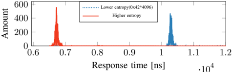
The image is a histogram comparing the distribution of response times for two different entropy levels: "Lower entropy" and "Higher entropy". The x-axis represents response time in nanoseconds (ns), scaled by 10^4, and the y-axis represents the amount or frequency of occurrence.
### Components/Axes
* **X-axis:** Response time [ns] * 10^4, ranging from 0.6 to 1.2 with increments of 0.1.
* **Y-axis:** Amount, ranging from 0 to 600 with increments of 200.
* **Legend (Top-Right):**
* Blue dotted line: Lower entropy (0x42*4096)
* Red solid line: Higher entropy
### Detailed Analysis
* **Higher Entropy (Red):** The distribution is concentrated around 0.67 ns. The peak is approximately at an amount of 550.
* **Lower Entropy (Blue):** The distribution is concentrated around 1.04 ns. The peak is approximately at an amount of 450.
### Key Observations
* The response times for higher entropy are significantly lower than those for lower entropy.
* The distribution for higher entropy appears to be slightly more concentrated than the distribution for lower entropy.
### Interpretation
The histogram suggests that higher entropy levels are associated with faster response times. The two distinct peaks indicate that the entropy level has a clear impact on the response time distribution. The difference in response times could be due to the computational complexity or data processing requirements associated with different entropy levels. The data suggests that systems with lower entropy may experience longer processing times, potentially due to factors such as increased data redundancy or less efficient algorithms.