## Line Chart: Accuracy vs. Thinking Compute
### Overview
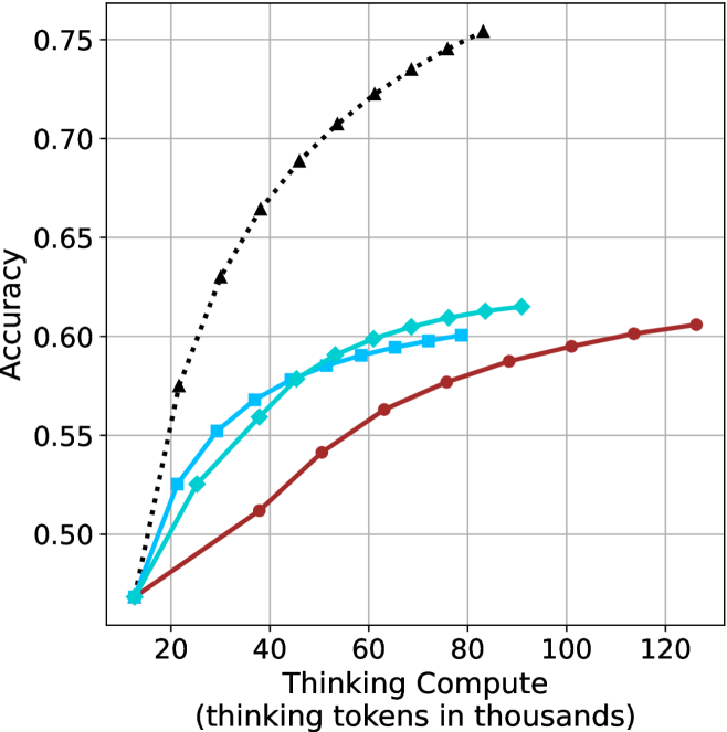
This image is a line chart illustrating the relationship between "Thinking Compute" (measured in thousands of thinking tokens) and "Accuracy." The chart displays four distinct data series, each represented by a different color and marker style. All four series originate from a common starting point at approximately (15, 0.47). Notably, the chart lacks a legend, making it impossible to identify the specific models or methods associated with each line without external context.
### Components/Axes
* **Y-Axis:** Labeled "Accuracy." The scale ranges from 0.50 to 0.75, with major grid lines at 0.05 intervals (0.50, 0.55, 0.60, 0.65, 0.70, 0.75).
* **X-Axis:** Labeled "Thinking Compute (thinking tokens in thousands)." The scale ranges from 20 to 120, with major grid lines at 20-unit intervals (20, 40, 60, 80, 100, 120).
* **Data Series (Legend Missing):**
* **Black Dotted Line:** Marked with triangles.
* **Cyan Solid Line:** Marked with diamonds.
* **Blue Solid Line:** Marked with squares.
* **Dark Red Solid Line:** Marked with circles.
### Detailed Analysis
All four data series begin at approximately (15, 0.47). As "Thinking Compute" increases, all series exhibit a positive correlation with "Accuracy," though the rate of improvement (slope) varies significantly between them.
* **Black Dotted Line (Triangles):**
* **Trend:** This series shows the steepest upward trajectory and the highest accuracy ceiling.
* **Data Points (Approximate):** Starts at (15, 0.47), rises to (20, 0.57), (30, 0.63), (40, 0.66), (50, 0.69), (60, 0.71), (70, 0.725), (80, 0.745), and ends at (85, 0.755).
* **Cyan Solid Line (Diamonds):**
* **Trend:** This series shows moderate growth, outperforming the Blue and Red lines.
* **Data Points (Approximate):** Starts at (15, 0.47), rises to (25, 0.525), (35, 0.56), (45, 0.58), (55, 0.59), (65, 0.60), (75, 0.61), (85, 0.615), and ends at (90, 0.615).
* **Blue Solid Line (Squares):**
* **Trend:** This series shows moderate growth, slightly trailing the Cyan line.
* **Data Points (Approximate):** Starts at (15, 0.47), rises to (20, 0.525), (30, 0.55), (40, 0.57), (50, 0.585), (60, 0.59), (70, 0.595), and ends at (80, 0.60).
* **Dark Red Solid Line (Circles):**
* **Trend:** This series has the shallowest slope, indicating the lowest efficiency (accuracy gain per token), but it is the only series that continues to scale out to 125k tokens.
* **Data Points (Approximate):** Starts at (15, 0.47), rises to (40, 0.51), (50, 0.54), (60, 0.56), (70, 0.575), (80, 0.585), (90, 0.59), (100, 0.595), (115, 0.60), and ends at (125, 0.605).
### Key Observations
* **Diminishing Returns:** All four lines exhibit a concave shape, meaning the marginal gain in accuracy decreases as more thinking tokens are allocated.
* **Performance Hierarchy:** The Black Dotted line is significantly more performant than the other three, achieving higher accuracy with fewer tokens.
* **Compute Range:** The Dark Red line is the only series that continues to scale beyond 90k tokens, suggesting it may represent a model architecture designed for longer-context or more extensive reasoning, albeit with lower efficiency.
### Interpretation
This chart demonstrates the "scaling laws" of reasoning models. It highlights that increasing "thinking compute" (tokens) generally improves accuracy, but the efficiency of this improvement varies drastically by model/method.
The **Black Dotted line** represents a highly efficient model, likely a more advanced or optimized architecture, as it reaches a 0.75 accuracy level with significantly less compute than the others. The **Dark Red line** represents a model that is less efficient at lower token counts but continues to improve slowly as compute increases, suggesting it may have a different "reasoning ceiling" or training objective. The absence of a legend is a critical omission, as it prevents the viewer from identifying which specific AI models (e.g., o1-preview, o1-mini, or other variants) are being compared.