## Chart: IsoLoss Contours and IsoFLOPs Slices
### Overview
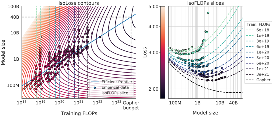
The image presents two related charts. The left chart, titled "IsoLoss contours," plots model size against training FLOPS, displaying contours of constant loss and empirical data points. The right chart, titled "IsoFLOPs slices," plots loss against model size, showing slices of constant training FLOPS. Both charts aim to visualize the relationship between model size, training FLOPS, and loss.
### Components/Axes
**Left Chart: IsoLoss contours**
* **Title:** IsoLoss contours
* **X-axis:** Training FLOPS (log scale), with markers at 10^18, 10^19, 10^20, 10^21, 10^22, and 10^23, labeled "Gopher budget".
* **Y-axis:** Model size (log scale), with markers at 100M, 1B, 10B, 40B, and 100B.
* **Contours:** IsoLoss contours are represented by curved lines. The color gradient suggests that contours closer to the bottom-left represent lower loss values.
* **Data Points:** Empirical data is plotted as dots. The color of the dots varies, likely representing a third dimension (possibly loss or training FLOPS).
* **Efficient Frontier:** A blue line represents the efficient frontier.
* **IsoFLOPs slice:** Vertical dashed lines represent IsoFLOPs slices.
**Right Chart: IsoFLOPs slices**
* **Title:** IsoFLOPs slices
* **X-axis:** Model size (log scale), with markers at 100M, 1B, 10B, and 40B.
* **Y-axis:** Loss (linear scale), with markers at 2.00, 3.00, 4.00, and 5.00.
* **Data Points:** Empirical data is plotted as dots. The color of the dots varies from red to green, likely representing a third dimension (possibly loss or training FLOPS).
* **IsoFLOPs slices:** Dashed lines represent IsoFLOPs slices.
* **Legend (Top Right):**
* 6e+18 (light green dashed line)
* 1e+19 (green dashed line)
* 3e+19 (green dashed line)
* 6e+19 (blue-green dashed line)
* 1e+20 (blue dashed line)
* 3e+20 (blue dashed line)
* 6e+20 (dark blue dashed line)
* 1e+21 (dark blue dashed line)
* 3e+21 (black dashed line)
* Gopher (black dashed line)
**Legend (Bottom Left of Left Chart):**
* Efficient frontier (blue line)
* Empirical data (blue dot)
* IsoFLOPs slice (light green dashed line)
### Detailed Analysis
**Left Chart: IsoLoss contours**
* The empirical data points are clustered in the lower-right region of the chart, indicating a trend towards larger models and higher training FLOPS.
* The efficient frontier (blue line) appears to represent the optimal trade-off between model size and training FLOPS for a given loss.
* The IsoLoss contours show that as you move towards the top-right of the chart (larger models and more training FLOPS), the loss decreases.
* The vertical dashed lines (IsoFLOPs slices) are spaced unevenly, with closer spacing on the left side of the chart.
**Right Chart: IsoFLOPs slices**
* The IsoFLOPs slices generally show a U-shaped curve, indicating that there is an optimal model size for a given training FLOPS that minimizes loss.
* The minimum loss for each IsoFLOPs slice shifts to the right (larger model sizes) as the training FLOPS increases.
* The data points are clustered around the minimum loss points of the IsoFLOPs slices.
* The color of the data points varies from red (lower left) to green (upper right), suggesting that higher training FLOPS are associated with lower loss.
### Key Observations
* There is a clear trade-off between model size, training FLOPS, and loss.
* Larger models and more training FLOPS generally lead to lower loss, but there are diminishing returns.
* The efficient frontier represents the optimal trade-off between model size and training FLOPS.
* The IsoFLOPs slices show that there is an optimal model size for a given training FLOPS.
### Interpretation
The charts illustrate the relationship between model size, training FLOPS, and loss in machine learning models. The IsoLoss contours show the overall trend that larger models and more training FLOPS lead to lower loss. However, the IsoFLOPs slices reveal that for a fixed amount of training FLOPS, there is an optimal model size that minimizes loss. This suggests that simply increasing model size or training FLOPS indefinitely is not the most efficient way to improve model performance. The efficient frontier represents the best possible trade-off between model size and training FLOPS for a given loss, and it can be used to guide the selection of model architectures and training strategies. The empirical data points provide real-world examples of model performance and can be used to validate the theoretical relationships shown in the charts. The "Gopher budget" line on the left chart likely represents a constraint on the available training FLOPS, and it can be used to determine the optimal model size for a given budget.