## Scatter Plot: Accuracy vs. Time-to-Answer
### Overview
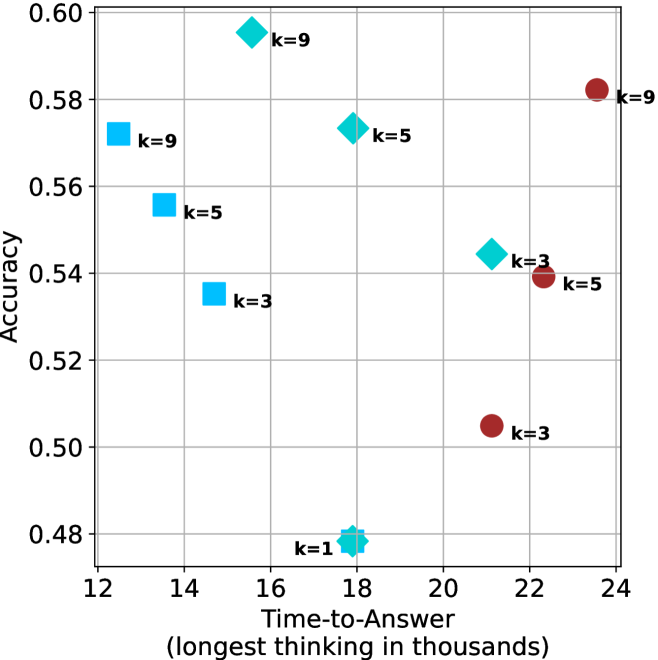
This image is a scatter plot visualizing the relationship between "Time-to-Answer" (measured in thousands of units) and "Accuracy" (a decimal value). The data points are categorized by three distinct shapes and two colors (Cyan and Maroon), with each point labeled with a "k" value (k=1, k=3, k=5, k=9). The plot suggests a performance comparison across different configurations or models.
### Components/Axes
* **X-Axis:** "Time-to-Answer (longest thinking in thousands)". The scale ranges from 12 to 24, with major grid lines at intervals of 2.
* **Y-Axis:** "Accuracy". The scale ranges from 0.48 to 0.60, with major grid lines at intervals of 0.02.
* **Data Series/Markers:**
* **Cyan Squares:** Located on the left side of the chart (Time-to-Answer 12–15).
* **Cyan Diamonds:** Located in the center-left of the chart (Time-to-Answer 15–22).
* **Maroon Circles:** Located on the right side of the chart (Time-to-Answer 21–24).
* **Labels:** Each data point is explicitly labeled with its corresponding "k" value (e.g., "k=9", "k=5", "k=3", "k=1").
### Detailed Analysis
#### 1. Cyan Squares (Left Cluster)
* **Trend:** As the "k" value increases, the accuracy increases, and the time-to-answer decreases (the points move up and to the left).
* **Data Points:**
* **k=9:** Positioned at approximately (12.5, 0.572).
* **k=5:** Positioned at approximately (13.5, 0.555).
* **k=3:** Positioned at approximately (14.5, 0.535).
#### 2. Cyan Diamonds (Center Cluster)
* **Trend:** Excluding the k=1 outlier, as "k" increases, accuracy increases and time-to-answer decreases.
* **Data Points:**
* **k=9:** Positioned at approximately (15.5, 0.595). This is the highest accuracy point on the chart.
* **k=5:** Positioned at approximately (18.0, 0.573).
* **k=3:** Positioned at approximately (21.2, 0.545).
* **k=1:** Positioned at approximately (18.0, 0.480). This is the lowest accuracy point on the chart.
#### 3. Maroon Circles (Right Cluster)
* **Trend:** As "k" increases, both accuracy and time-to-answer increase (the points move up and to the right).
* **Data Points:**
* **k=9:** Positioned at approximately (23.5, 0.582).
* **k=5:** Positioned at approximately (22.3, 0.539).
* **k=3:** Positioned at approximately (21.2, 0.505).
### Key Observations
* **Performance vs. Efficiency:** The Cyan Squares represent the most efficient models, achieving relatively high accuracy (up to ~0.57) with the lowest time-to-answer (12k–15k).
* **The "k" Factor:** Across all three groups, increasing the "k" value consistently results in higher accuracy.
* **Outlier:** The "k=1" diamond is a significant outlier, showing the lowest accuracy (0.48) despite having a moderate time-to-answer (18k).
* **Group Separation:** The three shapes clearly delineate three distinct operational modes or model architectures, as they occupy non-overlapping regions on the X-axis (Time-to-Answer).
### Interpretation
This chart likely represents a hyperparameter tuning experiment or a comparison of different inference strategies (e.g., different decoding methods or model sizes) where "k" represents a parameter like beam width, k-shots, or a similar search constraint.
The data demonstrates a clear trade-off:
1. **Cyan Squares** appear to be the most optimized strategy, providing high accuracy with low latency.
2. **Maroon Circles** represent a "heavy" strategy; while they achieve high accuracy at k=9, they require significantly more time (23.5k) compared to the Cyan Squares (12.5k) to achieve similar results.
3. The **Cyan Diamonds** show a mixed performance profile, with the k=9 variant achieving the absolute highest accuracy on the chart (0.595), suggesting that if maximum accuracy is the sole priority, this specific configuration is the optimal choice, despite the higher time cost compared to the squares.