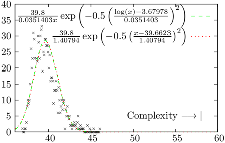
## Chart: Complexity Distribution
### Overview
The image is a scatter plot overlaid with two curves, representing a distribution of data points related to "Complexity". The x-axis represents complexity, ranging from approximately 35 to 60. The y-axis represents frequency or count, ranging from 0 to 35. The scatter plot shows the distribution of data points, while the curves represent two different mathematical models fitted to the data.
### Components/Axes
* **X-axis:** Labeled "Complexity" with an arrow pointing to the right, indicating increasing complexity. The axis ranges from approximately 35 to 60, with tick marks at intervals of 5.
* **Y-axis:** Ranges from 0 to 35, with tick marks at intervals of 5.
* **Scatter Plot:** A collection of 'x' marks representing individual data points.
* **Curve 1 (Green, Dashed):** Represented by the equation: `(39.8 / 0.0351403) * exp(-0.5 * ((log(x) - 3.67978) / 0.0351403)^2)`
* **Curve 2 (Red, Dotted):** Represented by the equation: `(39.8 / 1.40794) * exp(-0.5 * ((x - 39.6623) / 1.40794)^2)`
### Detailed Analysis
* **Scatter Plot Distribution:** The data points are concentrated between x = 37 and x = 45, with a peak around x = 39. Beyond x = 45, the data points become sparse.
* **Green Dashed Curve:** This curve starts near 0 at x=35, rises sharply to a peak around x=39, and then decreases rapidly, approaching 0 around x=45.
* The equation for the green curve is: `(39.8 / 0.0351403) * exp(-0.5 * ((log(x) - 3.67978) / 0.0351403)^2)`
* **Red Dotted Curve:** This curve also starts near 0 at x=35, rises sharply to a peak around x=39, and then decreases rapidly, approaching 0 around x=45. It closely follows the green curve.
* The equation for the red curve is: `(39.8 / 1.40794) * exp(-0.5 * ((x - 39.6623) / 1.40794)^2)`
### Key Observations
* The data points are clustered around a complexity value of approximately 39.
* Both curves provide a model for the distribution of the data, with peaks around x = 39.
* The green dashed curve and the red dotted curve are very similar in shape and position.
### Interpretation
The chart illustrates the distribution of complexity values, with a clear concentration around a specific value (approximately 39). The two curves represent different attempts to model this distribution mathematically. The similarity between the curves suggests that both models capture the underlying trend in the data. The scatter plot provides the raw data, while the curves offer a smoothed representation of the distribution. The equations provided for the curves indicate that they are Gaussian-like functions, suggesting that the complexity values are normally distributed around a mean. The data suggests that systems or processes being measured tend to have a complexity value close to 39, with fewer instances of very low or very high complexity.