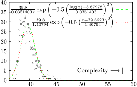
## Chart: Probability Distribution vs. Complexity
### Overview
The image presents a chart depicting two probability distributions plotted against a variable labeled "Complexity". The distributions are represented by scattered data points connected by dashed lines. The chart includes mathematical formulas defining each distribution.
### Components/Axes
* **X-axis:** Labeled "Complexity" with an arrow indicating increasing values from approximately 35 to 60. The scale is linear.
* **Y-axis:** Ranges from 0 to 40, representing the probability or value of the distribution. The scale is linear.
* **Data Series 1 (Green Dashed Line):** Represented by 'x' markers.
* **Data Series 2 (Red Dotted Line):** Represented by '+' markers.
* **Formulas:** Two mathematical formulas are displayed, one above each corresponding data series.
### Detailed Analysis
**Data Series 1 (Green Dashed Line):**
The green dashed line shows a unimodal distribution, peaking around a complexity value of approximately 39.5. The line slopes upward from a value of approximately 0 at a complexity of 37, reaching a maximum value of around 35 at a complexity of 39.5. It then slopes downward, crossing the x-axis (y=0) around a complexity of 42.5, and approaching 0 as complexity increases beyond 45.
Approximate data points:
* Complexity = 37, Value = 0
* Complexity = 38, Value = 5
* Complexity = 39, Value = 15
* Complexity = 39.5, Value = 35 (peak)
* Complexity = 40, Value = 25
* Complexity = 41, Value = 10
* Complexity = 42.5, Value = 0
* Complexity = 45, Value = 0
The formula for this distribution is: `39.8 / (0.0351403*π) * exp(-0.5 * ((log(x)-3.67978) / 0.0351403)^2)`
**Data Series 2 (Red Dotted Line):**
The red dotted line also exhibits a unimodal distribution, but with a peak at a complexity value of approximately 41.5. It starts at approximately 0 at a complexity of 38, rises to a maximum value of around 30 at a complexity of 41.5, and then declines, crossing the x-axis around a complexity of 44.5, and approaching 0 as complexity increases beyond 46.
Approximate data points:
* Complexity = 38, Value = 0
* Complexity = 39, Value = 8
* Complexity = 40, Value = 18
* Complexity = 41.5, Value = 30 (peak)
* Complexity = 42, Value = 20
* Complexity = 43, Value = 8
* Complexity = 44.5, Value = 0
* Complexity = 46, Value = 0
The formula for this distribution is: `39.8 / 1.40794 * exp(-0.5 * ((x-39.6623) / 1.40794)^2)`
### Key Observations
* Both distributions are bell-shaped, suggesting a normal or Gaussian-like distribution.
* The green distribution peaks at a lower complexity value (approximately 39.5) compared to the red distribution (approximately 41.5).
* The red distribution has a slightly higher peak value (approximately 30) than the green distribution (approximately 35).
* The distributions overlap significantly between complexity values of 38 and 44.
### Interpretation
The chart likely represents the probability distribution of two different phenomena as a function of their complexity. The formulas suggest these distributions might be related to statistical models, potentially representing the likelihood of observing certain outcomes based on the complexity of the underlying system. The shift in peak complexity between the two distributions indicates that the two phenomena are characterized by different typical complexity levels. The overlap suggests that there is a range of complexity values where both phenomena are equally likely. The formulas themselves are key to understanding the underlying mechanisms driving these distributions, and would require further analysis to fully interpret. The chart demonstrates a relationship between complexity and probability, suggesting that the likelihood of observing a particular outcome is influenced by the complexity of the system.