\n
## Time Series Charts: Residual Analysis
### Overview
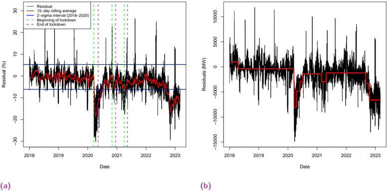
The image presents two time series charts (labeled (a) and (b)) displaying residual analysis over time, from approximately 2018 to 2023. Chart (a) shows residuals in percentage terms, while chart (b) shows residuals in Megawatts (MW). Both charts include a 15-day rolling average (red line) and reference lines indicating the beginning and end of lockdown periods. Chart (a) also includes 2-sigma interval lines.
### Components/Axes
**Chart (a):**
* **X-axis:** Date (from approximately 2018 to 2023)
* **Y-axis:** Residual (%) (ranging from approximately -30% to 30%)
* **Legend:**
* Residual (black lines)
* 15-day rolling average (red line)
* 2-sigma interval (2018-2020) (blue lines)
* Beginning of lockdown (purple dashed vertical line)
* End of lockdown (green dashed vertical line)
**Chart (b):**
* **X-axis:** Date (from approximately 2018 to 2023)
* **Y-axis:** Residuals (MW) (ranging from approximately -150,000 MW to 100,000 MW)
* **Legend:**
* Residuals (black lines)
* 15-day rolling average (red line)
* Beginning of lockdown (purple dashed vertical line)
* End of lockdown (green dashed vertical line)
### Detailed Analysis or Content Details
**Chart (a): Residual (%)**
The black lines representing the residuals fluctuate significantly around zero. The 15-day rolling average (red line) provides a smoothed representation of these fluctuations. The blue lines represent the 2-sigma interval (2018-2020), indicating a range within which most residuals fall. Vertical dashed lines mark the beginning and end of lockdown periods.
* **2018-2019:** Residuals fluctuate within the 2-sigma interval. The rolling average remains relatively stable around 0%.
* **Early 2020 (Lockdown Start):** A noticeable shift in the residual pattern occurs around the beginning of lockdown (purple line). The residuals tend to become more positive.
* **2020-2021:** The residuals exhibit increased volatility. The rolling average shows a slight upward trend.
* **2021-2022:** A significant negative shift in residuals is observed, with values dropping well below the 2-sigma interval. The rolling average declines sharply.
* **2022-2023:** Residuals remain largely negative, with some fluctuations. The rolling average stabilizes at a negative value.
**Chart (b): Residuals (MW)**
The black lines representing the residuals in MW also fluctuate considerably. The 15-day rolling average (red line) smooths these fluctuations. Vertical dashed lines mark the beginning and end of lockdown periods.
* **2018-2019:** Residuals fluctuate around zero. The rolling average remains relatively stable.
* **Early 2020 (Lockdown Start):** A slight increase in residuals is observed around the beginning of lockdown (purple line).
* **2020-2021:** The residuals show increased volatility. The rolling average exhibits a slight upward trend.
* **2021-2022:** A substantial negative shift in residuals is observed, with values dropping significantly below zero. The rolling average declines sharply.
* **2022-2023:** Residuals remain largely negative, with some fluctuations. The rolling average stabilizes at a negative value.
### Key Observations
* Both charts show a clear impact of lockdown periods on residuals.
* The negative shift in residuals observed in 2021-2022 is particularly pronounced in both charts.
* The 2-sigma interval in chart (a) provides a useful reference for identifying outliers.
* The rolling average effectively smooths out short-term fluctuations, revealing underlying trends.
### Interpretation
The charts suggest that lockdown periods and subsequent events significantly impacted the system being modeled. The initial lockdowns (early 2020) appear to have caused a slight increase in residuals, potentially due to changes in demand patterns. However, the substantial negative shift in residuals observed in 2021-2022 indicates a more significant disruption, possibly related to broader economic or systemic changes. The fact that the rolling average remains negative in 2022-2023 suggests that this disruption has had a lasting effect.
The difference in scale between the two charts (percentage vs. MW) highlights the importance of considering both relative and absolute changes when analyzing residuals. Chart (a) provides a sense of the magnitude of the residuals relative to the overall system, while chart (b) provides a sense of the absolute impact in terms of MW.
The use of the 2-sigma interval in chart (a) allows for the identification of outliers, which may warrant further investigation. The consistent alignment of the lockdown markers with shifts in the residual patterns suggests a causal relationship, although further analysis would be needed to confirm this.