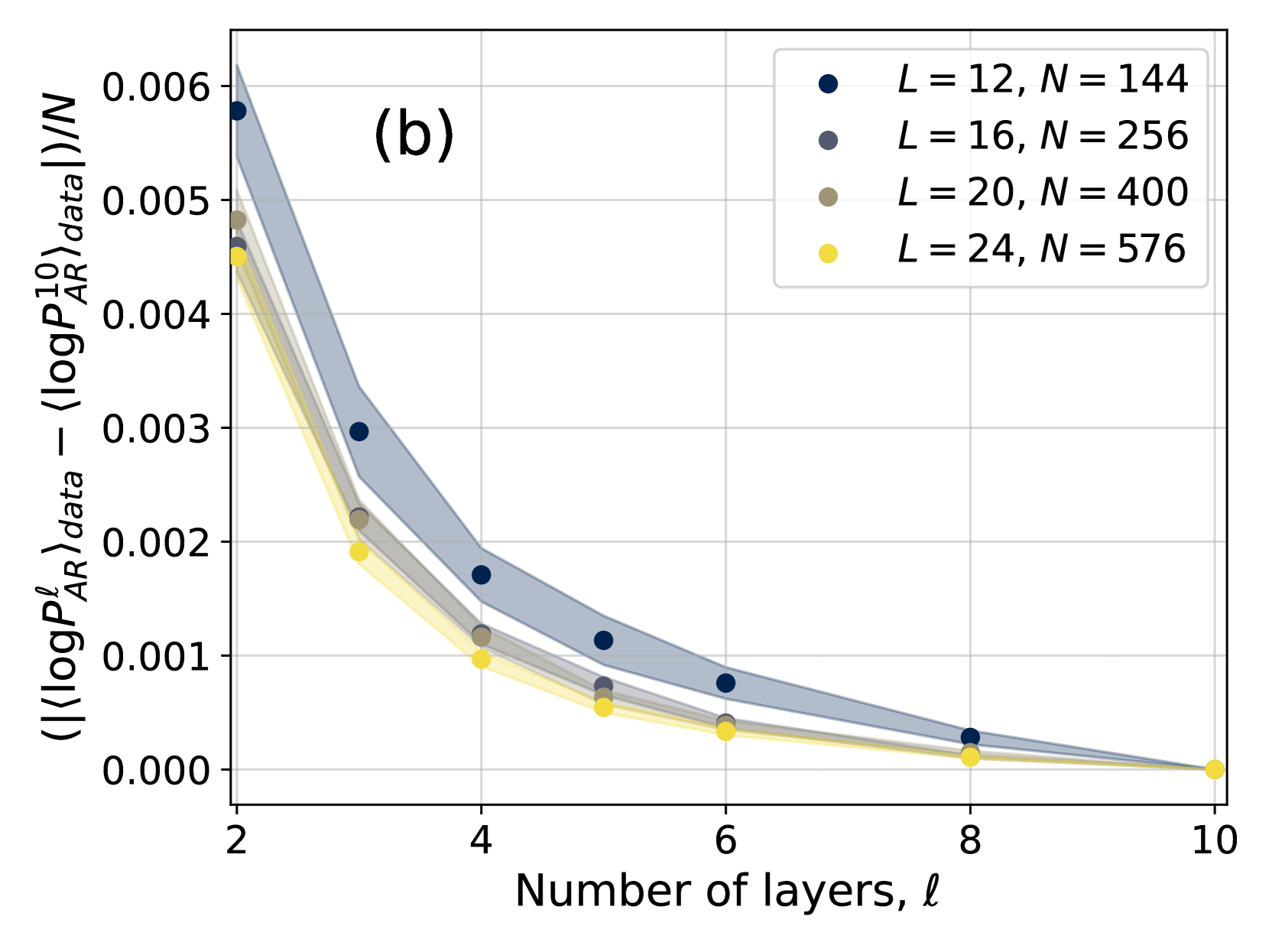
## Chart: Difference in Log Probabilities
### Overview
The image presents a chart illustrating the difference in log probabilities as a function of the number of layers. The chart displays four data series, each representing a different set of parameters (L and N values). Shaded regions represent confidence intervals around each data series.
### Components/Axes
* **X-axis:** Number of layers, denoted as 'ℓ' (ell). Scale ranges from approximately 2 to 10.
* **Y-axis:** ⟨⟨logP<sup>ℓ</sup><sub>AR</sub>⟩<sub>data</sub> - ⟨logP<sub>AR</sub>⟩<sub>data</sub>⟩/N. Scale ranges from approximately 0.000 to 0.006.
* **Legend:** Located in the top-right corner. Contains the following data series labels:
* L = 12, N = 144 (Dark Blue)
* L = 16, N = 256 (Dark Grey)
* L = 20, N = 400 (Light Grey)
* L = 24, N = 576 (Yellow)
* **Title:** "(b)" located in the top-left corner.
### Detailed Analysis
The chart shows a decreasing trend for all data series as the number of layers increases. Each series is represented by a set of data points connected by a line, with a shaded area indicating the uncertainty or confidence interval.
* **L = 12, N = 144 (Dark Blue):** The line slopes downward, starting at approximately 0.0055 at ℓ = 2 and decreasing to approximately 0.0002 at ℓ = 9. Data points are located at approximately: (2, 0.0055), (4, 0.003), (6, 0.001), (8, 0.0005), (9, 0.0002).
* **L = 16, N = 256 (Dark Grey):** The line also slopes downward, starting at approximately 0.005 at ℓ = 2 and decreasing to approximately 0.0001 at ℓ = 9. Data points are located at approximately: (2, 0.005), (4, 0.0025), (6, 0.0008), (8, 0.0003), (9, 0.0001).
* **L = 20, N = 400 (Light Grey):** This line exhibits a similar downward trend, beginning at approximately 0.0045 at ℓ = 2 and reaching approximately 0.00005 at ℓ = 9. Data points are located at approximately: (2, 0.0045), (4, 0.002), (6, 0.0006), (8, 0.0002), (9, 0.00005).
* **L = 24, N = 576 (Yellow):** The line shows a downward trend, starting at approximately 0.004 at ℓ = 2 and decreasing to approximately 0.00002 at ℓ = 9. Data points are located at approximately: (2, 0.004), (4, 0.0018), (6, 0.0005), (8, 0.00015), (9, 0.00002).
The shaded regions around each line are wider at lower values of ℓ and become narrower as ℓ increases, indicating decreasing uncertainty with more layers.
### Key Observations
* All data series demonstrate a consistent downward trend.
* The differences between the series are more pronounced at lower values of ℓ.
* The confidence intervals narrow as the number of layers increases, suggesting greater certainty in the results with more layers.
* The series with L=12, N=144 consistently shows the highest values, while the series with L=24, N=576 consistently shows the lowest values.
### Interpretation
The chart suggests that as the number of layers increases, the difference in log probabilities decreases. This could indicate that the model is converging or becoming more stable with more layers. The varying values for different L and N combinations suggest that the optimal number of layers may depend on the specific parameters used. The narrowing confidence intervals with increasing layers imply that the model's behavior becomes more predictable as the number of layers grows. The consistent ordering of the series (L=12 being highest, L=24 being lowest) suggests a relationship between the L and N parameters and the magnitude of the log probability difference. The "(b)" label suggests this is part of a larger figure with other related data. The y-axis represents a normalized difference, implying that the raw log probability values are being compared relative to the number of data points (N).