## Line Chart with Shaded Regions: Autoregressive Probability Deviation vs. Number of Layers
### Overview
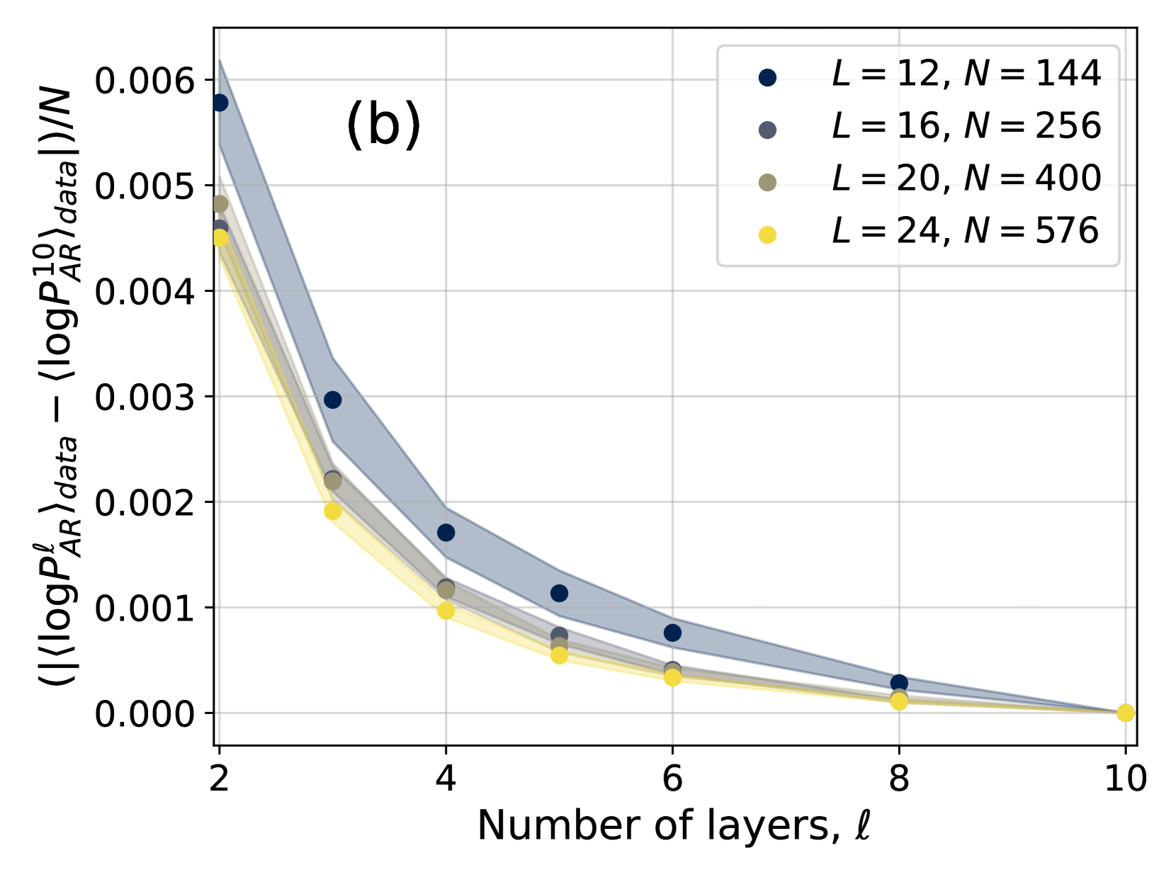
The image is a scientific line chart, labeled "(b)" in the top-left corner, plotting a normalized difference in log-probability against the number of layers (`ℓ`). It compares four different system configurations, each represented by a distinct color and shaded region. The chart demonstrates a clear decreasing trend for all series as the number of layers increases.
### Components/Axes
* **Chart Label:** "(b)" - positioned in the upper-left quadrant of the plot area.
* **X-Axis:**
* **Title:** "Number of layers, ℓ"
* **Scale:** Linear, with major tick marks and labels at 2, 4, 6, 8, and 10.
* **Y-Axis:**
* **Title:** `( (⟨logP_AR^ℓ⟩_data - ⟨logP_AR^10⟩_data) ) / N`
* **Scale:** Linear, ranging from 0.000 to 0.006, with major tick marks at intervals of 0.001.
* **Legend:** Positioned in the top-right corner of the plot area. It contains four entries, each with a colored circle marker and a label:
1. **Dark Blue Circle:** `L = 12, N = 144`
2. **Gray Circle:** `L = 16, N = 256`
3. **Olive/Brown Circle:** `L = 20, N = 400`
4. **Yellow Circle:** `L = 24, N = 576`
* **Data Series:** Each series consists of a line connecting circular data points at integer `ℓ` values (2, 3, 4, 5, 6, 8, 10) and a semi-transparent shaded region of the same color surrounding the line, likely representing a confidence interval or standard deviation.
### Detailed Analysis
**Trend Verification:** All four data series exhibit a consistent, monotonic downward trend. The lines slope steeply downward from `ℓ=2` to `ℓ=4` and then continue to decrease at a diminishing rate, approaching zero as `ℓ` approaches 10.
**Data Point Extraction (Approximate Y-values):**
* **`L=12, N=144` (Dark Blue):**
* `ℓ=2`: ~0.0058
* `ℓ=3`: ~0.0030
* `ℓ=4`: ~0.0017
* `ℓ=5`: ~0.0011
* `ℓ=6`: ~0.0008
* `ℓ=8`: ~0.0003
* `ℓ=10`: ~0.0000
* **`L=16, N=256` (Gray):**
* `ℓ=2`: ~0.0050
* `ℓ=3`: ~0.0022
* `ℓ=4`: ~0.0012
* `ℓ=5`: ~0.0007
* `ℓ=6`: ~0.0004
* `ℓ=8`: ~0.0001
* `ℓ=10`: ~0.0000
* **`L=20, N=400` (Olive):**
* `ℓ=2`: ~0.0048
* `ℓ=3`: ~0.0022
* `ℓ=4`: ~0.0012
* `ℓ=5`: ~0.0006
* `ℓ=6`: ~0.0004
* `ℓ=8`: ~0.0001
* `ℓ=10`: ~0.0000
* **`L=24, N=576` (Yellow):**
* `ℓ=2`: ~0.0045
* `ℓ=3`: ~0.0019
* `ℓ=4`: ~0.0010
* `ℓ=5`: ~0.0005
* `ℓ=6`: ~0.0003
* `ℓ=8`: ~0.0001
* `ℓ=10`: ~0.0000
**Shaded Regions:** The width of the shaded regions (uncertainty/variance) is largest at low `ℓ` values and narrows significantly as `ℓ` increases. The dark blue series (`L=12`) has the widest shaded region, while the yellow series (`L=24`) has the narrowest.
### Key Observations
1. **Universal Decay:** The quantity on the y-axis decays towards zero for all configurations as the number of layers (`ℓ`) increases towards 10.
2. **Initial Hierarchy:** At `ℓ=2`, the series are ordered from highest to lowest y-value as: Dark Blue (`L=12`) > Gray (`L=16`) ≈ Olive (`L=20`) > Yellow (`L=24`). This suggests that smaller systems (lower `L` and `N`) exhibit a larger initial deviation.
3. **Convergence:** By `ℓ=10`, all series converge to approximately the same value (zero). The differences between the series become negligible after `ℓ=6`.
4. **Uncertainty Correlation:** The magnitude of the y-value and the width of the shaded uncertainty region are positively correlated. The series with the highest values also shows the greatest variance.
### Interpretation
This chart likely illustrates the convergence behavior of an autoregressive model's probability estimates as a function of its depth (number of layers `ℓ`). The y-axis represents a normalized difference between the average log-probability at layer `ℓ` and at a reference layer (10), scaled by system size `N`.
The data suggests that:
* **Layer-wise Refinement:** The model's internal probability estimates undergo significant adjustment in the early layers (steep drop from `ℓ=2` to `4`), with diminishing changes in deeper layers. This implies the core "computation" or "refinement" of the probability distribution happens early in the network.
* **System Size Effect:** Larger systems (higher `L` and `N`, e.g., yellow line) start with a smaller deviation from the final (layer 10) probability estimate. This could indicate that larger models are more stable or require less adjustment across layers.
* **Convergence to a Stable State:** The convergence of all lines to zero at `ℓ=10` confirms that layer 10 is being used as the reference point. The narrowing shaded regions indicate that the model's behavior becomes more deterministic and consistent across different samples or runs in the deeper layers.
* **Peircean Reading:** The chart demonstrates a **law of diminishing returns** in the context of neural network depth. Adding more layers beyond a certain point (here, around `ℓ=6`) yields minimal change in this specific probability metric. The initial conditions (system size `L, N`) affect the starting point of this decay curve but not its ultimate convergence point, highlighting a fundamental property of the model's architecture or training.