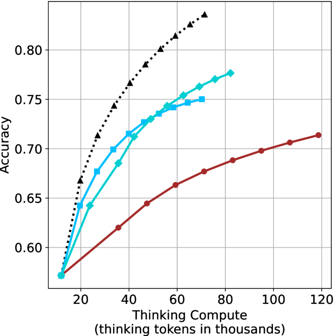
## Line Chart: Accuracy vs. Thinking Compute
### Overview
The image is a line chart comparing the accuracy of different models as a function of "Thinking Compute," measured in thousands of tokens. There are three distinct data series represented by different colored lines with different markers. The chart shows how accuracy increases with more compute for each model.
### Components/Axes
* **X-axis:** "Thinking Compute (thinking tokens in thousands)". The scale ranges from approximately 10 to 120 in increments of 20.
* **Y-axis:** "Accuracy". The scale ranges from 0.60 to 0.80 in increments of 0.05.
* **Data Series:**
* **Black dotted line with triangle markers:** This line shows the highest accuracy for a given compute level.
* **Blue line with square markers:** This line shows intermediate accuracy.
* **Teal line with diamond markers:** This line shows intermediate accuracy.
* **Brown line with circle markers:** This line shows the lowest accuracy for a given compute level.
* **Gridlines:** Present on both axes to aid in reading values.
### Detailed Analysis
* **Black dotted line (triangle markers):** This line starts at approximately (15, 0.58) and rises sharply, reaching approximately (70, 0.83).
* (15, 0.58)
* (20, 0.65)
* (30, 0.72)
* (40, 0.76)
* (50, 0.79)
* (60, 0.81)
* (70, 0.83)
* **Blue line (square markers):** This line starts at approximately (15, 0.58) and rises, reaching approximately (75, 0.75).
* (15, 0.58)
* (25, 0.68)
* (35, 0.72)
* (50, 0.745)
* (75, 0.75)
* **Teal line (diamond markers):** This line starts at approximately (15, 0.58) and rises, reaching approximately (75, 0.77).
* (15, 0.58)
* (30, 0.70)
* (40, 0.725)
* (50, 0.74)
* (75, 0.77)
* **Brown line (circle markers):** This line starts at approximately (15, 0.58) and rises more slowly, reaching approximately (120, 0.715).
* (15, 0.58)
* (30, 0.62)
* (40, 0.64)
* (60, 0.665)
* (80, 0.685)
* (100, 0.70)
* (120, 0.715)
### Key Observations
* The black dotted line (triangle markers) shows the highest accuracy across all compute levels.
* The brown line (circle markers) shows the lowest accuracy across all compute levels.
* The blue line (square markers) and teal line (diamond markers) perform similarly, with the teal line showing slightly higher accuracy.
* All lines show an increase in accuracy as "Thinking Compute" increases.
* The rate of increase in accuracy appears to diminish as "Thinking Compute" increases, especially for the black dotted line.
### Interpretation
The chart demonstrates the relationship between "Thinking Compute" (likely representing computational resources or processing time) and the accuracy of different models. The black dotted line represents the most efficient model, achieving the highest accuracy with the least amount of compute. The brown line represents the least efficient model. The other two models fall in between. The diminishing returns observed suggest that there is a point beyond which increasing compute provides only marginal gains in accuracy. This information is valuable for optimizing model performance and resource allocation.