## Diagram and Scatter Plot: Multiple Protected Attributes
### Overview
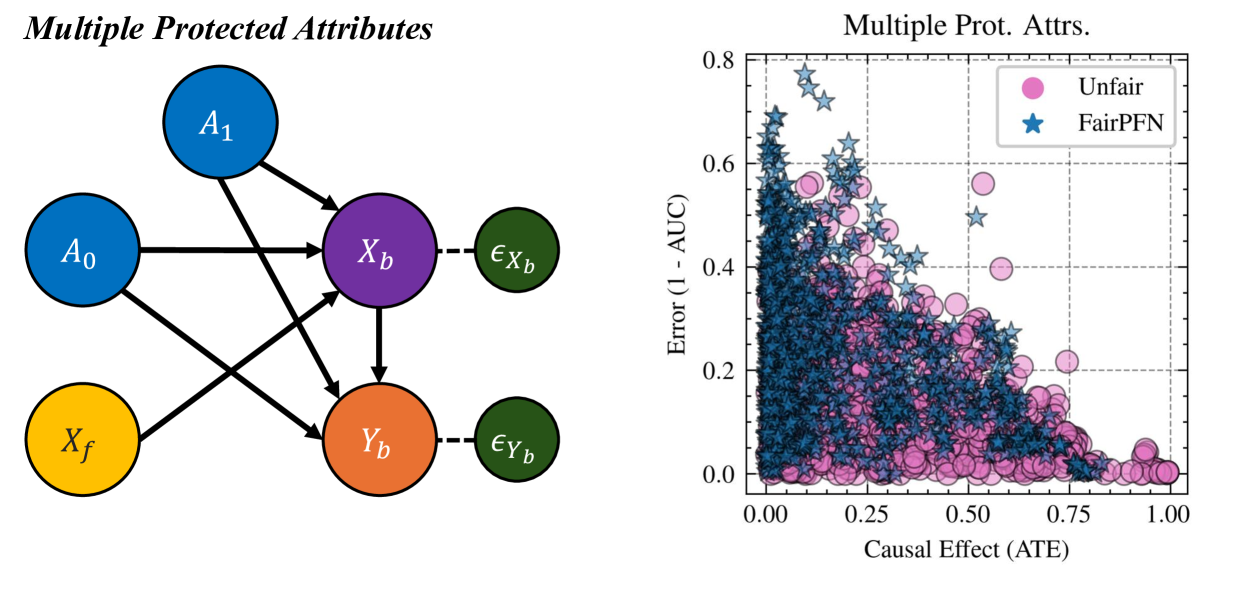
The image consists of two parts: a directed acyclic graph (DAG) on the left, illustrating relationships between variables, and a scatter plot on the right, comparing the performance of "Unfair" and "FairPFN" models in terms of error and causal effect.
### Components/Axes
**Left: Directed Acyclic Graph (DAG)**
* **Title:** Multiple Protected Attributes
* **Nodes:**
* A0 (blue circle)
* A1 (blue circle)
* Xf (yellow circle)
* Xb (purple circle)
* eXb (green circle)
* Yb (orange circle)
* eYb (green circle)
* **Edges:** Arrows indicate the direction of influence.
* A0 -> Xb
* A0 -> Yb
* A1 -> Xb
* A1 -> Yb
* Xf -> Yb
* Xb --(dashed)--> eXb
* Yb --(dashed)--> eYb
* Xb -> Yb
**Right: Scatter Plot**
* **Title:** Multiple Prot. Attrs.
* **X-axis:** Causal Effect (ATE)
* Scale: 0.00 to 1.00, with tick marks at 0.00, 0.25, 0.50, 0.75, and 1.00
* **Y-axis:** Error (1 - AUC)
* Scale: 0.0 to 0.8, with tick marks at 0.0, 0.2, 0.4, 0.6, and 0.8
* **Legend (top-right):**
* Pink circles: Unfair
* Blue stars: FairPFN
### Detailed Analysis or ### Content Details
**Left: Directed Acyclic Graph (DAG)**
* The DAG shows the relationships between protected attributes (A0, A1), a feature (Xf), biased variables (Xb, Yb), and error terms (eXb, eYb).
* A0 and A1 both influence Xb and Yb.
* Xf influences Yb.
* Xb directly influences Yb.
* The dashed lines from Xb to eXb and Yb to eYb indicate a relationship to their respective error terms.
**Right: Scatter Plot**
* The scatter plot visualizes the relationship between causal effect (ATE) and error (1 - AUC) for two models: "Unfair" and "FairPFN".
* **Unfair (pink circles):** The pink circles are concentrated in the lower-right portion of the plot, indicating a trend towards lower error and higher causal effect. The data points are mostly below 0.4 on the y-axis.
* **FairPFN (blue stars):** The blue stars are more spread out, with a higher concentration in the upper-left portion of the plot, indicating a trend towards higher error and lower causal effect. The data points range from approximately 0.0 to 0.8 on the y-axis.
### Key Observations
* The DAG illustrates a causal model with multiple protected attributes influencing biased variables.
* The scatter plot suggests that the "FairPFN" model generally has higher error and lower causal effect compared to the "Unfair" model.
* There is a clear separation between the two models in the scatter plot, with "Unfair" points clustered towards lower error and higher causal effect, and "FairPFN" points more dispersed and tending towards higher error and lower causal effect.
### Interpretation
The image presents a comparison between an "Unfair" model and a "FairPFN" model in the context of multiple protected attributes. The DAG provides a visual representation of the causal relationships between these attributes and the model's variables. The scatter plot then quantifies the trade-off between fairness (as presumably enforced by FairPFN) and performance (measured by error and causal effect).
The data suggests that enforcing fairness (using FairPFN) comes at the cost of increased error and reduced causal effect. This highlights the inherent challenges in balancing fairness and accuracy in machine learning models, especially when dealing with protected attributes. The "Unfair" model, while potentially more accurate and effective in terms of causal effect, may exhibit biases due to its disregard for fairness considerations. The FairPFN model, on the other hand, prioritizes fairness, leading to a trade-off in performance.