\n
## Diagram & Scatter Plot: Multiple Protected Attributes & Multiple Prot. Attrs.
### Overview
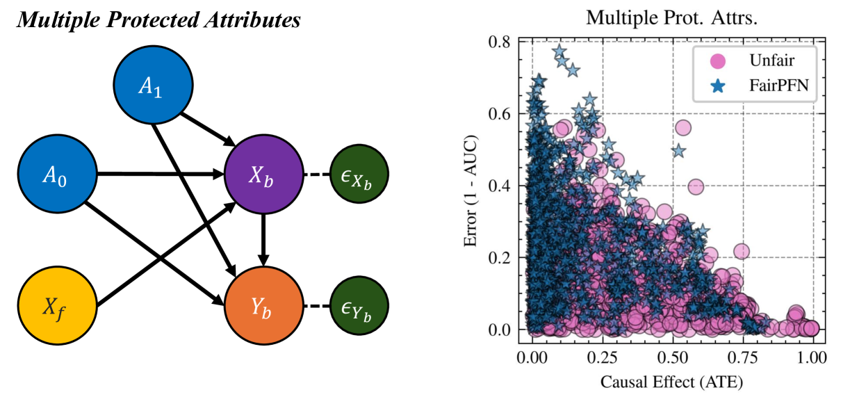
The image contains two distinct visual elements: a diagram illustrating relationships between variables related to protected attributes, and a scatter plot comparing the performance of "Unfair" and "FairPFN" models based on causal effect and error.
### Components/Axes
**Diagram (Left):**
* **Nodes:** A₀ (blue), A₁ (blue), X<sub>f</sub> (yellow), X<sub>b</sub> (purple), Y<sub>b</sub> (orange), ε<sub>Xb</sub> (purple), ε<sub>Yb</sub> (orange).
* **Edges:** Arrows connecting the nodes, indicating relationships.
* **Title:** "Multiple Protected Attributes"
**Scatter Plot (Right):**
* **X-axis:** "Causal Effect (ATE)" ranging from approximately 0.00 to 1.00.
* **Y-axis:** "Error (1 - AUC)" ranging from approximately 0.00 to 0.80.
* **Legend:**
* "Unfair" (represented by red circles)
* "FairPFN" (represented by blue stars)
* **Title:** "Multiple Prot. Attrs."
### Detailed Analysis or Content Details
**Diagram (Left):**
The diagram depicts a causal model. A₀ and A₁ are protected attributes. X<sub>f</sub> represents features, and X<sub>b</sub> and Y<sub>b</sub> are intermediate variables. ε<sub>Xb</sub> and ε<sub>Yb</sub> represent error terms. The arrows indicate the following relationships:
* A₀ and A₁ both influence X<sub>b</sub>.
* X<sub>f</sub> influences X<sub>b</sub>.
* X<sub>b</sub> influences Y<sub>b</sub>.
* ε<sub>Xb</sub> directly influences X<sub>b</sub>.
* ε<sub>Yb</sub> directly influences Y<sub>b</sub>.
**Scatter Plot (Right):**
The scatter plot shows the relationship between Causal Effect (ATE) and Error (1 - AUC) for two models: Unfair and FairPFN.
* **Unfair (Red Circles):** The points generally form a downward sloping trend. At a Causal Effect of approximately 0.00, the Error is around 0.65. As the Causal Effect increases to 1.00, the Error decreases to approximately 0.05. There is significant spread in the data, indicating variability.
* **FairPFN (Blue Stars):** The points also show a downward sloping trend, but are more concentrated. At a Causal Effect of approximately 0.00, the Error is around 0.60. As the Causal Effect increases to 1.00, the Error decreases to approximately 0.10. The points are generally below the Unfair points for a given Causal Effect, suggesting better performance.
### Key Observations
* The Unfair model exhibits higher error rates, particularly at lower causal effects.
* The FairPFN model consistently demonstrates lower error rates across the range of causal effects.
* Both models show a negative correlation between Causal Effect and Error – as the causal effect increases, the error decreases.
* The spread of the Unfair model's data points is much larger than that of the FairPFN model, indicating greater instability or sensitivity to variations.
### Interpretation
The diagram illustrates a scenario where multiple protected attributes (A₀ and A₁) can influence outcomes through intermediate variables (X<sub>b</sub> and Y<sub>b</sub>). The scatter plot compares the performance of an "Unfair" model and a "FairPFN" model in this context. The results suggest that the FairPFN model is more effective at mitigating bias and achieving lower error rates, especially when the causal effect is high. The downward trend in both models indicates that as the causal effect becomes stronger, the model's ability to predict accurately improves. The larger spread in the Unfair model's data suggests that it is more susceptible to variations in the data or sensitive to the protected attributes, leading to less consistent performance.
The FairPFN model appears to be designed to address fairness concerns by reducing the error rate while maintaining a reasonable causal effect. The data suggests that it successfully achieves this goal, offering a more robust and equitable solution compared to the Unfair model. The diagram provides the theoretical context for understanding why fairness interventions are necessary, while the scatter plot demonstrates the practical benefits of using a fairness-aware model like FairPFN.