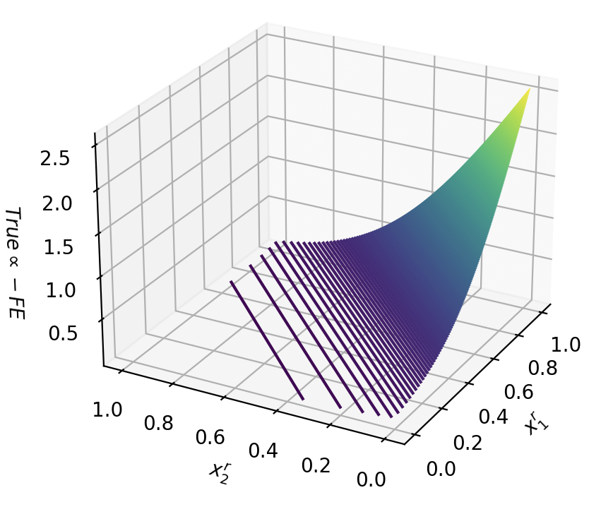
## 3D Surface Plot: Relationship Between \(x_1'\), \(x_2'\), and "True α - FE"
### Overview
The image displays a three-dimensional surface plot visualizing the relationship between two independent variables, \(x_1'\) and \(x_2'\), and a dependent variable labeled "True α - FE". The plot is rendered within a 3D Cartesian coordinate system with a grid. The surface exhibits a pronounced curvature, with its color mapping indicating the magnitude of the dependent variable.
### Components/Axes
* **X-axis (Bottom Right):** Labeled \(x_1'\). The scale runs from 0.0 to 1.0, with major tick marks at intervals of 0.2 (0.0, 0.2, 0.4, 0.6, 0.8, 1.0).
* **Y-axis (Bottom Left):** Labeled \(x_2'\). The scale runs from 0.0 to 1.0, with major tick marks at intervals of 0.2 (0.0, 0.2, 0.4, 0.6, 0.8, 1.0). Note: The axis is oriented such that 1.0 is on the left and 0.0 is on the right from the viewer's perspective.
* **Z-axis (Vertical, Left Side):** Labeled "True α - FE". The scale runs from 0.5 to 2.5, with major tick marks at 0.5, 1.0, 1.5, 2.0, and 2.5.
* **Surface & Color Mapping:** The plotted surface is colored with a gradient. The color serves as a redundant visual cue for the Z-axis value:
* **Dark Purple/Blue:** Corresponds to the lowest values of "True α - FE" (approximately 0.5 to 1.0).
* **Teal/Green:** Corresponds to mid-range values (approximately 1.0 to 2.0).
* **Yellow:** Corresponds to the highest values (approximately 2.0 to 2.5 and above).
* **Legend:** There is no separate, discrete legend box. The color gradient itself acts as a continuous legend for the Z-axis values.
### Detailed Analysis
* **Spatial Grounding & Trend Verification:** The surface forms a curved sheet that rises dramatically from one corner of the \(x_1'\)-\(x_2'\) plane.
* **Lowest Region:** The surface is lowest (dark purple, Z ≈ 0.5-0.8) in the region where \(x_1'\) is low (near 0.0) and \(x_2'\) is high (near 1.0). This is the front-left corner of the plotted domain.
* **Highest Region:** The surface peaks (bright yellow, Z > 2.5) at the opposite corner, where \(x_1'\) is high (1.0) and \(x_2'\) is low (0.0). This is the back-right corner of the domain.
* **Primary Trend:** The value of "True α - FE" increases sharply and non-linearly as \(x_1'\) increases and \(x_2'\) decreases. The gradient is steepest along the diagonal from the (0.0, 1.0) corner to the (1.0, 0.0) corner.
* **Secondary Trend:** Holding \(x_2'\) constant, "True α - FE" increases with \(x_1'\). Holding \(x_1'\) constant, "True α - FE" decreases as \(x_2'\) increases.
* **Data Point Approximation (Key Corners):**
* At (\(x_1'\)=0.0, \(x_2'\)=1.0): "True α - FE" ≈ 0.5 - 0.8 (estimated from the lowest purple region).
* At (\(x_1'\)=1.0, \(x_2'\)=0.0): "True α - FE" ≈ 2.5+ (the peak extends beyond the top Z-axis tick).
* At (\(x_1'\)=0.5, \(x_2'\)=0.5): "True α - FE" ≈ 1.2 - 1.5 (estimated from the teal region at the center of the domain).
### Key Observations
1. **Strong Interaction Effect:** The relationship is not additive. The effect of increasing \(x_1'\) is much more pronounced when \(x_2'\) is low. Similarly, the effect of decreasing \(x_2'\) is amplified when \(x_1'\) is high.
2. **Monotonic Surface:** The surface appears smooth and monotonic across the displayed domain—there are no visible local minima, maxima, or saddle points within the plotted range.
3. **Color as Intensity Guide:** The color gradient effectively highlights the region of maximum value (yellow peak) and the region of minimum value (purple base), making the overall trend immediately apparent.
### Interpretation
This plot demonstrates a **synergistic or multiplicative relationship** between the normalized variables \(x_1'\) and \(x_2'\) in determining the output "True α - FE". The output is maximized when \(x_1'\) is at its maximum and \(x_2'\) is at its minimum, suggesting these two conditions work together to produce the highest value.
The steep, curved surface indicates that the system being modeled is highly sensitive to changes in these parameters, especially in the region where \(x_1'\) is high and \(x_2'\) is low. Small adjustments in this region could lead to large changes in the output. Conversely, the system is less sensitive (the surface is flatter) in the region where \(x_1'\) is low and \(x_2'\) is high.
Without additional context, "True α - FE" could represent an error metric (where lower is better), a performance gain (where higher is better), or a physical quantity. The plot's primary message is the **non-linear, interactive dependence** of this quantity on the two input parameters. To optimize for a high "True α - FE", one should push \(x_1'\) toward 1.0 and \(x_2'\) toward 0.0. To minimize it, the opposite conditions are required.