\n
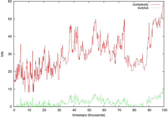
## Line Chart: Complexity vs. Surplus over Time
### Overview
The image presents a line chart illustrating the relationship between "complexity" and "surplus" over time, measured in "timesteps (thousands)". The y-axis represents values in "bits". The chart displays fluctuating trends for both metrics across a range of timesteps from 0 to 100.
### Components/Axes
* **X-axis:** "timesteps (thousands)", ranging from 0 to 100. The axis is marked with increments of 10.
* **Y-axis:** "bits", ranging from 0 to 60. The axis is marked with increments of 10.
* **Data Series 1:** "complexity" - represented by a red line.
* **Data Series 2:** "surplus" - represented by a green line.
* **Legend:** Located in the top-right corner, labeling the two data series with their corresponding colors.
### Detailed Analysis
**Complexity (Red Line):**
The red line representing "complexity" exhibits significant fluctuations throughout the observed timeframe. The line generally starts around 15 bits at timestep 0, increases to a peak of approximately 48 bits around timestep 40, then decreases to a low of around 22 bits at timestep 80, and finally rises again to approximately 46 bits at timestep 100.
* Timestep 0: ~15 bits
* Timestep 10: ~18 bits
* Timestep 20: ~25 bits
* Timestep 30: ~35 bits
* Timestep 40: ~48 bits
* Timestep 50: ~38 bits
* Timestep 60: ~28 bits
* Timestep 70: ~24 bits
* Timestep 80: ~22 bits
* Timestep 90: ~35 bits
* Timestep 100: ~46 bits
**Surplus (Green Line):**
The green line representing "surplus" remains relatively low and stable compared to "complexity". It generally fluctuates between 0 and 10 bits.
* Timestep 0: ~2 bits
* Timestep 10: ~3 bits
* Timestep 20: ~4 bits
* Timestep 30: ~6 bits
* Timestep 40: ~5 bits
* Timestep 50: ~3 bits
* Timestep 60: ~2 bits
* Timestep 70: ~4 bits
* Timestep 80: ~5 bits
* Timestep 90: ~8 bits
* Timestep 100: ~9 bits
### Key Observations
* "Complexity" demonstrates much higher variability than "surplus".
* "Surplus" remains consistently low throughout the entire timeframe.
* There appears to be a general upward trend in "complexity" from timestep 0 to 100, despite the significant fluctuations.
* "Surplus" shows a slight upward trend towards the end of the observed period.
### Interpretation
The chart suggests a dynamic system where "complexity" is constantly changing, while "surplus" remains relatively stable. The high fluctuations in "complexity" could indicate a system undergoing frequent transitions or adaptations. The low "surplus" values might suggest that the system is operating close to its capacity or that resources are being efficiently utilized. The increasing trend in both metrics towards the end of the timeframe could indicate a period of growth or increased activity. The large difference in scale between the two metrics suggests that "complexity" is a more dominant factor in the system's behavior than "surplus". The relationship between these two metrics could be further investigated to understand the underlying mechanisms driving the system's dynamics. The chart does not provide information about the nature of the system or the meaning of "complexity" and "surplus" in a specific context.