\n
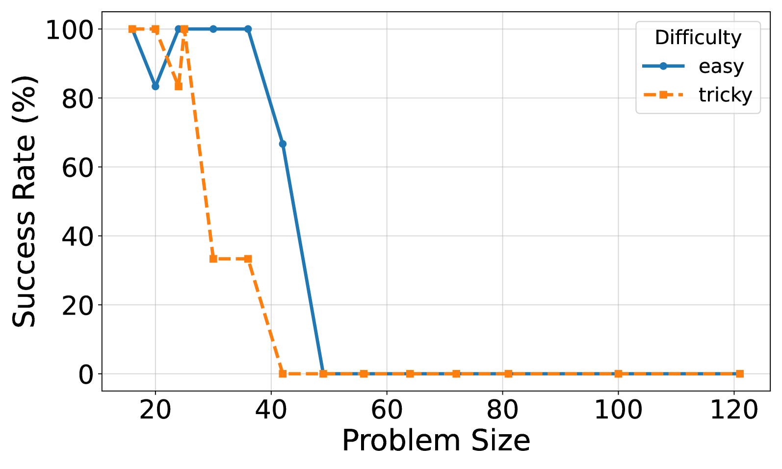
## Line Chart: Success Rate vs. Problem Size by Difficulty
### Overview
This is a line chart comparing the percentage success rate of solving problems of two different difficulty levels ("easy" and "tricky") as the problem size increases. The chart demonstrates a clear negative correlation between problem size and success rate for both categories, with performance dropping to zero at larger sizes.
### Components/Axes
* **X-Axis:** Labeled "Problem Size". The axis displays major tick marks and labels at intervals of 20, starting at 20 and ending at 120. The scale appears linear.
* **Y-Axis:** Labeled "Success Rate (%)". The axis displays major tick marks and labels at intervals of 20, from 0 to 100. The scale is linear.
* **Legend:** Located in the top-right corner of the chart area. It is titled "Difficulty" and defines two data series:
* `easy`: Represented by a solid blue line with circular markers.
* `tricky`: Represented by a dashed orange line with square markers.
* **Grid:** A light gray grid is present, aligned with the major ticks on both axes.
### Detailed Analysis
**Data Series: "easy" (Blue, Solid Line with Circles)**
* **Trend:** The line starts at the maximum success rate, experiences a single sharp dip, recovers fully, then begins a steep, final decline to zero.
* **Data Points (Approximate):**
* Problem Size 20: 100%
* Problem Size 25: ~83%
* Problem Size 30: 100%
* Problem Size 35: 100%
* Problem Size 40: ~67%
* Problem Size 45: 0%
* Problem Sizes 50, 60, 70, 80, 100, 120: 0%
**Data Series: "tricky" (Orange, Dashed Line with Squares)**
* **Trend:** The line starts at the maximum success rate, holds for one interval, then begins a stepwise decline that is more immediate and severe than the "easy" series, reaching zero earlier.
* **Data Points (Approximate):**
* Problem Size 20: 100%
* Problem Size 25: 100%
* Problem Size 30: ~83%
* Problem Size 35: ~33%
* Problem Size 40: ~33%
* Problem Size 45: 0%
* Problem Sizes 50, 60, 70, 80, 100, 120: 0%
### Key Observations
1. **Performance Cliff:** Both difficulty levels exhibit a "cliff" where success rates plummet to 0%. For "tricky" problems, this cliff begins after size 25 and is complete by size 45. For "easy" problems, the final decline starts after size 35 and is complete by size 45.
2. **Relative Difficulty:** The "tricky" series consistently performs worse than or equal to the "easy" series at every measured problem size. The performance gap is most pronounced between sizes 30 and 40.
3. **Anomalous Dip:** The "easy" series shows a significant, isolated drop in success rate at problem size 25 (~83%) before recovering to 100% at sizes 30 and 35. This is the only non-monotonic movement in either series.
4. **Convergence to Zero:** From problem size 45 onward, both series show a 0% success rate, indicating a complete failure to solve problems of that size or larger, regardless of difficulty.
### Interpretation
The chart illustrates a scalability limit for the system or method being tested. Success is highly dependent on problem size, with a sharp phase transition from high success to complete failure.
* **The "tricky" problems** are not just harder at a given size; they cause the system to fail at smaller sizes. The system's capacity is lower for complex tasks.
* **The "easy" problems** show a more robust performance curve, maintaining perfect success for larger sizes (up to 35) before failing. The dip at size 25 is curious and may indicate a specific, non-linear challenge at that particular scale for otherwise easy problems, or it could be an artifact of the test data.
* **The universal failure at size ≥45** suggests a fundamental bottleneck—be it computational, algorithmic, or related to resource constraints—that prevents success beyond this threshold. The data implies that to handle larger problems, a fundamental change to the underlying approach is required, as incremental improvements are unlikely to overcome this hard limit.