\n
## Spectrograms & Text Snippets: Sentiment Analysis Visualization
### Overview
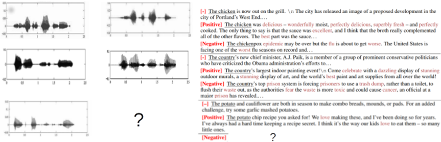
The image presents six spectrograms arranged in a 2x3 grid, alongside corresponding text snippets. Each spectrogram appears to visually represent audio data, likely speech, with time on the x-axis (ranging from approximately 0 to 15) and amplitude or intensity on the y-axis (ranging from approximately 0 to 1). Each spectrogram is paired with a text excerpt labeled with sentiment: "[+]" for positive, "[-]" for negative, or "[?]" for unknown/unlabeled. The spectrograms are grayscale, with darker areas indicating lower intensity and lighter areas indicating higher intensity.
### Components/Axes
* **Spectrograms:** Six individual visualizations of audio data.
* **X-axis:** Represents time, scaled from approximately 0 to 15.
* **Y-axis:** Represents amplitude or intensity, scaled from approximately 0 to 1.
* **Sentiment Labels:** "[+]", "[-]", "[?]" indicating positive, negative, or unknown sentiment respectively.
* **Text Snippets:** Short excerpts of text associated with each spectrogram.
### Detailed Analysis or Content Details
**Row 1:**
* **Spectrogram 1 (Top-Left):** The spectrogram shows a relatively consistent, low-amplitude signal for the first ~8 time units, followed by a burst of higher-amplitude activity around time unit 9, then a decline.
* **Text 1 (Top-Left):** "[+]" "The chicken is now out on the grill. \n The city has released an image of a proposed development in the city of Portland’s West End…"
* **Spectrogram 2 (Top-Right):** The spectrogram shows a more dispersed signal with varying amplitude throughout the time range. There are several distinct bands of energy.
* **Text 2 (Top-Right):** "[Positive]" "The chicken was delicious – wonderfully moist, perfectly delicious, superbly fresh – and perfectly cooked. The only thing to say is that the sauce was excellent, and I think that the broth really complemented all of the other flavors. The best part was the sauce."
**Row 2:**
* **Spectrogram 3 (Middle-Left):** The spectrogram shows a relatively consistent, low-amplitude signal for the first ~5 time units, followed by a burst of higher-amplitude activity around time unit 6, then a decline.
* **Text 3 (Middle-Left):** "[-]" "The chickenpox epidemic may be over but the flu is about to get worse. The United States is facing one of the worst flu seasons on record…"
* **Spectrogram 4 (Middle-Right):** The spectrogram shows a more dispersed signal with varying amplitude throughout the time range. There are several distinct bands of energy.
* **Text 4 (Middle-Right):** "[+]" "The country’s new chief minister, A.J. Paik, is a member of a group of prominent conservative politicians who have criticized the Obama administration’s efforts to…"
**Row 3:**
* **Spectrogram 5 (Bottom-Left):** The spectrogram shows a relatively consistent, low-amplitude signal for the first ~5 time units, followed by a burst of higher-amplitude activity around time unit 6, then a decline.
* **Text 5 (Bottom-Left):** "[+]" "The potato chip recipe you asked for! We love making these, and I’ve been doing so for years. We always had a hard time keeping a recipe secret. I think it’s the way our kids love to eat them – so many little ones."
* **Spectrogram 6 (Bottom-Right):** Spectrogram is present, but the associated text is missing, indicated by a question mark "[?]" for both the text and sentiment.
### Key Observations
* The spectrograms appear to correlate with the sentiment of the associated text. Positive sentiment text ("delicious," "love") is paired with spectrograms that have more distinct and potentially energetic patterns. Negative sentiment text ("epidemic," "worse") is paired with spectrograms that have more consistent, lower-amplitude patterns.
* The spectrograms do not have clear, easily interpretable features. The visual patterns are subtle and require analysis.
* The last spectrogram has no associated text, indicating incomplete data.
### Interpretation
This image likely represents a visualization of sentiment analysis applied to audio data. The spectrograms are visual representations of speech, and the associated text snippets provide the content of that speech. The sentiment labels indicate whether the speech expresses positive, negative, or neutral/unknown sentiment. The goal is likely to demonstrate a correlation between the acoustic features of speech (as represented by the spectrograms) and the emotional tone of the content.
The varying patterns in the spectrograms suggest that different emotional states are associated with different acoustic characteristics. For example, positive sentiment might be associated with more variation in pitch and amplitude, while negative sentiment might be associated with a more monotone or subdued delivery.
The missing text for the last spectrogram highlights a potential limitation of the analysis: the inability to determine sentiment when the content is unknown. This could be due to errors in speech recognition or a lack of context.
The image suggests that it is possible to automatically detect sentiment from audio data using machine learning techniques. This has applications in areas such as customer service, market research, and mental health monitoring. The image is a demonstration of a system that attempts to correlate audio features with sentiment labels.