\n
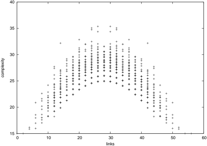
## Scatter Plot: Complexity vs. Links
### Overview
The image presents a scatter plot visualizing the relationship between "links" and "complexity". The plot consists of numerous data points represented by '+' symbols. The distribution of points suggests a correlation between the two variables, peaking at a certain range of "links" values.
### Components/Axes
* **X-axis:** Labeled "links", ranging from approximately 0 to 60, with tick marks at intervals of 10.
* **Y-axis:** Labeled "complexity", ranging from approximately 15 to 40, with tick marks at intervals of 5.
* **Data Points:** Represented by '+' symbols, scattered across the plot area.
* **No Legend:** There is no legend present in the image.
### Detailed Analysis
The data points exhibit a bell-shaped distribution. The density of points is lowest at both ends of the "links" axis (near 0 and 60) and highest around the "links" value of 25-30.
Here's an approximate breakdown of data point distribution, noting the inherent difficulty in precisely reading values from a scatter plot of this type:
* **Links = 10:** Complexity ranges from approximately 18 to 28.
* **Links = 20:** Complexity ranges from approximately 22 to 34.
* **Links = 25:** Complexity ranges from approximately 24 to 36. This appears to be the peak density of points.
* **Links = 30:** Complexity ranges from approximately 23 to 35.
* **Links = 40:** Complexity ranges from approximately 20 to 30.
* **Links = 50:** Complexity ranges from approximately 17 to 25.
* **Links = 5:** Complexity ranges from approximately 16 to 24.
* **Links = 15:** Complexity ranges from approximately 20 to 30.
* **Links = 35:** Complexity ranges from approximately 21 to 32.
* **Links = 45:** Complexity ranges from approximately 19 to 27.
The trend is that as "links" increase from 0 to around 30, "complexity" generally increases. Beyond 30 "links", "complexity" appears to decrease, creating a roughly symmetrical distribution.
### Key Observations
* The data suggests a non-linear relationship between "links" and "complexity".
* The peak density of data points occurs around 25-30 "links".
* There are no obvious outliers significantly deviating from the general trend.
* The distribution is approximately symmetrical around the peak.
### Interpretation
The scatter plot suggests that there is an optimal range of "links" (around 25-30) where "complexity" is maximized. Increasing or decreasing the number of "links" beyond this point results in a decrease in "complexity". This could represent a system where adding more connections initially increases complexity, but eventually leads to diminishing returns or even a reduction in overall complexity due to redundancy or interference.
Without knowing the context of what "links" and "complexity" represent, it's difficult to provide a more specific interpretation. However, the data suggests a trade-off or an optimal balance between these two variables. The bell-shaped curve indicates a natural limit to the benefits of increasing "links," and potentially a cost associated with excessive connectivity. This type of relationship is common in complex systems, such as networks, organizations, or biological systems.