## Heatmap: The Mean Operation For Query, Key and Value
### Overview
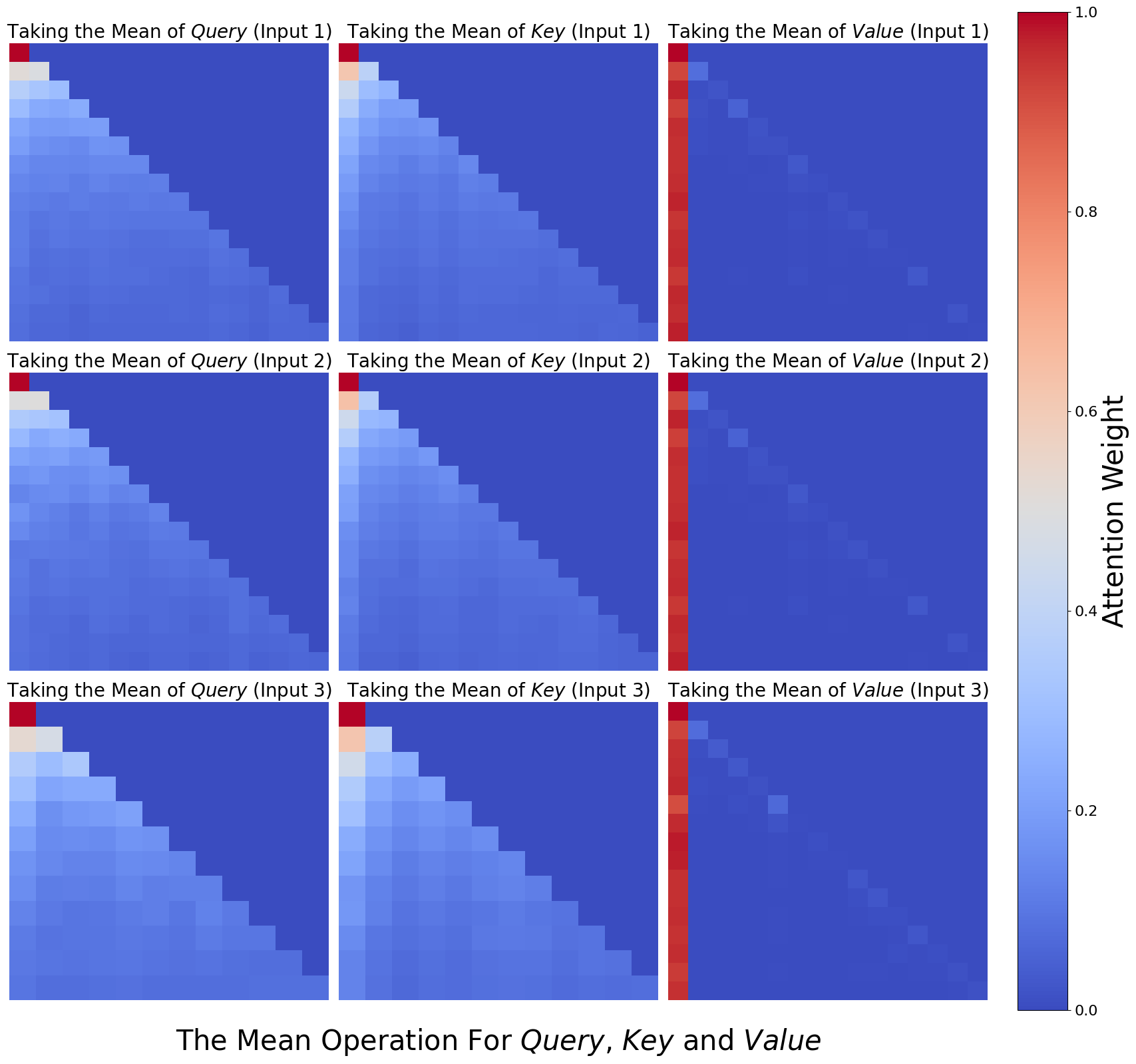
The image presents a series of heatmaps visualizing the attention weights resulting from taking the mean of Query, Key, and Value inputs across three different input instances (Input 1, Input 2, Input 3). The heatmaps are arranged in a 3x3 grid, with each row representing an input instance and each column representing the Query, Key, or Value component. The color intensity represents the attention weight, ranging from blue (low) to red (high), as indicated by the colorbar on the right.
### Components/Axes
* **Title:** "The Mean Operation For Query, Key and Value" (located at the bottom center)
* **Heatmap Titles (Row 1):**
* Column 1: "Taking the Mean of *Query* (Input 1)"
* Column 2: "Taking the Mean of *Key* (Input 1)"
* Column 3: "Taking the Mean of *Value* (Input 1)"
* **Heatmap Titles (Row 2):**
* Column 1: "Taking the Mean of *Query* (Input 2)"
* Column 2: "Taking the Mean of *Key* (Input 2)"
* Column 3: "Taking the Mean of *Value* (Input 2)"
* **Heatmap Titles (Row 3):**
* Column 1: "Taking the Mean of *Query* (Input 3)"
* Column 2: "Taking the Mean of *Key* (Input 3)"
* Column 3: "Taking the Mean of *Value* (Input 3)"
* **Colorbar (Right):**
* Label: "Attention Weight" (vertical text)
* Scale: 0.0 to 1.0, with increments of 0.2 (0.0, 0.2, 0.4, 0.6, 0.8, 1.0)
### Detailed Analysis
Each heatmap is a square grid, approximately 15x15 cells.
* **Query Heatmaps (Column 1):**
* Input 1: High attention weights (red/orange) concentrated in the top-left corner, decreasing towards the bottom-right.
* Input 2: Similar pattern to Input 1, but with slightly lower overall attention weights.
* Input 3: Similar pattern to Input 1 and Input 2, but with slightly lower overall attention weights than Input 2.
* **Key Heatmaps (Column 2):**
* Input 1: High attention weights (red/orange) concentrated in the top-left corner, decreasing towards the bottom-right.
* Input 2: Similar pattern to Input 1, but with slightly lower overall attention weights.
* Input 3: Similar pattern to Input 1 and Input 2, but with slightly lower overall attention weights than Input 2.
* **Value Heatmaps (Column 3):**
* Input 1: High attention weights (red) concentrated in the first column, with very low attention weights (blue) elsewhere.
* Input 2: Similar pattern to Input 1, with high attention weights in the first column and low attention weights elsewhere.
* Input 3: Similar pattern to Input 1 and Input 2, with high attention weights in the first column and low attention weights elsewhere.
### Key Observations
* The Query and Key heatmaps show a similar pattern, with attention focused on the initial elements and decreasing as the sequence progresses.
* The Value heatmaps show a strong focus on the first element, suggesting it is the most important when taking the mean of the Value input.
* The attention weights generally decrease from Input 1 to Input 3 for Query and Key.
### Interpretation
The heatmaps visualize the attention distribution when taking the mean of Query, Key, and Value inputs. The concentration of attention in the top-left corner of the Query and Key heatmaps suggests that the initial elements of these sequences are more influential in determining the mean. The strong focus on the first element in the Value heatmaps indicates that this element dominates the mean calculation for the Value input. The decreasing attention weights from Input 1 to Input 3 for Query and Key might indicate a diminishing importance of these inputs over time or iterations. The visualization highlights how different components (Query, Key, Value) contribute to the overall attention mechanism when their means are considered.