TECHNICAL ASSET FINGERPRINT
aec4b93f9609b0abdebf1f79
Click to view fullscreen
Press ESC or click to close
FOUND IN PAPERS
EXPERT: gemini-2.0-flash VERSION 1
RUNTIME: nugit/gemini/gemini-2.0-flash
INTEL_VERIFIED
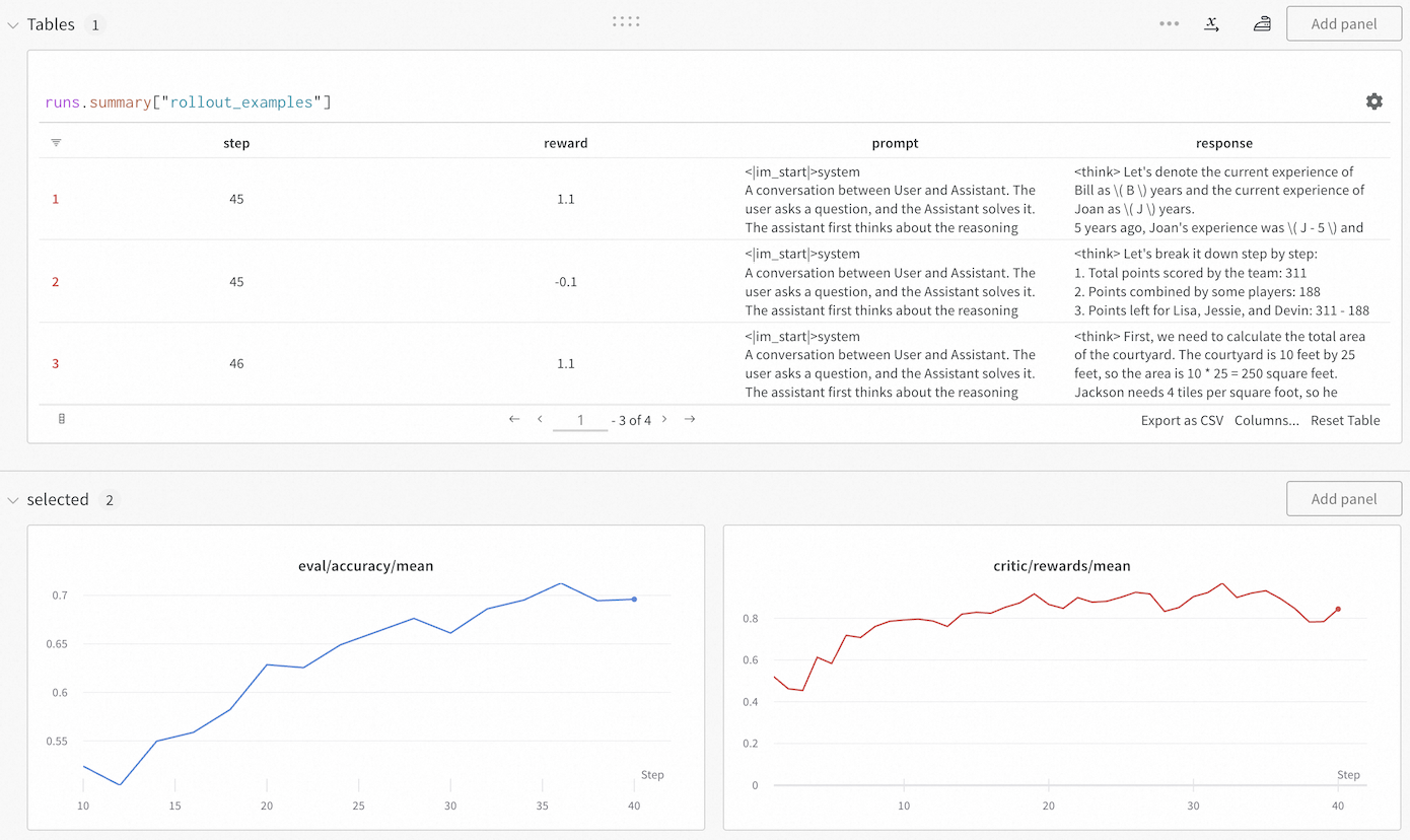
## Tables and Charts: Agent Performance Analysis
### Overview
The image presents a table and two line charts displaying the performance of an agent during a rollout. The table shows individual steps with associated rewards, prompts, and responses. The charts visualize the agent's `eval/accuracy/mean` and `critic/rewards/mean` over steps.
### Components/Axes
**Table:**
* **Title:** Tables 1, runs.summary["rollout_examples"]
* **Columns:** step, reward, prompt, response
* **Rows:** 1, 2, 3
* **Navigation:** Pagination controls indicating "1 - 3 of 4" pages.
**Chart 1: eval/accuracy/mean**
* **Title:** eval/accuracy/mean
* **X-axis:** Step, ranging from 10 to 40 in increments of 5.
* **Y-axis:** eval/accuracy/mean, ranging from 0.55 to 0.7 in increments of 0.05.
* **Data Series:** A blue line representing the eval/accuracy/mean.
**Chart 2: critic/rewards/mean**
* **Title:** critic/rewards/mean
* **X-axis:** Step, ranging from 0 to 40 in increments of 10.
* **Y-axis:** critic/rewards/mean, ranging from 0 to 0.8 in increments of 0.2.
* **Data Series:** A red line representing the critic/rewards/mean.
### Detailed Analysis
**Table Content:**
| Row | Step | Reward | Prompt get the agent to do something else.
DECODING INTELLIGENCE...