TECHNICAL ASSET FINGERPRINT
aec4b93f9609b0abdebf1f79
Click to view fullscreen
Press ESC or click to close
FOUND IN PAPERS
EXPERT: healer-alpha-free VERSION 1
RUNTIME: free/openrouter/healer-alpha
INTEL_VERIFIED
\n
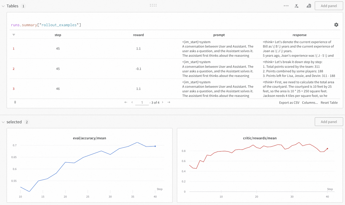
## Dashboard Screenshot: Training Metrics and Rollout Examples
### Overview
The image displays a monitoring dashboard, likely from a machine learning or AI training platform. It consists of two main sections: a data table at the top showing specific training rollout examples, and two line charts at the bottom tracking aggregate metrics over training steps. The interface includes controls for adding panels, exporting data, and navigating the table.
### Components/Axes
**Top Section - Table Panel:**
* **Panel Title:** `Tables 1`
* **Table Query/Label:** `runs.summary["rollout_examples"]`
* **Table Columns:**
1. (Index Column - unlabeled header)
2. `step`
3. `reward`
4. `prompt`
5. `response`
* **Table Navigation:** Shows rows 1-3 of 4 total (`1 - 3 of 4`). Navigation arrows (`<`, `>`) and a page number (`1`) are present.
* **Table Actions:** `Export as CSV`, `Columns...`, `Reset Table`.
**Bottom Section - Charts Panel:**
* **Panel Title:** `selected 2`
* **Left Chart:**
* **Title:** `eval/accuracy/mean` (text color matches the blue line).
* **Y-Axis:** Labeled with values from `0.55` to `0.7` in increments of `0.05`.
* **X-Axis:** Labeled `Step` with major ticks at `10`, `15`, `20`, `25`, `30`, `35`, `40`.
* **Data Series:** A single blue line.
* **Right Chart:**
* **Title:** `critic/rewards/mean` (text color matches the red line).
* **Y-Axis:** Labeled with values from `0` to `0.8` in increments of `0.2`.
* **X-Axis:** Labeled `Step` with major ticks at `10`, `20`, `30`, `40`.
* **Data Series:** A single red line.
### Detailed Analysis
**Table Content (Visible Rows):**
* **Row 1:**
* `step`: 45
* `reward`: 1.1
* `prompt`: `<im_start>system\nA conversation between User and Assistant. The user asks a question, and the Assistant solves it. The assistant first thinks about the reasoning`
* `response`: `<think> Let's denote the current experience of Bill as \( B \) years and the current experience of Joan as \( J \) years.\n5 years ago, Joan's experience was \( J - 5 \) and` (text is truncated).
* **Row 2:**
* `step`: 45
* `reward`: -0.1
* `prompt`: `<im_start>system\nA conversation between User and Assistant. The user asks a question, and the Assistant solves it. The assistant first thinks about the reasoning`
* `response`: `<think> Let's break it down step by step:\n1. Total points scored by the team: 311\n2. Points combined by some players: 188\n3. Points left for Lisa, Jessie, and Devin: 311 - 188` (text is truncated).
* **Row 3:**
* `step`: 46
* `reward`: 1.1
* `prompt`: `<im_start>system\nA conversation between User and Assistant. The user asks a question, and the Assistant solves it. The assistant first thinks about the reasoning`
* `response`: `<think> First, we need to calculate the total area of the courtyard. The courtyard is 10 feet by 25 feet, so the area is 10 * 25 = 250 square feet.\nJackson needs 4 tiles per square foot, so he` (text is truncated).
**Chart Data Trends:**
* **`eval/accuracy/mean` (Blue Line):**
* **Trend:** Shows a clear, generally upward trend with some minor fluctuations.
* **Data Points (Approximate):**
* Step 10: ~0.53
* Step 15: ~0.55
* Step 20: ~0.63
* Step 25: ~0.66
* Step 30: ~0.67
* Step 35: ~0.71 (peak)
* Step 40: ~0.70
* **`critic/rewards/mean` (Red Line):**
* **Trend:** Shows an overall upward trend but with significantly higher volatility and more pronounced dips compared to the accuracy chart.
* **Data Points (Approximate):**
* Step 10: ~0.50
* Step 15: ~0.70
* Step 20: ~0.80
* Step 25: ~0.85
* Step 30: ~0.80
* Step 35: ~0.90 (peak)
* Step 40: ~0.85
### Key Observations
1. **Correlated Improvement:** Both the evaluation accuracy and the mean critic reward show a positive correlation with training steps, suggesting the model is improving on both metrics.
2. **Volatility Discrepancy:** The critic reward signal (`critic/rewards/mean`) is much noisier than the evaluation accuracy (`eval/accuracy/mean`). This is common in reinforcement learning setups where the critic's estimates can be unstable.
3. **Training Step Alignment:** The table shows specific rollout examples from steps 45 and 46, which are beyond the range displayed in the charts (which end at step 40). This indicates the dashboard is showing a snapshot of ongoing training.
4. **Reward Variance in Table:** The table reveals high variance in rewards for similar prompts at the same step (Step 45 has rewards of 1.1 and -0.1), highlighting the granularity of the training signal.
5. **Prompt Structure:** All visible prompts share an identical system message prefix, indicating a standardized evaluation or training format.
### Interpretation
This dashboard provides a multi-faceted view of an AI model's training progress, likely within a reinforcement learning from human feedback (RLHF) or similar framework.
* **The Charts** show the macroscopic view: the model is successfully learning, as evidenced by rising accuracy and reward trends. The volatility in the critic reward is a key diagnostic point; while the trend is positive, the instability might require tuning of the reward model or training hyperparameters to ensure stable convergence.
* **The Table** provides a microscopic, qualitative view. It links specific training steps (`step`) to the model's performance on individual examples (`prompt` and `response`), quantified by a `reward`. The presence of both positive (1.1) and negative (-0.1) rewards at the same step demonstrates the model's mixed performance on different tasks during this phase of training. The truncated `response` fields suggest the model is generating step-by-step reasoning (`<think>` tags), which is being evaluated.
* **Synthesis:** The combination allows a practitioner to correlate aggregate metrics with concrete examples. For instance, the dip in critic reward around step 30 on the chart might be investigable by examining rollout tables from that step. The dashboard is designed for iterative debugging and monitoring, enabling a user to move from high-level trends to specific failure or success cases. The "Add panel" buttons suggest this is a customizable monitoring environment.
DECODING INTELLIGENCE...