\n
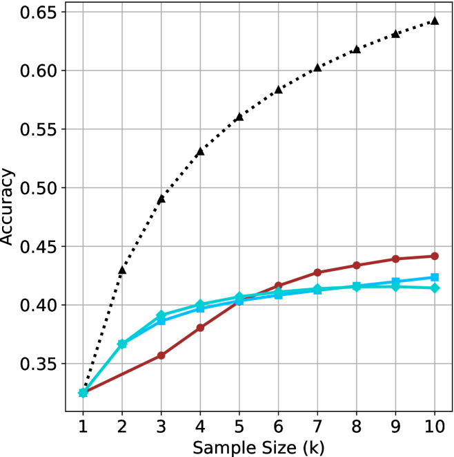
## Line Chart: Accuracy vs. Sample Size (k)
### Overview
The image is a line chart comparing the performance (accuracy) of four different methods or models as a function of increasing sample size. The chart demonstrates how accuracy improves with more data for each method, with one method showing significantly superior performance.
### Components/Axes
* **X-Axis:** Labeled "Sample Size (k)". It has discrete integer markers from 1 to 10.
* **Y-Axis:** Labeled "Accuracy". It has numerical markers from 0.35 to 0.65, in increments of 0.05.
* **Legend:** Positioned in the top-left corner of the chart area. It contains four entries:
1. A black dotted line with upward-pointing triangle markers (▲).
2. A red solid line with circle markers (●).
3. A cyan solid line with square markers (■).
4. A cyan solid line with diamond markers (◆).
* **Grid:** A light gray grid is present, aligning with the major ticks on both axes.
### Detailed Analysis
The chart plots four data series. Below is an analysis of each, including trend description and approximate data points extracted from visual inspection. Values are approximate (±0.005).
**1. Black Dotted Line (▲)**
* **Trend:** Shows a strong, logarithmic-like growth pattern. It starts at the lowest accuracy but rises steeply and continues to increase across the entire range, maintaining the highest accuracy from k=2 onward.
* **Data Points (k, Accuracy):**
* (1, ~0.325)
* (2, ~0.430)
* (3, ~0.490)
* (4, ~0.530)
* (5, ~0.560)
* (6, ~0.585)
* (7, ~0.605)
* (8, ~0.620)
* (9, ~0.635)
* (10, ~0.645)
**2. Red Solid Line (●)**
* **Trend:** Shows a steady, near-linear increase. It starts at the same point as the cyan lines but grows at a slower rate than the black line, eventually surpassing the cyan lines around k=6.
* **Data Points (k, Accuracy):**
* (1, ~0.325)
* (2, ~0.340)
* (3, ~0.355)
* (4, ~0.380)
* (5, ~0.405)
* (6, ~0.415)
* (7, ~0.430)
* (8, ~0.435)
* (9, ~0.440)
* (10, ~0.445)
**3. Cyan Solid Line (■)**
* **Trend:** Shows initial growth that plateaus relatively early. It closely follows the diamond-marked cyan line, with a very slight divergence at higher k values where the square-marked line is marginally higher.
* **Data Points (k, Accuracy):**
* (1, ~0.325)
* (2, ~0.365)
* (3, ~0.385)
* (4, ~0.395)
* (5, ~0.405)
* (6, ~0.410)
* (7, ~0.415)
* (8, ~0.418)
* (9, ~0.420)
* (10, ~0.425)
**4. Cyan Solid Line (◆)**
* **Trend:** Nearly identical to the square-marked cyan line, showing early growth and a plateau. It is slightly below the square-marked line from k=7 onward.
* **Data Points (k, Accuracy):**
* (1, ~0.325)
* (2, ~0.365)
* (3, ~0.390)
* (4, ~0.400)
* (5, ~0.405)
* (6, ~0.408)
* (7, ~0.410)
* (8, ~0.412)
* (9, ~0.413)
* (10, ~0.415)
### Key Observations
1. **Performance Hierarchy:** The method represented by the black dotted line (▲) is the clear top performer, achieving an accuracy of ~0.645 at k=10, which is approximately 0.20 higher than the next best method.
2. **Convergence at Start:** All four methods begin at approximately the same accuracy (~0.325) when the sample size is 1.
3. **Divergence with Data:** As sample size increases, the performance of the methods diverges significantly. The black line separates immediately, while the red line separates from the cyan cluster around k=5-6.
4. **Plateauing:** The two cyan methods show signs of performance saturation (plateauing) after k=5 or 6, with very marginal gains for additional samples. The red and black lines show no clear plateau within the observed range.
5. **Cyan Line Similarity:** The two cyan lines (■ and ◆) are extremely close in performance throughout, suggesting they may represent very similar algorithms or minor variations of the same method.
### Interpretation
This chart illustrates a classic machine learning or statistical learning curve. The key takeaway is the **superior data efficiency and scalability** of the method represented by the black dotted line.
* **What the data suggests:** The black method not only learns faster from initial data (steeper slope between k=1 and k=3) but also continues to extract meaningful signal from additional data long after the other methods have begun to plateau. This indicates a more robust or complex model architecture capable of leveraging larger datasets.
* **Relationship between elements:** The x-axis (Sample Size) is the independent variable, driving the change in the dependent variable (Accuracy). The legend distinguishes between different modeling approaches being tested under identical conditions.
* **Notable implications:** For applications where data is scarce (low k), all methods perform similarly. However, for applications where data can be scaled to k=10 or beyond, the choice of method is critical, with the black method being the unequivocal choice for maximizing accuracy. The plateauing of the cyan methods suggests they may be too simple (high bias) to capture the underlying pattern in the data beyond a certain point, while the black method's continued growth suggests it has the capacity (low bias) to do so. The red method represents a middle ground, showing steady but unspectacular improvement.