## Line Chart: Accuracy vs. Sample Size (k)
### Overview
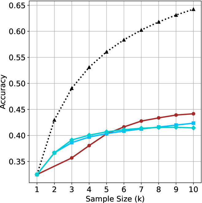
This image displays a line chart comparing the performance (Accuracy) of four distinct data series against an increasing "Sample Size (k)" ranging from 1 to 10. The chart utilizes a grid background for readability. Notably, the image lacks a legend, meaning the specific identity of each data series is not explicitly labeled.
### Components/Axes
* **X-Axis:** Labeled "Sample Size (k)". The scale is linear, marked with integers from 1 to 10.
* **Y-Axis:** Labeled "Accuracy". The scale ranges from 0.35 to 0.65, with major grid lines at 0.05 intervals.
* **Data Series:** There are four distinct lines plotted:
1. **Black Dotted Line:** Marked with upward-pointing triangles.
2. **Red/Maroon Solid Line:** Marked with filled circles.
3. **Cyan/Light Blue Solid Line (A):** Marked with filled squares.
4. **Cyan/Light Blue Solid Line (B):** Marked with filled diamonds.
* **Legend:** Absent.
### Detailed Analysis
All four data series originate from a common starting point at Sample Size 1, with an Accuracy of approximately 0.325.
**1. Black Dotted Line (Triangles)**
* **Trend:** This series exhibits a steep, concave-downward growth curve. It shows the highest rate of improvement across all sample sizes.
* **Data Points:**
* x=1: ~0.325
* x=3: ~0.49
* x=6: ~0.58
* x=10: ~0.64
**2. Red/Maroon Solid Line (Circles)**
* **Trend:** This series shows a steady, nearly linear upward slope. It starts as the lowest performing series (tied with the cyan lines) but demonstrates better scaling than the cyan lines as the sample size increases. It overtakes both cyan lines between x=5 and x=6.
* **Data Points:**
* x=1: ~0.325
* x=5: ~0.405
* x=10: ~0.44
**3. Cyan/Light Blue Solid Line (Squares)**
* **Trend:** This series rises rapidly from x=1 to x=3, then begins to plateau significantly after x=4.
* **Data Points:**
* x=1: ~0.325
* x=4: ~0.395
* x=10: ~0.425
**4. Cyan/Light Blue Solid Line (Diamonds)**
* **Trend:** This series follows a nearly identical trajectory to the Cyan/Square line, rising rapidly until x=3, then plateauing. It remains consistently slightly below the Cyan/Square line.
* **Data Points:**
* x=1: ~0.325
* x=4: ~0.40
* x=10: ~0.415
### Key Observations
* **Convergence:** All models perform identically at the minimum sample size (k=1).
* **Divergence:** As sample size increases, the performance gap between the models widens significantly.
* **Performance Tiers:** The Black Dotted series is a clear outlier, significantly outperforming the other three models. The Red and Cyan series form a lower-performing cluster.
* **Saturation:** The two Cyan series exhibit clear signs of saturation (diminishing returns) after k=4, whereas the Black and Red series continue to show more robust growth.
### Interpretation
The data suggests a comparison between different machine learning models or algorithms, where the "Black Dotted" model is significantly more data-efficient and scalable than the others.
* **The "Black Dotted" model:** Likely represents a more complex or better-optimized architecture that benefits substantially from increased data volume.
* **The "Cyan" models:** These appear to be models that reach their capacity or "ceiling" very quickly. Adding more data beyond k=4 provides negligible accuracy gains, suggesting these models may be under-parameterized or limited by their architecture.
* **The "Red" model:** This model occupies a middle ground. It is slower to learn than the cyan models initially but possesses a higher "ceiling," as evidenced by its ability to overtake the cyan models as the sample size increases. It does not show the same aggressive saturation as the cyan models within the observed range.