\n
## Line Chart: Distribution Comparison
### Overview
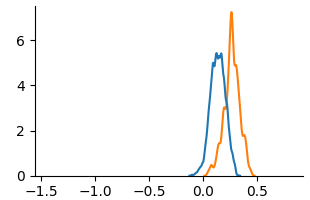
The image presents a line chart comparing two distributions. The chart displays values on the y-axis against values on the x-axis, ranging from -1.5 to 0.5. Two distinct lines, one blue and one orange, represent the distributions.
### Components/Axes
* **X-axis:** Labeled with numerical values ranging from -1.5 to 0.5, with markings at -1.0, -0.5, 0.0, and 0.5.
* **Y-axis:** Labeled with numerical values ranging from 0 to 6, with markings at 0, 2, 4, and 6.
* **Line 1:** Blue line.
* **Line 2:** Orange line.
* **Legend:** No explicit legend is present, but the lines are visually distinguishable by color.
### Detailed Analysis
* **Blue Line:** The blue line starts at approximately y=0 at x=-0.5. It increases steadily, reaching a peak of approximately y=5.2 at x=0.0. It then decreases rapidly, returning to approximately y=0 at x=0.25.
* **Orange Line:** The orange line starts at approximately y=0 at x=-0.5. It increases more gradually than the blue line, reaching a peak of approximately y=7.0 at x=0.25. It then decreases more slowly than the blue line, reaching approximately y=0 at x=0.5.
### Key Observations
* The orange line has a higher peak value than the blue line.
* The blue line peaks earlier (at x=0.0) than the orange line (at x=0.25).
* The blue line has a steeper descent after its peak than the orange line.
* Both lines exhibit a similar overall shape, suggesting they represent distributions with similar characteristics but different parameters.
### Interpretation
The chart likely represents the probability density functions of two different distributions. The higher peak of the orange line suggests that values around x=0.25 are more probable in that distribution compared to the blue distribution, where values around x=0.0 are more probable. The difference in peak location and steepness indicates that the distributions have different means and variances. Without further context, it's difficult to determine the specific nature of these distributions or the variables they represent. The chart suggests a comparison of two related phenomena, where one is slightly shifted to the right and has a broader spread than the other.