\n
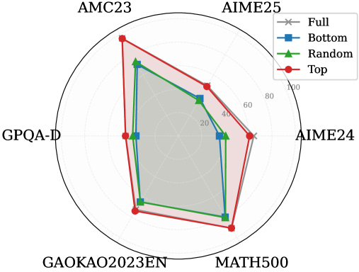
## Radar Chart: Performance Comparison Across Mathematical and Reasoning Benchmarks
### Overview
This image is a radar chart (also known as a spider chart) comparing the performance of four different methods or models across six distinct benchmarks. The chart uses a radial layout where each axis represents a benchmark, and the distance from the center represents a score, likely a percentage or accuracy metric. The four methods are distinguished by different colors and marker shapes.
### Components/Axes
* **Chart Type:** Radar Chart.
* **Benchmarks (Axes):** Six axes radiate from the center, each labeled with a benchmark name. Starting from the top and moving clockwise:
1. `AMC23`
2. `AIME25`
3. `AIME24`
4. `MATH500`
5. `GAOKAO2023EN`
6. `GPQA-D`
* **Radial Scale:** Concentric circles represent the scoring scale. The innermost circle is unlabeled (likely 0). The labeled circles, moving outward, are marked: `20`, `40`, `60`, `80`, and `100` at the outermost edge.
* **Legend:** Located in the top-right corner of the chart area. It defines four data series:
* `Full`: Gray line with 'x' markers.
* `Bottom`: Blue line with square markers.
* `Random`: Green line with triangle markers.
* `Top`: Red line with circle markers.
* **Data Series:** Four polygons are plotted, each connecting the scores of one method across all six benchmarks.
### Detailed Analysis
The chart compares the performance profiles of the four methods. Below is an analysis of each benchmark, describing the visual trend (from lowest to highest score) and providing approximate score values based on the radial scale.
**1. AMC23 (Top Axis):**
* **Trend:** The `Top` (red) method scores significantly higher than the others. `Full` (gray) and `Random` (green) are close, with `Bottom` (blue) scoring the lowest.
* **Approximate Scores:**
* Top: ~95
* Random: ~75
* Full: ~70
* Bottom: ~65
**2. AIME25 (Top-Right Axis):**
* **Trend:** `Top` (red) again leads. `Full` (gray) and `Random` (green) are tightly clustered in the middle. `Bottom` (blue) is the lowest.
* **Approximate Scores:**
* Top: ~70
* Random: ~55
* Full: ~50
* Bottom: ~45
**3. AIME24 (Right Axis):**
* **Trend:** `Top` (red) is the highest. `Full` (gray) and `Random` (green) are nearly identical and in the middle. `Bottom` (blue) is the lowest.
* **Approximate Scores:**
* Top: ~65
* Random: ~50
* Full: ~50
* Bottom: ~40
**4. MATH500 (Bottom-Right Axis):**
* **Trend:** `Top` (red) has the highest score. `Random` (green) and `Bottom` (blue) are very close, with `Full` (gray) scoring slightly lower than them.
* **Approximate Scores:**
* Top: ~85
* Random: ~75
* Bottom: ~73
* Full: ~68
**5. GAOKAO2023EN (Bottom-Left Axis):**
* **Trend:** `Top` (red) is the highest. `Random` (green) and `Bottom` (blue) are again very close. `Full` (gray) is the lowest.
* **Approximate Scores:**
* Top: ~80
* Random: ~70
* Bottom: ~68
* Full: ~60
**6. GPQA-D (Left Axis):**
* **Trend:** `Top` (red) is the highest. `Full` (gray) and `Random` (green) are close in the middle. `Bottom` (blue) is the lowest.
* **Approximate Scores:**
* Top: ~60
* Random: ~45
* Full: ~42
* Bottom: ~35
### Key Observations
1. **Consistent Leader:** The `Top` method (red line/circles) achieves the highest score on every single benchmark, forming the outermost polygon.
2. **Middle Cluster:** The `Full` (gray/x) and `Random` (green/triangles) methods frequently perform similarly, often occupying the middle range of scores. Their lines overlap or run close together on several axes (AIME24, AIME25, GPQA-D).
3. **Lower Performer:** The `Bottom` method (blue/squares) is consistently among the lowest-scoring, often forming the innermost polygon, though it is sometimes very close to `Random` (e.g., MATH500, GAOKAO2023EN).
4. **Benchmark Difficulty:** The spread between the highest (`Top`) and lowest (`Bottom`) scores varies by benchmark. The spread appears largest on `AMC23` and `GPQA-D`, suggesting these benchmarks may differentiate the methods more starkly. The spread is narrower on `MATH500` and `GAOKAO2023EN`.
### Interpretation
This radar chart visually demonstrates a clear performance hierarchy among the four evaluated methods across a suite of mathematical and reasoning benchmarks.
* **What the data suggests:** The method labeled `Top` is unequivocally the strongest performer, suggesting it represents a high-performing model, a model fine-tuned on top-tier data, or an optimized configuration. The `Bottom` method's consistently lower scores imply it may represent a baseline, a model trained on lower-quality data, or a less optimized setup.
* **Relationship between elements:** The close performance of `Random` and `Full` is intriguing. It suggests that, for these benchmarks, a model using a random subset of data (`Random`) performs comparably to one using the full dataset (`Full`). This could indicate diminishing returns from the full dataset or that the random subset is sufficiently representative. The `Bottom` method's proximity to `Random` on some tasks further implies that selecting the "bottom" performers for training may not be worse than random selection, and is often better than using the full, potentially noisy, dataset.
* **Notable patterns:** The consistent dominance of `Top` across diverse benchmarks (from AMC/AIME competitions to the Chinese Gaokao and the graduate-level GPQA-D) indicates robust and generalizable superior performance. The chart effectively argues that the strategy or data represented by `Top` is highly effective. The investigation would next focus on understanding what "Top" specifically refers to (e.g., top 10% of data, a top-performing model variant) to replicate its success.