\n
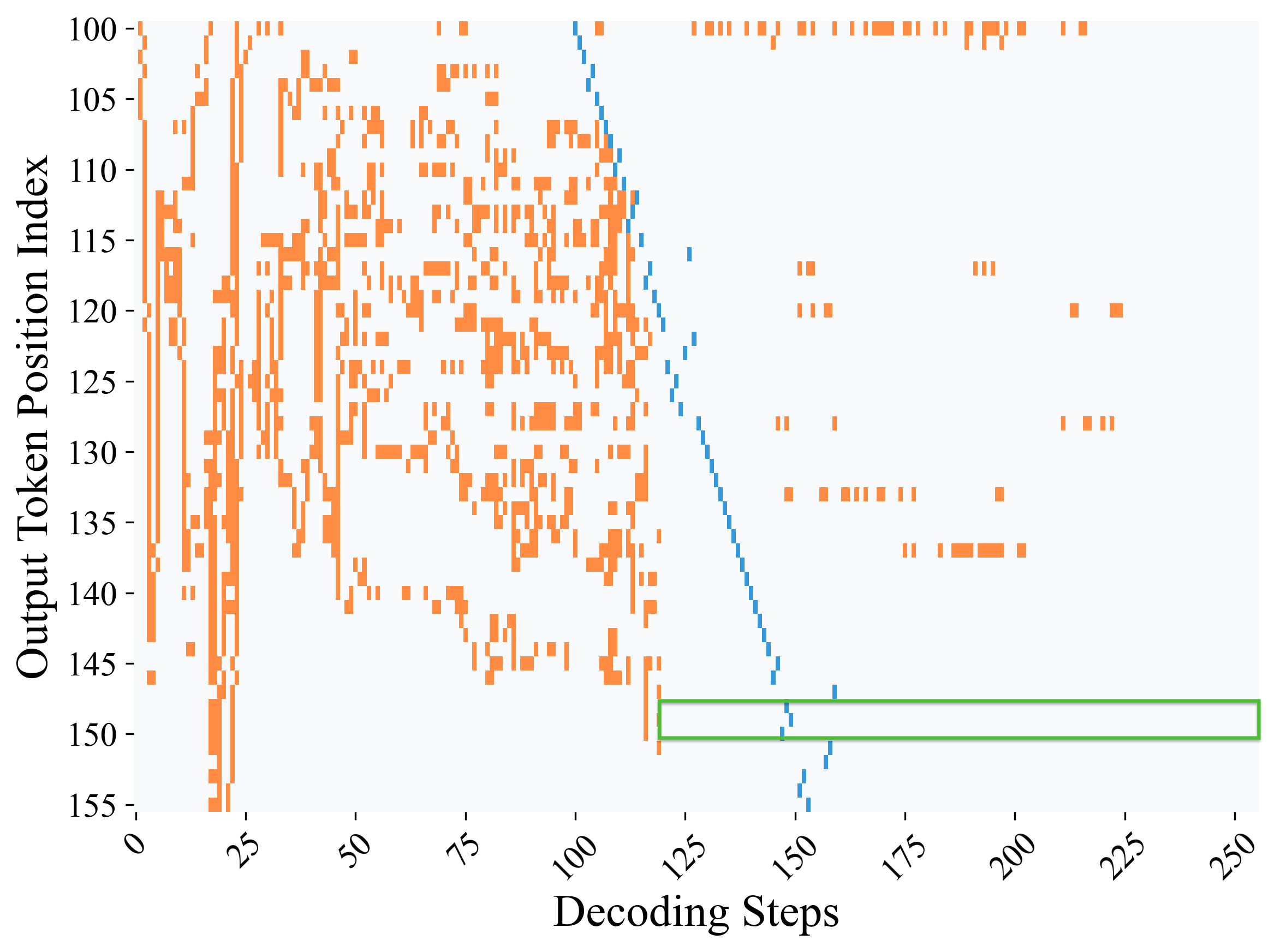
## Scatter Plot: Decoding Steps vs. Output Token Position Index
### Overview
The image presents a scatter plot visualizing the relationship between "Decoding Steps" and "Output Token Position Index". The plot displays three distinct colored lines, likely representing different phases or behaviors during the decoding process. The plot appears to show the progression of token generation as decoding steps increase.
### Components/Axes
* **X-axis:** "Decoding Steps" - Scale ranges from approximately 0 to 250.
* **Y-axis:** "Output Token Position Index" - Scale ranges from approximately 100 to 155.
* **Data Series 1 (Orange):** A dense scatter of points, predominantly in the lower decoding steps (0-100) and higher token positions (100-145).
* **Data Series 2 (Blue):** A line that slopes downward from approximately (100, 110) to (150, 155).
* **Data Series 3 (Green):** A line that appears after the blue line, starting around (150, 155) and extending to (250, 150).
* **No Legend:** There is no explicit legend provided in the image.
### Detailed Analysis
The orange scatter plot shows a high density of points in the initial decoding steps, with token positions ranging from approximately 100 to 145. The density of points decreases as decoding steps increase.
The blue line exhibits a clear downward trend. Starting at approximately decoding step 100 and token position 110, it descends to decoding step 150 and token position 155. The line appears to represent a transition phase.
The green line begins around decoding step 150 and token position 155, and extends horizontally to decoding step 250, with the token position remaining relatively stable around 150. This suggests a stabilization or completion phase.
**Approximate Data Points (extracted visually):**
* **Orange Scatter:**
* (0, 140) - High density
* (25, 135) - High density
* (50, 125) - Moderate density
* (75, 115) - Moderate density
* (100, 110) - Low density
* **Blue Line:**
* (100, 110)
* (125, 130)
* (150, 155)
* **Green Line:**
* (150, 155)
* (200, 150)
* (250, 150)
### Key Observations
* The orange scatter plot indicates a period of active token generation with a wide range of token positions being explored.
* The blue line represents a transition phase where token positions increase as decoding steps progress.
* The green line signifies a stabilization phase where token positions remain relatively constant.
* There is a clear sequential progression of these phases: orange (exploration), blue (transition), and green (stabilization).
### Interpretation
This plot likely represents the behavior of a decoding algorithm, such as one used in large language models. The orange scatter plot shows the initial exploration of possible token sequences. The blue line indicates a phase where the algorithm converges towards a more specific sequence, and the green line represents the final, stable output.
The downward slope of the blue line suggests that as the decoding process continues, the algorithm focuses on higher token positions, potentially indicating the completion of earlier parts of the sequence. The horizontal green line suggests that the algorithm has reached a stable state and is no longer significantly altering the token sequence.
The absence of a legend makes it difficult to definitively label these phases, but the visual trends strongly suggest they represent different stages of the decoding process. The plot provides insights into the algorithm's behavior and how it generates output sequences. The data suggests a successful decoding process, transitioning from exploration to convergence and finally to stabilization.