## Chart: Accuracy vs. Ratio for R1-Qwen | GK23EN
### Overview
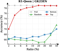
The image is a line chart comparing the accuracy (%) of different data selection methods (Full, Random, Bottom, Top) against the ratio (%) of data used. The chart shows how accuracy changes as the ratio of data increases from 2% to 50%.
### Components/Axes
* **Title:** R1-Qwen | GK23EN
* **X-axis:** Ratio (%) - Ranges from 2% to 50% with markers at 2, 4, 6, 8, 10, 20, 30, 40, and 50.
* **Y-axis:** Accuracy (%) - Ranges from 66% to 78% with no explicit markers.
* **Legend:** Located in the top-right corner.
* Full (Gray dashed line with an 'x' marker)
* Random (Green line with a triangle marker)
* Bottom (Blue line with a square marker)
* Top (Red line with a circle marker)
### Detailed Analysis
* **Full (Gray dashed line):** The accuracy is constant at approximately 78.8% across all ratios.
* **Random (Green line):** The accuracy starts at approximately 66.2% at 2% ratio, decreases to a minimum of approximately 64.8% at 20% ratio, and then increases to approximately 71.6% at 50% ratio.
* Ratio 2%: 66.2%
* Ratio 4%: 65.8%
* Ratio 6%: 65.8%
* Ratio 8%: 65.4%
* Ratio 10%: 65.6%
* Ratio 20%: 64.8%
* Ratio 30%: 65.2%
* Ratio 40%: 67.8%
* Ratio 50%: 71.6%
* **Bottom (Blue line):** The accuracy starts at approximately 66.2% at 2% ratio, increases to approximately 67.2% at 4% ratio, then remains relatively stable between 66.8% and 67.2% until 20% ratio, then increases to approximately 70% at 50% ratio.
* Ratio 2%: 66.2%
* Ratio 4%: 67.2%
* Ratio 6%: 66.8%
* Ratio 8%: 66.8%
* Ratio 10%: 67.2%
* Ratio 20%: 67%
* Ratio 30%: 67.8%
* Ratio 40%: 68.2%
* Ratio 50%: 70%
* **Top (Red line):** The accuracy starts at approximately 70% at 2% ratio, increases rapidly to approximately 77.2% at 6% ratio, and then gradually increases to approximately 78.4% at 50% ratio.
* Ratio 2%: 70%
* Ratio 4%: 75.4%
* Ratio 6%: 77.2%
* Ratio 8%: 78%
* Ratio 10%: 78.2%
* Ratio 20%: 78.4%
* Ratio 30%: 78.4%
* Ratio 40%: 78.6%
* Ratio 50%: 78.4%
### Key Observations
* The "Full" data selection method consistently achieves the highest accuracy, remaining constant across all ratios.
* The "Top" data selection method shows a rapid increase in accuracy initially, then plateaus at a high level.
* The "Random" data selection method has the lowest accuracy and exhibits a slight decrease before increasing again.
* The "Bottom" data selection method shows a gradual increase in accuracy as the ratio increases.
### Interpretation
The chart demonstrates the impact of different data selection methods on the accuracy of the R1-Qwen model. Selecting the "Top" data points appears to be an effective strategy for achieving high accuracy with a smaller data ratio. The "Full" method provides the best accuracy, but it requires using all the data. The "Random" method performs the worst, suggesting that random data selection is not an optimal strategy. The "Bottom" method performs better than "Random" but not as well as "Top". The data suggests that prioritizing certain data points (e.g., "Top") can lead to better performance than using a random sample.