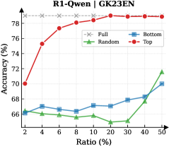
## Line Chart: R1-Owen | GK23EN
### Overview
The image is a line chart comparing the performance (Accuracy %) of four different methods or data selection strategies ("Full", "Random", "Bottom", "Top") as a function of an increasing "Ratio (%)". The chart suggests an experiment where a model's accuracy is evaluated when trained or fine-tuned on subsets of data, with the "Ratio" likely representing the percentage of the total dataset used.
### Components/Axes
* **Chart Title:** "R1-Owen | GK23EN" (located at the top center).
* **Y-Axis:**
* **Label:** "Accuracy (%)"
* **Scale:** Linear, ranging from 66% to 78%.
* **Major Ticks:** 66, 68, 70, 72, 74, 76, 78.
* **X-Axis:**
* **Label:** "Ratio (%)"
* **Scale:** Appears to be a logarithmic or custom scale, not linear. The labeled points are: 2, 4, 6, 8, 10, 20, 30, 40, 50.
* **Legend:** Positioned in the top-right corner of the chart area. It contains four entries:
1. **Full:** Gray dashed line with 'x' markers.
2. **Random:** Green solid line with upward-pointing triangle markers.
3. **Bottom:** Blue solid line with square markers.
4. **Top:** Red solid line with square markers.
### Detailed Analysis
**Data Series and Trends:**
1. **Full (Gray, dashed line, 'x' marker):**
* **Trend:** Perfectly horizontal, constant line.
* **Value:** Maintains a constant accuracy of **78%** across all ratios. This likely represents the baseline performance using the entire dataset (100% ratio).
2. **Top (Red, solid line, square marker):**
* **Trend:** Shows a strong, consistent upward trend. It starts as the second-highest performer at low ratios and steadily increases, converging with the "Full" baseline at the highest ratios.
* **Data Points (Approximate):**
* Ratio 2%: ~70%
* Ratio 4%: ~75.5%
* Ratio 6%: ~77%
* Ratio 8%: ~77.5%
* Ratio 10%: ~78% (matches Full baseline)
* Ratios 20%, 30%, 40%, 50%: ~78% (plateaus at baseline)
3. **Bottom (Blue, solid line, square marker):**
* **Trend:** Shows a very gradual, shallow upward trend. It remains the second-lowest performer for most of the chart, with a slight uptick at the highest ratios.
* **Data Points (Approximate):**
* Ratio 2%: ~66.5%
* Ratio 4%: ~66.8%
* Ratio 6%: ~66.5%
* Ratio 8%: ~66.8%
* Ratio 10%: ~67.2%
* Ratio 20%: ~67%
* Ratio 30%: ~67.5%
* Ratio 40%: ~68%
* Ratio 50%: ~70%
4. **Random (Green, solid line, triangle marker):**
* **Trend:** Shows a fluctuating but generally upward trend. It starts as the lowest performer, dips at a mid-range ratio, and then rises sharply to become the second-highest performer at the 50% ratio.
* **Data Points (Approximate):**
* Ratio 2%: ~66%
* Ratio 4%: ~66.2%
* Ratio 6%: ~66%
* Ratio 8%: ~65.8%
* Ratio 10%: ~66%
* Ratio 20%: ~65.5% (notable dip)
* Ratio 30%: ~66.5%
* Ratio 40%: ~68.5%
* Ratio 50%: ~71.5%
### Key Observations
1. **Clear Hierarchy:** The "Top" strategy (red) is vastly superior to "Random" and "Bottom" at all data ratios below 10%. It achieves near-maximum accuracy with only 10% of the data.
2. **Convergence:** The "Top" method's performance converges with the "Full" data baseline at a 10% ratio and remains there.
3. **Inefficiency of "Bottom":** The "Bottom" strategy (blue) shows minimal improvement, suggesting the data it selects is of low quality or relevance for the task.
4. **Non-linear "Random" Performance:** The "Random" selection (green) does not improve linearly. Its performance dip at 20% ratio is an anomaly, suggesting potential variance or a non-uniform data distribution where a random 20% subset is particularly unrepresentative.
5. **Late Surge by "Random":** At the 50% ratio, "Random" selection outperforms "Bottom" selection, indicating that with enough data, even random sampling captures sufficient useful information.
### Interpretation
This chart demonstrates the critical importance of **data selection strategy** in machine learning or model fine-tuning. The "Top" method likely represents a curated selection of high-quality, relevant, or informative data samples. Its steep learning curve shows that a small, well-chosen subset of data can be as effective as the entire dataset, which has significant implications for reducing computational costs and training time.
The poor performance of "Bottom" suggests that not all data is beneficial; some may be noisy, irrelevant, or even harmful to model performance. The "Random" line serves as a control, showing the expected performance gain from simply adding more data without intelligent selection. Its fluctuating path highlights the risk of relying on random sampling, as performance can be inconsistent until a large enough sample size is reached.
The overarching conclusion is that **quality trumps quantity** in data for this specific task (R1-Owen on GK23EN). Investing in identifying and using the "Top" 10-20% of data yields maximum performance, while using the "Bottom" data or even random data is far less efficient. The "Full" baseline being matched so early indicates potential redundancy in the complete dataset.