## Line Chart: Pass@k (%) Performance Across Models
### Overview
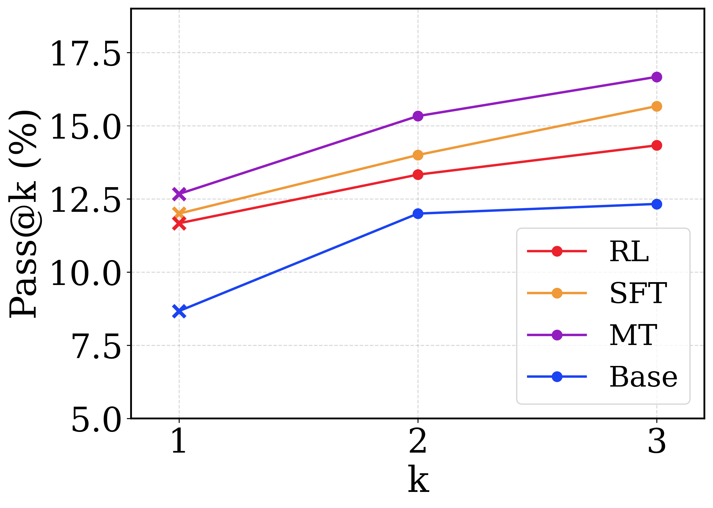
This image is a line chart comparing the performance of four different machine learning models or training methodologies across a metric denoted as "Pass@k (%)". The x-axis represents the value of 'k' (1, 2, and 3), and the y-axis represents the percentage score.
### Components/Axes
* **Y-axis (Left, Vertical):**
* **Label:** `Pass@k (%)`
* **Scale:** Ranges from 5.0 to 17.5.
* **Major Tick Markers:** 5.0, 7.5, 10.0, 12.5, 15.0, 17.5.
* **X-axis (Bottom, Horizontal):**
* **Label:** `k`
* **Scale:** Discrete integer values.
* **Major Tick Markers:** 1, 2, 3.
* **Legend (Bottom-Right):** Positioned inside the chart area, bounded by a rounded rectangle. It maps colors to model names:
* Red line with circle: `RL`
* Orange line with circle: `SFT`
* Purple line with circle: `MT`
* Blue line with circle: `Base`
* **Grid:** Light gray, dashed grid lines align with both the x-axis and y-axis major tick marks.
### Detailed Analysis
*Component Isolation: Main Chart Area*
**Trend Verification & Spatial Grounding:**
Before extracting data points, I will verify the visual trend of each line and cross-reference the color with the legend located in the bottom-right. Note: A distinct visual feature is that all data points at `k=1` are marked with an 'x', whereas data points at `k=2` and `k=3` are marked with solid circles.
1. **MT Series (Purple Line):**
* *Trend:* The purple line occupies the highest position on the chart. It slopes upward consistently from left to right.
* *Data Points (Approximate, ±0.2%):*
* k=1 ('x' marker): ~12.7% (Slightly above the 12.5 grid line)
* k=2 (circle marker): ~15.3% (Slightly above the 15.0 grid line)
* k=3 (circle marker): ~16.7% (Between 15.0 and 17.5, closer to 17.5)
2. **SFT Series (Orange Line):**
* *Trend:* The orange line is positioned second from the top. It slopes upward consistently, running roughly parallel to the MT line.
* *Data Points (Approximate, ±0.2%):*
* k=1 ('x' marker): ~12.0% (Below the 12.5 grid line)
* k=2 (circle marker): ~14.0% (Slightly below the midpoint of 12.5 and 15.0)
* k=3 (circle marker): ~15.7% (Above the 15.0 grid line)
3. **RL Series (Red Line):**
* *Trend:* The red line is positioned third from the top. It slopes upward consistently, running roughly parallel to the SFT line.
* *Data Points (Approximate, ±0.2%):*
* k=1 ('x' marker): ~11.7% (Below the SFT point, above 10.0)
* k=2 (circle marker): ~13.3% (Above the 12.5 grid line)
* k=3 (circle marker): ~14.3% (Below the 15.0 grid line)
4. **Base Series (Blue Line):**
* *Trend:* The blue line occupies the lowest position on the chart. It exhibits a sharp upward slope from k=1 to k=2, but then flattens out significantly, showing very little growth between k=2 and k=3.
* *Data Points (Approximate, ±0.2%):*
* k=1 ('x' marker): ~8.7% (Between 7.5 and 10.0)
* k=2 (circle marker): ~12.0% (Below the 12.5 grid line)
* k=3 (circle marker): ~12.3% (Barely above the k=2 point)
### Key Observations
* **Strict Hierarchy:** There is no crossover between any of the lines. The performance ranking is strictly maintained across all values of k: MT > SFT > RL > Base.
* **Diminishing Returns for Base:** The `Base` model shows a distinct anomaly compared to the others. While RL, SFT, and MT continue to improve at a relatively steady rate from k=2 to k=3, the `Base` model's performance plateaus.
* **Marker Anomaly:** The use of 'x' markers exclusively at `k=1` and solid circles at `k=2` and `k=3` suggests a methodological difference in how the metric is calculated or how the models generate outputs at k=1 versus higher values of k.
### Interpretation
The chart demonstrates the effectiveness of different training paradigms on a generative task (likely code generation or mathematical reasoning, where "Pass@k" is a standard metric measuring the probability that at least one out of 'k' generated samples is correct).
The data clearly shows that the `Base` model is the weakest performer. Applying Reinforcement Learning (`RL`) provides a noticeable boost. Supervised Fine-Tuning (`SFT`) provides an even larger boost. The method labeled `MT` (which likely stands for Multi-Task training or a similar advanced paradigm) yields the highest overall performance.
**Reading between the lines:** The plateau of the `Base` model between k=2 and k=3 is highly informative. It suggests that the `Base` model lacks diversity in its generated outputs; if it doesn't get the correct answer within the first two attempts, generating a third attempt is highly unlikely to yield a correct result. Conversely, the fine-tuned models (`RL`, `SFT`, `MT`) continue to benefit from higher 'k' values. This indicates that these advanced training methods not only improve top-1 accuracy but also create a "deeper" and more diverse distribution of correct answers, making it worthwhile to sample more heavily from them. The change in marker shape at k=1 ('x') likely denotes that k=1 uses a greedy decoding strategy (picking the single most likely output), whereas k=2 and k=3 utilize a sampling strategy (like temperature sampling) to generate multiple distinct outputs.