## Bar Chart: Distribution of Overlap Ratio (%)
### Overview
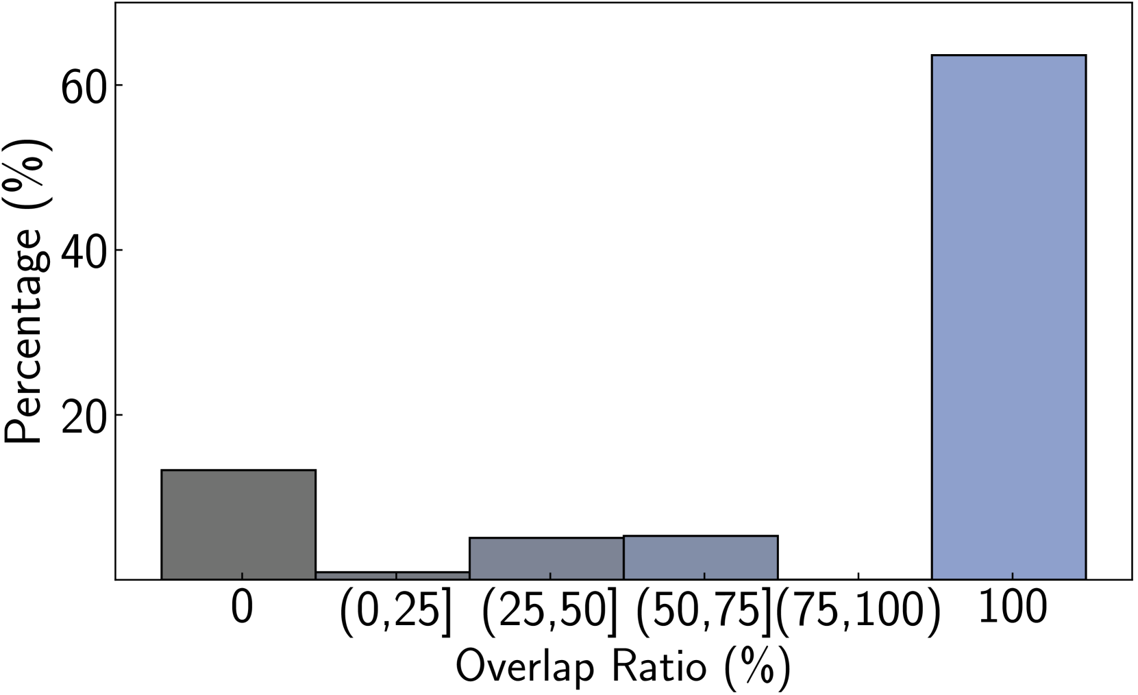
This image is a bar chart displaying the distribution of an "Overlap Ratio (%)" across different categories. The y-axis represents "Percentage (%)", and the x-axis represents the "Overlap Ratio (%)" categorized into bins.
### Components/Axes
* **Y-axis Title**: "Percentage (%)"
* **Scale**: Increments of 20, ranging from 0 to 60. Markers are at 0, 20, 40, and 60.
* **X-axis Title**: "Overlap Ratio (%)"
* **Categories/Bins**:
* 0
* (0, 25]
* (25, 50]
* (50, 75]
* 100
### Detailed Analysis or Content Details
The chart displays five bars, each representing a category on the x-axis and its corresponding percentage on the y-axis.
1. **Category '0'**:
* **Color**: Dark Grey.
* **Height**: The bar reaches approximately the 15% mark on the y-axis.
* **Approximate Value**: 15% (with an uncertainty of +/- 1%).
2. **Category '(0, 25]'**:
* **Color**: Light Blue/Grey.
* **Height**: The bar reaches approximately the 5% mark on the y-axis.
* **Approximate Value**: 5% (with an uncertainty of +/- 1%).
3. **Category '(25, 50]'**:
* **Color**: Light Blue/Grey.
* **Height**: The bar reaches approximately the 7% mark on the y-axis.
* **Approximate Value**: 7% (with an uncertainty of +/- 1%).
4. **Category '(50, 75]'**:
* **Color**: Light Blue/Grey.
* **Height**: The bar reaches approximately the 7% mark on the y-axis.
* **Approximate Value**: 7% (with an uncertainty of +/- 1%).
5. **Category '100'**:
* **Color**: Medium Blue.
* **Height**: The bar reaches approximately the 63% mark on the y-axis.
* **Approximate Value**: 63% (with an uncertainty of +/- 1%).
### Key Observations
* The most significant portion of the data falls into the '100' overlap ratio category, accounting for approximately 63%.
* The '0' overlap ratio category is the second largest, representing approximately 15%.
* The overlap ratio categories between 0% and 75% (specifically (0, 25], (25, 50], and (50, 75]) have relatively small and similar percentages, each around 5-7%.
* There is a clear bimodal distribution, with peaks at 0% and 100% overlap.
### Interpretation
This bar chart suggests a strong tendency for items or entities being analyzed to either have no overlap (0%) or complete overlap (100%). The intermediate overlap ratios are significantly less common. This pattern could indicate a binary outcome in the process being measured, where results are either entirely distinct or entirely identical, with few cases of partial similarity. For example, this could represent the results of a comparison algorithm where matches are either perfect or non-existent, or a classification task where items are clearly one category or another, with no ambiguity. The dominance of the '100' category suggests that in most instances, the overlap is complete.