## Bar Chart: Distribution of Overlap Ratios
### Overview
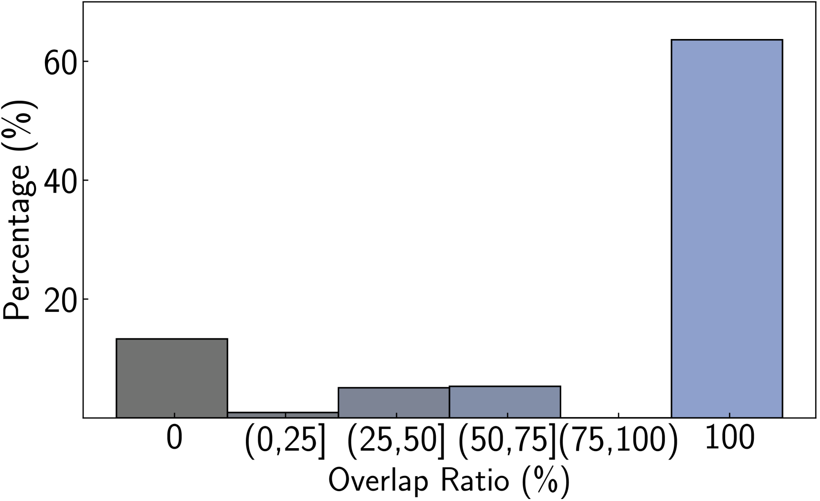
The image displays a bar chart illustrating the percentage distribution of items across different overlap ratio categories. The chart reveals a highly polarized distribution, with the vast majority of items falling into either the "0" (no overlap) or "100" (complete overlap) categories, and very few items showing partial overlap.
### Components/Axes
* **Chart Type:** Vertical bar chart.
* **X-Axis (Horizontal):**
* **Label:** "Overlap Ratio (%)"
* **Categories (from left to right):**
1. `0`
2. `(0,25]` (representing >0% to ≤25%)
3. `(25,50]` (representing >25% to ≤50%)
4. `(50,75]` (representing >50% to ≤75%)
5. `(75,100)` (representing >75% to <100%)
6. `100`
* **Y-Axis (Vertical):**
* **Label:** "Percentage (%)"
* **Scale:** Linear scale from 0 to 60, with major tick marks at 0, 20, 40, and 60.
* **Legend:** No separate legend is present. The categories are defined by the x-axis labels.
* **Spatial Layout:** The chart area is bounded by a simple black frame. The y-axis is on the left, and the x-axis is at the bottom. The bars are evenly spaced along the x-axis.
### Detailed Analysis
The chart contains six bars, each corresponding to an overlap ratio category. The height of each bar represents the approximate percentage of items in that category.
1. **Category `0` (Leftmost bar):**
* **Color:** Dark gray.
* **Approximate Value:** ~13% (The bar height is between the 0 and 20 marks, closer to 20).
* **Trend:** This is the second-tallest bar, indicating a significant portion of items have zero overlap.
2. **Category `(0,25]`:**
* **Color:** Very dark gray (similar to the first bar but appears slightly lighter).
* **Approximate Value:** ~1% (The bar is barely visible above the baseline).
* **Trend:** This is the shortest bar, showing a negligible number of items have a low partial overlap.
3. **Category `(25,50]`:**
* **Color:** Medium gray.
* **Approximate Value:** ~5% (The bar height is about a quarter of the way to the 20 mark).
* **Trend:** A small but measurable percentage of items fall into this mid-low overlap range.
4. **Category `(50,75]`:**
* **Color:** Medium gray (identical to the `(25,50]` bar).
* **Approximate Value:** ~5% (The bar height is visually identical to the `(25,50]` bar).
* **Trend:** The percentage of items in this mid-high overlap range is similar to the mid-low range.
5. **Category `(75,100)`:**
* **Color:** Not visible. There is no bar present for this category.
* **Approximate Value:** 0% or a value too small to render.
* **Trend:** This indicates an absence of items with high-but-not-complete overlap in this dataset.
6. **Category `100` (Rightmost bar):**
* **Color:** Light blue/periwinkle.
* **Approximate Value:** ~63% (The bar extends slightly above the 60 mark on the y-axis).
* **Trend:** This is by far the tallest bar, dominating the chart. It shows that a clear majority of items have a complete (100%) overlap ratio.
### Key Observations
1. **Bimodal Distribution:** The data is heavily concentrated at the two extremes (`0` and `100`), with very little representation in the intermediate partial overlap ranges (`(0,25]` to `(75,100)`).
2. **Dominance of Complete Overlap:** The `100` category accounts for nearly two-thirds of all items, making it the most significant finding.
3. **Significant Zero-Overlap Group:** The `0` category represents a substantial minority (~13%), indicating a distinct group with no overlap.
4. **Absence of High Partial Overlap:** The `(75,100)` category has no visible bar, suggesting items either achieve full overlap or do not reach that high threshold.
5. **Symmetry in Mid-Range:** The percentages for `(25,50]` and `(50,75]` are approximately equal, forming a low, flat plateau in the middle of the distribution.
### Interpretation
This chart demonstrates a **polarized or "all-or-nothing" pattern** in the measured overlap ratio. The data suggests that the process or phenomenon being measured tends to result in either complete alignment (100% overlap) or no alignment (0% overlap), with partial overlap being an uncommon outcome.
* **What it means:** This could indicate a system with binary success criteria, a threshold effect where partial states are unstable, or a classification where items are forced into definitive categories. The near-equal, low percentages in the middle ranges might represent transitional states or measurement noise.
* **Why it matters:** Understanding this polarization is crucial. If the goal is to maximize overlap, efforts should focus on understanding what drives items to the `100` state. Conversely, if partial overlap is desirable, the system or measurement method may need adjustment, as the current outcome strongly discourages it. The stark contrast between the `100` and `0` bars is the central story of this data.